CloudBlue Commerce API
Navigation Elements
The APS UI navigation tree is declared in Metadata Descriptor (APP-META.xml) as illustrated below.
In this document:
General Attributes
The attributes described in this section are applicable to all navigation elements.
Access Privileges
Optionally, a navigation element can declare a privilege that users must obtain to have access to this element.
This privilege is declared by the shown-by-privilege attribute as in the followings example, where
the top-level element (<navigation>) does not have an explicit declaration of an access privilege, and its child elements
require different access privileges:
<navigation id="navigation-without-privilege" label="Navigation wo privilege">
   <plugs-to id="http://www.parallels.com/ccp/2"/>
   <item id="item-wo-privilege">
      <view id="view-wo-privilege" src="ui/view11.js"/>
      <view id="view-with-privilege-1"
         src="ui/view12.js" shown-by-privilege="privilege-1"/>
   </item>
   <item id="item-with-privilege-1" shown-by-privilege="privilege-1">
      <view id="view-under-item-with-privilege-1" src="ui/view21.js"/>
      <view id="view-with-privilege-2-under-item-with-privilege-1" src="ui/view22.js"
         shown-by-privilege="privilege-2"/>
   </item>
</navigation>
In accordance with the above declaration, the views are protected as follows:
The platform’s built-in UX1 Navigation Element Implicit Access privilege grants access to
view11.jsbecause neither this view nor its parents have an explicit declaration of an access privilege.The users granted both UX1 Navigation Element Implicit Access and privilege-1 privileges additionally have access to
view12.js(this view requires privilege-1) andview21.js(this view does not require an explicit privilege, but its direct parent requires privilege-1).The users granted UX1 Navigation Element Implicit Access, privilege-1, and privilege-2 privileges additionally have access to
view22.js(this view requires privilege-2, and its direct parent requires privilege-1).
For more details, see the Navigation Element Access Management document.
Placeholders in Control Panels
A platform user panel must have at least one placeholder for embedding APS UI navigation trees. The following placeholders are predefined in a CP:
http://www.aps-standard.org/ui/applicationis used to expose an APS navigation tree to the provider. In OSS, it allows the embedding of a navigation tree into the top level navigation menu of the application instance screen in the PCP.http://www.aps-standard.org/ui/serviceis used to expose navigation in the CCP. In the platform, it allows the embedding of an APS UI tree into the top level navigation menu of the CCP.http://www.aps-standard.org/ui/useris used to expose navigation to an end-user. In the platform, it allows the embedding of the APS UI navigation tree into the top level navigation menu of the MyCP.
In the UX1 environment, navigation trees can plug into:
http://www.aps-standard.org/rcp/2: the navigation placeholder in UX1 used by reseller administrators.http://www.parallels.com/ccp/2: the navigation placeholder in UX1 used by customer administrators.http://www.aps-standard.org/ui/user/2: the navigation placeholder in UX1 used by customer service users.
Navigation Item
An <item> element defines a navigation item that can embed other items, creating the skeleton of the navigation tree. Normally, it contains views and a variable definition. Optionally, you can use it as a placeholder to embed other navigation trees or tree branches.
This is an example of a multilayer branch:
<item id="network" label="Network">
   <item id="network-ip" label="IP Addresses">
      <view id="ip-addresses" label="IP Addresses">
      ...
      </view>
   </item>
   <item id="network-firewall" label="Firewall">
      <view id="firewall" label="Firewall" />
   </item>
</item>
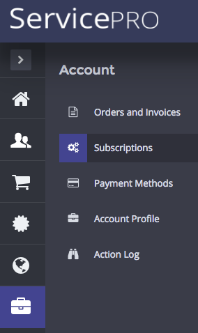
An application can define an icon for the second level navigation item, for example:
<item icon="fa-cogs" id="subscription-management" label="Subscriptions">
View
A <view> element defines an HTML or JS file and other attributes needed to visualize a screen. When a user navigates to an item, the view placed in that item will be active. The view can have other child views (to be called dynamically) as illustrated in the following example:
<view id="servers" src="ui/servers-main.html">
   <view id="server-selected" label="Server Configuration" src="ui/servers.html"
         description="This is the landpage to configure a virtual server">
      <var name="server" type-id="http://aps-standard.org/samples/vpsdemo/vps/1.0" required="true" />
      <view id="server-config" maximized="true">
         <view id="server-config-details" maximized="true"/>
      </view>
      <view id="server-network" />
      <view id="app-templates-network" />
   </view>
</view>
The
idattribute must uniquely identify the view throughout the metadata XML file.The
labelattribute defines a string to print out on top of the screen.The
srcattribute defines the HTML or JS file implementing the view. All such files must be placed into theui/folder, so the path must always start with “ui/”. If thesrcattribute is missing, the implicit definition is the concatenation of theidvalue and thehtmlextension. In the example above, ifsrcwere missing in the <view id=”servers”> definition, the implicit name of the file would beservers.html.Note
In the CP environment, the
srcattribute allows the use of an HTML file as the source for several views in the same or in different navigation trees. In UX1, the relationship must be one-to-one.The
descriptionattribute is used to display a text on top of the screen, directly below the view label.<view id="server-edit" label="Edit VPS" src="ui/server-edit.js" description="You can edit the VPS properties here. Note, if you change the OS, all data will be lost and the upper limits on the properties will change"> ... </view>
Note
The
descriptionattribute is valid in UX1 only, for all view types.The
maximizedattribute hides tabs behind the view when the latter is opened. This protects users from data loss in the view (data editor) if a user accidentally clicks on a tab.
When working in UX1, you can find more view types in addition to the regular view described here.
Controls
To embed navigation controls managed by the user panel into a view, you must first place a <controls> element inside the <view> element.
The following buttons can be used: cancel, prev, next, and submit.
These controls are declared in metadata and must be handled by methods defined in those views
where the controls are used.
CONTRLOL |
HANDLER |
DESCRIPTION |
|---|---|---|
|
|
Cancels the view. The handler must navigate users to another view. |
|
|
Used in wizards to navigate to the previous view in a chain. If it is necessary to process data before navigating to the previous view, you can do so in the respective button handler. |
|
|
Used in wizards to navigate to the next view in a chain. You can redefine the button handler, if it is necessary to process data before navigating and pass it to the next view. |
|
|
Used in a view to commit data processing. The handler must process data and direct the user to another view. |
In the following example, two navigation buttons will appear in the offer-edit view.
<view id="offer-edit" label="Offer {offer.offername}">
    <var name="offer" type-id="http://aps-standard.org/samples/vpsclouds/offers/1.0"/>
    <controls>
        <cancel label="Back to Offers list"/>
        <submit label="Save Changes"/>
    </controls>
</view>
The platform user panel must send an event to the view, when a navigation control is activated.
The following example illustrates how clicking Cancel can be processed inside
the offer-edit view plugged into the PCP:
aps.app.onCancel = function() {
    aps.apsc.gotoView("offers");
};
In UX1, the best way is to define the handlers as methods of a view object
based on the aps/View module, for example:
onCancel: function() {
   aps.apsc.gotoView("servers");
}
Limitations
Follow the limitations described below as the best practice recommendations for your application design.
In this section:
Navigation Tree Depth
The depth of the navigation tree skeleton built by embedded items is limited:
In the PCP and CCP, an application may have up to 2 levels of custom tabs that is up to 2 levels of items.
In UX1, an application may only have 1 level of items.
In the sample package,
the application declares a navigation tree consisting of 3 levels:
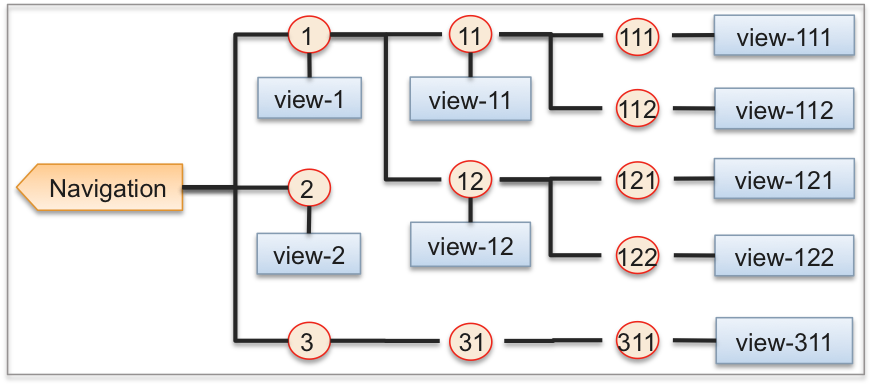
The meta declaration of the tree looks as follows:
<navigation>
   <plugs-to id="http://www.aps-standard.org/ui/application"/>
   <item id="1stlevel-item1" label="1st Level Item-1">
      <view id="1stlevel-view1" label="1st Level View 1" src="ui/showviewid.html"
               visible="true"/>
      <item id="2ndlevel-item11" label="2nd Level Item-11">
         <view id="2ndlevel-view11" label="2nd Level View 11" src="ui/showviewid.html"
               visible="true"/>
         <item id="3rdlevel-item111" label="3rd Level Item-111">
            <view id="3rdlevel-view111" label="3rd Level View 111" src="ui/showviewid.html"/>
         </item>
         <item id="3rdlevel-item112" label="3rd Level Item-112">
            <view id="3rdlevel-view112" label="3rd Level View 112" src="ui/showviewid.html"/>
         </item>
      </item>
      <item id="2ndlevel-item12" label="2nd Level Item-12">
         <view id="2ndlevel-view12" label="2nd Level View 12" src="ui/showviewid.html"
               visible="false"/>
         <item id="3rdlevel-item121" label="3rd Level Item-121">
            <view id="3rdlevel-view121" label="3rd Level View 121" src="ui/showviewid.html"/>
         </item>
         <item id="3rdlevel-item122" label="3rd Level Item-122">
            <view id="3rdlevel-view122" label="3rd Level View 122" src="ui/showviewid.html"/>
         </item>
      </item>
   </item>
   <item id="1stlevel-item2" label="1st Level Item-2">
      <view id="1stlevel-view2" label="1st Level View 2" src="ui/showviewid.html"
               visible="true"/>
   </item>
   <item id="1stlevel-item3" label="1st Level Item-3">
      <item id="2ndlevel-item1" label="2nd Level Item-31">
         <item id="3rdlevel-item1" label="3rd Level Item-311">
            <view id="3rdlevel-view1" label="3rd Level View 311" src="ui/showviewid.html"
               visible="true"/>
         </item>
      </item>
   </item>
</navigation>
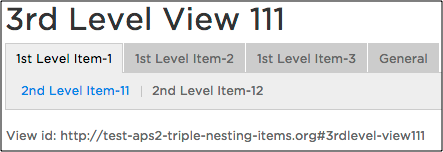
After the application package is imported and its APS application instance is installed, you will find the following navigation structure in the application instance view on the PCP:
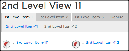
UX1 renders 2 levels of tabs and presents the 3rd level as links to the respective items. When you click on a link, the child view of the selected item will be displayed.
Using Variables in Attributes
The attributes considered in this section allow value assignment from a statement that includes evaluation of navigation variables. Such a dynamic assignment is rarely used because the computation of variable properties affects the overall performance of the UI. Nevertheless, it might be required in special cases.
Note
When building a package, the APS tools can miss some errors in RQL statements
that use navigation variables because a variable cannot be evaluated outside of the APS controller.
It is not possible to validate whether a property used in a statement exists and not null. For example, the existence of
the vpsmanagement.showNetworkTab property of the vpsmanagement variable is not validated when the APS tools
parse the package. Ifsuch an error occurs, diagnose it during test runtime on the platform using
its /var/log/pa/pui/pui.log log file.
Refer to Using RQL for more details about statements used in attributes.
label
Dynamic assignment for a label is used more often than for other attributes. A typical example is to display the name of a resource being configured in an editor view:
<view id="offer-edit" label="Edit Offer {offer.name}">
   <var name="offer" type-id="http://aps-standard.org/samples/offer-mgmt/offer/1.0"/>
   <controls>
      <cancel/>
      <submit/>
   </controls>
</view>
In the example above, label="{offer.name}" means the label will get the value of the name property of
the JSON object identified by the offer variable.
visible
The visible attribute makes an item visible on a condition. The expression can be
a Resource Query Language statement returning true or false. In the following example,
the navigation engine must evaluate the showNetworkTab property of the object specified by the vpsmanagement
variable.
<item id="network" label="Network" visible="vpsmanagement.showNetworkTab=eq=true()">
Note
From the performance standpoint, instead of using the visible attribute it is better to
declare a required variable, which will have the same effect, for example:
<item id="network" label="Network">
   <var name=network required="true" />
description
The description attribute is used to display a text on top of the screen, just below the view label.
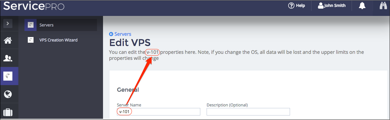
To display variable data, the text can contain a reference to a variable property, for example:
<view id="server-edit" label="Edit VPS" src="ui/server-edit.js"
      description="You can edit the {vps.name} properties here.
      Note, if you change the OS, all data will be lost
      and the upper limits on the properties will change">
   <var name="vps" type-id="http://aps-standard.org/samples/offer1p/vps/1.0"/>
   ...
</view>
Placeholders
The <placeholder> element inside a <navigation>, <item>, or <group> element declares a socket for embedding other navigation trees or tree branches. Those trees or branches must have the <plugs-to> element with the same ID as specified by the considered <placeholder> element. The following example illustrates how to declare a placeholder in an <item>:
<item id="network" label="Network">
   ...
   <placeholder id="http://aps-standard.org/samples/basic/management#network" />
</item>
Warning
Although any APS application can declare its own placeholders, be careful when using this capability, because incorrect plugging can convert a tree into a cyclic graph that destroys the navigation. For example, avoid cases when one application, app-1, plugs its branch into another application, app-2, and the latter plugs its branch into the former, making a loop in the navigation structure.