Table Of Contents
Application Packaging Standard
Last updated 18-Mar-2019Subscription Tile in Service View
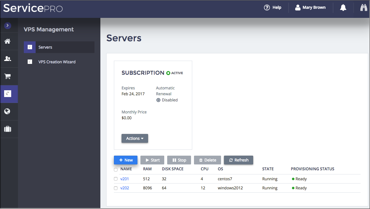
An application can use its own view to show the status of a subscription that delivers the application
services to subscribers.
For this purpose, APS JS SDK provides the aps/biz/SubscriptionInfoTile module that shows
a tile with the subscription business-related properties.
In this document:
Properties and Actions
A tile informs about the current status of the subscription and allow getting more details by means of some action buttons.

Depending on the subscription status, a set of displayed properties and buttons may vary.
Typical subscription properties are as follows:
- Status is shown by an icon and a text.
- Expires shows the subscription expiration date.
- Automatic Renewal indicates if an order for the subscription renewal will be generated automatically.
- Renewal Price shows the price to be set in the renewal order.
- Monthly Price or another type of billing price shows the recurring price for the subscription.
- Warning or Error message attracts a user attention in a case when the current subscription period is close to the expiration date, or already expired, or suspended.
The buttons in the tile support the following actions:
- View Subscription forwards a user to the standard view presenting the subscription details.
- Renew forwards a user to the renewal order wizard.
- Disable Automatic Renewal disables automatic generation of a renewal order.
- Enable Automatic Renewal enables automatic generation of a renewal order.
- Cancel Subscription forwards a user to the cancellation order wizard.
- Upgrade to Paid is visible for a trial subscription. It forwards a user to the subscription upgrade wizard.
- Pay Invoices is visible when the subscription status is On Credit Hold and the customer has unpaid invoices. It forwards a user to the payment wizard.
Using SubscriptionInfoTile
Typical Steps
Typical steps to use the module in an application view are as follows.
In the
initmethod, add theaps/biz/SubscriptionInfoTilemodule to the widget hierarchy returned by the method. In the following example, it is added with default values:return ["aps/Panel",[ ["aps/Tiles", [ ["aps/biz/SubscriptionInfoTile", { id: this.genId("subscription_status") }] ]], ["aps/Grid", { ... }, [ ... ]] ]];
In the
onContextmethod, specify the APS ID of the subscription to be displayed. For example:this.byId("subscription_status").set( "subscriptionId", aps.context.vars.context.aps.subscription );
Status Presentation
The module declares the following properties:
subscriptionIdspecifies the APS ID of the subscription as demonstrated in the example above.titlereplaces the default “Subscription” title of the tile.subscriptionStatusListis an object that defines a label and a CSS style for each subscription status. It is assigned the following structure by default:subscriptionStatusList: { "ordered": { label: "Registering", type: "default" }, "active": { label: "Active", type: "success" }, "canceling": { label: "Canceling", type: "default" }, "graced": { label: "Expired", type: "danger" }, "expired": { label: "Expired", type: "danger" }, "terminated": { label: "Canceled", type: "disabled" } }
If necessary, redefine the subscriptionStatusList` object as needed.