CloudBlue Commerce API (DRAFT)
Table Of Contents
aps/ListSwitcher
Presents objects from a data source in one of two view modes at a time.
The widget defines a pair of containers. In PCP / CCP v1, they are ``aps/Grid`` and ``aps/ActiveList``. In CCP v2, they are ``aps/Grid`` and ``aps/Tiles``. A user can switch from one view mode to another.
Table of contents
Compatibility
All user panels - CP and UX1
Overview
Structure
The aps/ListSwitcher object contains definition of two presentation formats (view modes).
It is used to present a collection of objects from a data model in one of these formats at a time
as in the following example:
Depending on the control panel version, it is possible to use the following pairs of presentation formats:
For CP, use the aps/Grid and aps/ActiveList pair.
List of servers displayed in the
aps/Gridview mode: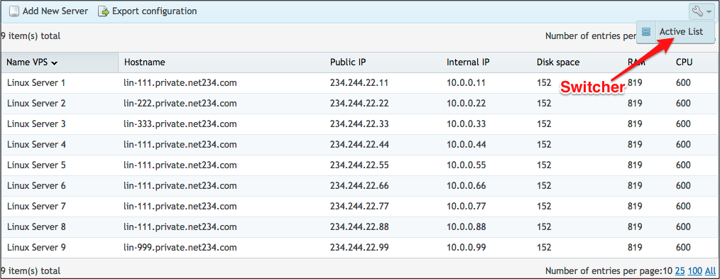
Same list in the
aps/ActiveListview mode: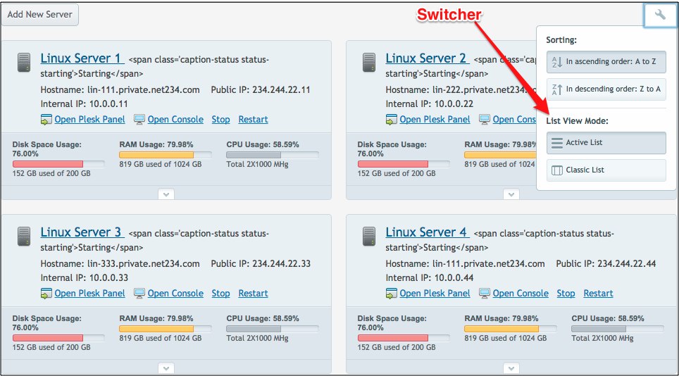
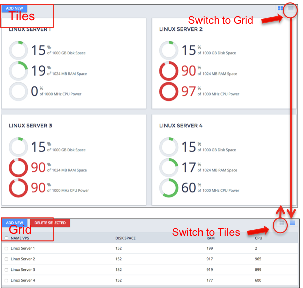
For UX1, use the aps/Grid and aps/Tiles pair:
Find the nested rules for this widget in the recommended Widget Hierarchy.
Warning
If the number of elements is less or equal the number of
columns in aps/ActiveList, then the menu for choosing sorting and
view mode will not be visible.
Saving Session State
The aps/ListSwitcher widget stores the view mode and sorting configuration
used in the current session. When you open the same screen next time, the saved
session state is restored. If you need to open the screen always in a predefined
state, you should create needed settings in the screen code by means of
the set method.
Examples
CP Environment
    require([
      "aps/load",
      "aps/Output",
      "aps/Memory",
      "dojox/mvc/at",
      "aps/ready!"
    ], function(load, Output, Memory, at){
      "use strict";
      var data = [
		// Array content is hidden
];

      var store = new Memory({ data: data, idProperty: "aps.id" });

      var layout = [  {"name": "Name VPS",  "field": "info.title"},
              {"name": "Hostname",  "field": "info.hostname"},
              {"name": "Public IP",   "field": "info.publicIp"},
              {"name": "Internal IP", "field": "info.internalIp"},
              {"name": "Disk space",  "field": "params.disk"},
              {"name": "RAM",     "field": "params.ram"},
              {"name": "CPU",     "field": "params.cpu"}];

      load(["aps/PageContainer", [
        ["aps/ListSwitcher", {
        store:      store,
        labelAttr:    "info.title"
        }, [
          ["aps/ActiveList", { cols: 2 },
          [ ["aps/Button", { title: "Add New Server" }],
            ["aps/ActiveItem", {
            iconName:   "../_static/examples/activeList/images/hardware-node.png",
            title:    at("rel:info", "title"),
            info:     "<span class='caption-status status-starting'>Starting</span>",
            description:
              [ new Output({
              content:  "Hostname: ${value}",
              value:    at("rel:info", "hostname"),
              "class":  "summary-item"
              }),
              new Output({
              content:  "Public IP: ${value}",
              value:    at("rel:info", "publicIp"),
              "class":  "summary-item"
              }),
              new Output({
              content:  "Internal IP: ${value}",
              value:    at("rel:info", "internalIp"),
              "class":  "summary-item"
              })
            ]
            }, [
            ["aps/ToolbarButton", {
              label:    "Open Plesk Panel",
              iconName:   "../_static/examples/activeList/images/login.png"
            }],
            ["aps/ToolbarButton", {
              label:    "Open Console",
              iconName:   "../_static/examples/activeList/images/computer.png"
            }],
            ["aps/ToolbarButton", {
              label:    "Stop",
              iconName:   ""
            }],
            ["aps/ToolbarButton", {
              label:    "Restart",
              iconName:   ""
            }],
            ["aps/InfoBoard", [
              ["aps/Gauge", {
              title:    "Disk Space Usage: ${percent}",
              legend:   "${value} GB used of ${maximum} GB",
              minimum:  0,
              maximum:  200,
              value:    at("rel:params", "disk"),
              width:    "auto",
              classesMap: {
                  "100": "warn",
                  "150": "over"
              }}],
              ["aps/Gauge", {
              title:    "RAM Usage: ${percent}",
              legend:   "${value} GB used of ${maximum} GB",
              minimum:  0,
              maximum:  1024,
              value:    at("rel:params", "ram"),
              width:    "auto",
              classesMap: {
                  "800": "warn",
                  "900": "over"
              }}],
              ["aps/Gauge", {
              title:    "CPU Usage: ${percent}",
              legend:   "Total 2X1000 MHg",
              minimum:  0,
              maximum:  1024,
              width:    "auto",
              value:    at("rel:params", "cpu"),
              }]
            ]],
            ["aps/Container", { cols: 2 }, [
              ["aps/FieldSet", { title: "Server Information" },
              [[ "aps/Output", {
                  label:    "OS",
                  content:
                  "CentOS 6 (x86_64)<br><a href=\"javascript:void(0)\">Upgrade is available</a>"
                }
                ], [ "aps/Output", {
                  label:    "Source Image",
                  content:  "Silver"
                  }
                ], [ "aps/Output", {
                  label:    "Technology",
                  content:
                    "<img src=\"../_static/examples/activeList/images/app-catalog.png\" " +
                      "alt=''> Virtuozzo"
                  }
                ], [ "aps/Output", {
                  label:    "State",
                  content:
                    "<img src=\"../_static/examples/activeList/images/ok.png\" alt=''> " +
                      "Running (uptime 1d 21h)"
                  }
              ]]
              ],
              ["aps/Container", { title: "Resource Usage" }, [
              ["aps/FieldSet",
                [[ "aps/Output", {
                  label:    "External incoming traffic",
                  content:  "1 TB"
                }],
                [ "aps/Output", {
                  label:    "External outcoming",
                  content:  "3 TB"
                }]
                ]
              ],
              ["aps/Output", {
                content: "<a href=\"javascript:void(0)\">Show All Resource Statistics</a>"
              }]
              ]]
            ]],
            [ "aps/ToolsList", { title: "Configuration" },
              [[ "aps/ToolsItem", {
                title:    "Server Configuration",
                iconName:   "../_static/examples/activeList/images/sitebuilder.png"
                }
              ], [ "aps/ToolsItem", {
                title:    "Network Settings",
                iconName:   "../_static/examples/activeList/images/site-aps.png"
                }
              ], [ "aps/ToolsItem", {
                title:    "Change Password",
                iconName:   "../_static/examples/activeList/images/file-manager.png"
                }
              ], [ "aps/ToolsItem", {
                title:    "Firewall",
                iconName:   "../_static/examples/activeList/images/web-stats.png"
                }
              ], [ "aps/ToolsItem", {
                title:    "Application Templates",
                iconName:   "../_static/examples/activeList/images/ftp-access.png"
                }
              ], [ "aps/ToolsItem", {
                title:    "Plesk Panel Configuration",
                iconName:   "/aps/ppanel-theme/icons/32/plesk/dns.png",
                description:
                  "<span class='note-important'>1 update available</span>"
                }
            ]]],
            ["aps/ToolsList", { title: "Backups" },
              [[ "aps/ToolsItem", {
                title:    "Backups",
                iconName:   "../_static/examples/activeList/images/backup.png",
                description:
                "<span class='note-minor'>Daily backups<br>Last backup 10-23-2012</span>"
              }],
              [ "aps/ToolsItem", {
                title:    "Operations Log",
                iconName:   "../_static/examples/activeList/images/certificates.png"
              }],
              [ "aps/ToolsItem", {
                title:    "Clone Server",
                iconName:   "../_static/examples/activeList/images/hosting-setup.png"
              }],
              [ "aps/ToolsItem", {
                title:    "Create Image",
                iconName:   "../_static/examples/activeList/images/sitebuilder.png"
              }],
              [ "aps/ToolsItem", {
                title:    "Recreate Server",
                iconName:   "../_static/examples/activeList/images/site-aps.png"
              }],
              [ "aps/ToolsItem", {
                title:    "Delete Server",
                iconName:   "../_static/examples/activeList/images/file-manager.png"
              }]
            ]]
            ]]
          ]
        ], ["aps/Grid", {
          columns: layout
        }, [
          [ "aps/Toolbar", [
          [ "aps/ToolbarButton", { label: "Add New Server",       iconClass:  "sb-add-new-server" } ],
          [ "aps/ToolbarButton", { label: "Export configuration", iconClass:  "sb-export" } ]
          ]]
        ]
        ]]]]]);
    });
UX1 Environment
require(["aps/load", "aps/Memory", "dojox/mvc/at", "aps/ready!"], function (load, Memory, at) {
	// Common data source
	var data = [
	// Array content is hidden
	{
		aps: {
			id: "1"
		},
		infoText: "infoText",
		info: {
			title: "Linux Server 1"
		},
		params: {
			disk: 152,
			ram: 199,
			cpu: 2
		}
	}, {
		aps: {
			id: "2"
		},
		infoText: "infoText",
		info: {
			title: "Linux Server 2"
		},
		params: {
			disk: 152,
			ram: 917,
			cpu: 965
		}
	}, {
		aps: {
			id: "3"
		},
		infoText: "infoText",
		info: {
			title: "Linux Server 3"
		},
		params: {
			disk: 152,
			ram: 919,
			cpu: 899
		}
	}, {
		aps: {
			id: "4"
		},
		infoText: "infoText",
		info: {
			title: "Linux Server 4"
		},
		params: {
			disk: 152,
			ram: 177,
			cpu: 600
		}
	}];
	// Make data source Stateful
	var store = new Memory({
		data: data,
		idProperty: "aps.id"
	});
	// Make Grid layout
	var gridlayout = [{
		"name": "Name VPS",
		"field": "info.title"
	}, {
		"name": "Disk space",
		"field": "params.disk"
	}, {
		"name": "RAM",
		"field": "params.ram"
	}, {
		"name": "CPU",
		"field": "params.cpu"
	}];
	// Make List Switcher
	load(["aps/ListSwitcher",
	{
		store: store,
		labelAttr: "info.title"
	},
	// First view mode - 'aps/Tiles'
	[
		["aps/Tiles",
		{}, [
			["aps/ToolbarButton",
			{
				label: "Add New",
				busyLabel: "Add New",
				iconClass: "fa-plus",
				timeout: 0,
				type: "primary"
			}],
			["aps/Tile",
			{
				title: at("rel:info", "title"),
				gridSize: "md-6"
			}, [
				["aps/Pie",
				{
					title: "${value}",
					gridSize: "md-4 xs-8",
					maximum: 1000,
					legend: "of ${maximum} GB Disk Space",
					value: at("rel:params", "disk")
				}],
				["aps/Pie",
				{
					title: "${value}",
					gridSize: "md-4 xs-8",
					maximum: 1024,
					legend: "of ${maximum} MB RAM Space",
					value: at("rel:params", "ram")
				}],
				["aps/Pie",
				{
					title: "${value}",
					gridSize: "md-4 xs-8",
					maximum: 1000,
					legend: "of ${maximum} MHz CPU Power",
					value: at("rel:params", "cpu")
				}]
			]]
		]],
		// Second view mode - 'aps/Grid'
		["aps/Grid",
		{
			columns: gridlayout,
            selectionMode: "multiple"
		}, [
			["aps/Toolbar", [
				["aps/ToolbarButton",
				{
					label: "Add New",
					busyLabel: "Add New",
					iconClass: "fa-plus",
					type: "primary"
				}],
				["aps/ToolbarButton",
				{
					label: "Delete Selected",
					busyLabel: "Deleting...",
					iconClass: false,
					type: "danger"
				}]
			]]
		]]
	]]);
});
Public Properties
PROPERTY |
TYPE |
DEFAULT |
DESCRIPTION |
|---|---|---|---|
boolean |
false |
Specifies if the widget will respond to user input. |
|
string |
undefined |
This specifies the widget width that is relevant only for widgets inside Container, FieldSet, or Tiles. |
|
boolean |
false |
The display mode. |
|
boolean |
false |
If the widget is busy then this property is true. |
|
string |
“” |
The source name that is used for the sort operations. |
|
boolean |
<strong>false</strong> (Ascending) |
Defines the sort direction: true - Descending, false - Ascending. |
|
boolean |
true |
If this property value is set to true, then the widget is visible. |
gridSize string
This specifies the widget width that is relevant only for widgets inside Container, FieldSet, or Tiles. In other cases it will be ignored.
gridSize string contains few options with number values (from 1 to 12) separated by spaces, which specify the grid size of the widget in different layouts:
- md - desktop
- xs - phone
For example, gridSize: “md-4 xs-2”.
All values below 1, e.g. “md-0”, will be replaced with the empty string (“”), values above 12, e.g. “md-14”, will be reduced to 12 (“md-12”).
Default value: undefined.
gridView boolean
The display mode. If the property value is true, the data is displayed as aps/Grid. The default value is false.
labelAttr string
The source name that is used for the sort operations. Specifies the field that will be used for sorting in the ``aps/ActiveList`` view mode. Deprecated for CCP v2. Default value: “”.
sortDescending boolean
Defines the sort direction: true - Descending, false - Ascending. Default value: false (Ascending). Deprecated for CCP v2.
visible boolean
If this property value is set to true, then the widget is visible.
Default value: true.
Public Methods
METHOD |
RETURN |
DESCRIPTION |
|---|---|---|
undefined
|
Makes the given widget a child of this widget |
|
object
|
Sets the isBusy property to false |
|
undefined
|
Destroys this widget |
|
aps/_containerbase
function
|
Focusing the focusable child |
|
any
|
Get a property of the Stateful instance |
|
array
|
Returns all direct children of this widget, i |
|
array
|
Discover and return all parents of the widget |
|
dijit/_widgetbase
function
|
Place this widget somewhere in the DOM based on standard dojo/dom-construct::place() conventions |
|
undefined
|
Refresh data in widget |
|
undefined
|
Remove all children in the widget |
|
undefined
|
Removes the passed widget instance from this widget and destroys it |
|
undefined
|
Resets the widget |
|
object
function
|
Set a property of the Stateful instance |
|
boolean
|
Called by oninit, onblur, and onkeypress |
addChild
Makes the given widget a child of this widget. Inserts specified child widget’s dom node as a child of this widget’s container node, and possibly does other processing (such as layout).
Return: undefined
ARGUMENT |
TYPE |
DESCRIPTION |
|---|---|---|
|
Widget
|
Child widget |
|
Number
String
|
Position child in the parent widget |
destroy
Destroys this widget. Will also destroy any resources (including widgets) registered via this.own(). This method will also destroy internal widgets such as those created from a template.
Return: undefined
get
Get a property of the Stateful instance. Get a named property of the Stateful object. The property may potentially be retrieved via a getter method in subclasses.
In the base class, this just retrieves the object’s property.
Return: any
getChildren
Returns all direct children of this widget, i.e. all widgets underneath this.containerNode whose parent is this widget. Note that it returns not all descendetns, but only the direct children. Analogous to Node.childNodes, except containing widgets rather than DOMNodes.
The result intentionally excludes internally created widgets (a.k.a. supporting widgets) outside of this.containerNode.
Note the returned array is a simple array. The application code should not assume existence of methods like forEach().
Return: array
placeAt
Place this widget somewhere in the DOM based on standard dojo/dom-construct::place() conventions. A convenience function providing a simple shorthand mechanism to put an existing (or newly created) widget somewhere in the DOM, and allow chaining.
Return: dijit/_widgetbase function
postCreate
removeChild
Removes the passed widget instance from this widget and destroys it. You can also pass in an integer indicating the index within the container to remove (ie, removeChild(5) removes the sixth widget).
Return: undefined
ARGUMENT |
TYPE |
DESCRIPTION |
|---|---|---|
|
Widget
Int
|
Child widget or index |
set
Set a property of the Stateful instance. Sets named properties of the stateful object and notifies the watchers of the property. A programmatic setter may be defined in subclasses.
Return: object function
startup
validate
Called by oninit, onblur, and onkeypress. Show missing or invalid messages if appropriate, and highlight textbox field.
Return: boolean
Public Events
EVENT |
RETURN |
DESCRIPTION |
|---|---|---|
undefined
|
The method is called when a user clicks on the widget |
onClick
The method is called when a user clicks on the widget.