Table Of Contents
Base Properties and Methods
All widgets have a set of base properties and methods. They are explained in this document.
In this document:
Inheritance and Synchronization
Since each widget corresponds to a certain HTML element, the following properties are synced between the widget and the HTML element:
id- unique ID assigned to the HTML DOM element. Generally, it must be unique within an HTML page. In a single page application, it must be unique in scope of the whole application UI.name- HTML element name that is used differently in different types of elements.label- HTML element label.
Top Level Widgets
The hierarchy of visual controls in a view is always tree-like with
the aps/PageContainer object in the root.
At the second level, it is recommended to use the following widgets:
aps/Panel- a universal containeraps/Grid- presents tabular data and can contain own toolbar and filter to manage the dataaps/Toolbar- containsaps/Buttonwidgetsaps/Tiles- containsaps/Tilewidgets and widgets of other types derived fromaps/Tileaps/Output- the only non-container widget in this list, it prints out some information
Note
At this level, it is also possible to use aps/Container containers, but only to
output some data by means of the aps/Output widgets.
Context Sensitive Properties
Most of widgets have a group of properties that are enabled if the respective widget is inside one of the following container types:
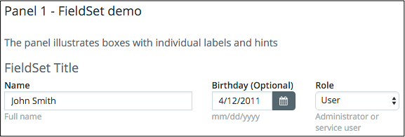
aps/FieldSet- recommended to wrap a set of blocks with individual labels and description
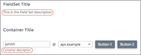
aps/Container- recommended to arrange a set of blocks in a line with a common title
The following table contains the list of widget properties sensitive to the widget’s parent container:
aps/FieldSet, aps/Container, or another parent container. It shows if a property of a child widget is
enabled when the widget is wrapped into a certain parent in dependence on the user panel:
CHILD PROPERTY |
aps/FieldSet |
aps/Container |
Other Containers |
Notes |
|---|---|---|---|---|
|
CP
UX1 - details
|
|
|
|
|
CP - all, UX1:
Container
DateTextBox
ComboBox
Password
Select
Slider
Spinner
TextArea
TextBox
|
CP - all, UX1:
FieldSet
Panel
Tiles
CheckBox
RadioButton
UsageInfo
|
CP - all, UX1:
FieldSet
Panel
Tiles
CheckBox
RadioButton
UsageInfo
|
|
|
CP |
|
CP |
|
UX1 - details |
UX1 - details |
|
Also enabled for
aps/Tile inside aps/TilesDisabled for
aps/Output and aps/Status wrapped into aps/Container |
|
|
UX1 |
|
|
For children that have an input field |
require([
    "aps/load",
    "aps/ready!"
], function(load) {
    load([
        ["aps/Panel", {
                title: "Panel 1 - FieldSet demo",
            description: "The panel illustrates boxes with " +
            "individual labels and hints"
            },
            [
                ["aps/FieldSet", {
                        title: "FieldSet Title",
                        description: "This is the Field Set description",
                        hint: "FieldSet hint"
                    },
                    [
                        ["aps/TextBox", {
                            label: "Name",
                            hint: "Full name",
                            value: "John Smith",
                            gridSize: "md-6",
                            required: true
                        }],
                        ["aps/DateTextBox", {
                            label: "Birthday",
                            hint: "mm/dd/yyyy",
                            value: "2011-04-12",
                            gridSize: "md-3"
                        }],
                        ["aps/Select", {
                            label: "Role",
                            hint: "Administrator or service user",
                            options: [{
                                label: "Admin",
                                value: "11111"
                            }, {
                                label: "User",
                                value: "22222",
                                selected: true
                            }],
                            gridSize: "md-3",
                            required: true
                        }]
                    ]
                ]
            ]
        ],
        ["aps/Panel", {
					title: "Panel 2 - Container demo",
					description: "The panel illustrates in-line boxes"
            },
            [
                ["aps/Container", {
                        title: "Container Title",
                        description: "Container description"
                    },
                    [
                        ["aps/TextBox", {
                            value: "jsmith",
                            gridSize: "md-4",
                            required: true
                        }],
                        ["aps/Output", {
                            value: "@"
                        }],
                        ["aps/Select", {
                            options: [{
                                label: "aps.test",
                                value: "11-11-11"
                            }, {
                                label: "aps.example",
                                value: "22-22-22",
                                selected: true
                            }],
                            gridSize: "md-3",
                            required: true
                        }],
                        ["aps/Button", {
                            title: "Button-1",
                            gridSize: "md-12"	// Doesn't work for buttons
                        }],
                        ["aps/Button", {
                            title: "Button-2"
                        }]
                    ]
                ]
            ]
        ],
        ["aps/TextBox", {
            value: "TextBox out of intermediate parent containers",
            description: "TextBox description",	// Works in version 1
            gridSize: "md-12"					// Doesn't work
        }]

    ]);
});
Widget ID
Each widget must have a unique ID assigned to it. In a single page application, all views are loaded into a single IFrame. In this case, widget IDs must be unique in scope of the whole application. If you do not assign an ID to a widget, it will be generated automatically. For auto-tests, it is highly recommended to assign a unique ID to each widget.
There are two ways of managing widget IDs as explained here.
Using dijit/registry Module
Using this method, you assign widget IDs manually. Thereafter, you can easily get the
widget by this ID using the byId method of the dijit/registry module.
For example:
require(["dijit/registry", "aps/ready!"],
   function(registry){
      var btn = registry.byId("example1");
});
An ID can be assigned when calling a constructor or as the ID attribute of a DOM node, when the widget substitutes the DOM node during insertion into the DOM tree.
Warning
You should not assign the following reserved values to id:
page, top, content, header, footer, main, pageLayout, search, search-form,
navbar, login, frames-wrapper, frame-side, frame-main, frame-side-wrapper,
frame-switcher, wrapper, side-panel, footer-wrapper, content-wrapper,
classic-mode-navigation, top-wrapper, content-body, content-mode-navigation,
divLeftFrameSwitcher, screenID, toolbar-content, secondary, screenTabs,
tabSubItemsRow, key-code-input, chkProceed, fldset-mailInfo, fldset-admin_info,
fldset-power.
Using _View genId and byId Methods
In a single page application, a view implements the aps/View module that has own methods for managing widget IDs. The methods help you assign and use unique widget IDs in scope of the application.
To create a widget ID in a view, you need to call the
genId(localId)method passing a locally unique ID (localId) to it. The method will generate a widget ID unique in scope of the application by adding the view ID prefix to localID.You can find a widget by the local ID you assigned to it. For this purpose, call the
byId(localId)method passing the widget local ID to it. The method works in either case, when an ID is assigned manually or generated by thegenIdmethod.
The following excerpts illustrate the way these methods can be used.
define([
   "dojo/_base/declare",
   "aps/View",
   ...
], function (declare, _View, ...) {
   var self;
   return declare(_View, {
      init: function() {
         self = this;
         ...
         load(["aps/Grid", {
            id: self.genId("srv_grid"),
            ... },
            ...
         ]);
         ...
         var grid = self.byId("srv_grid");
         ...
      }
   });
});
CSS Grid Size
When placing a widget in a container, it is often needed to specify the widget size. APS JS SDK allows you to specify a number of units that a widget can occupy in a row. It works as follows:
When placing widgets, the parser ensures that the total size of all widgets in a row does not exceed the row limit. The last widgets that cause this excess are moved to the next row.
The widget size is set by means of the
gridSizeproperty.Widget size is responsive to the type of device. This allows a developer to set different sizes for the following types of devices:
md- middle size screen, for example, on a desktop computer or a tabletxs- extra-small size screen, for example, on a smartphone
In the following example, size 6 is assigned to “md” and 12 to “xs”.
gridSize: "md-6 xs-12"
In a container grid, the row size limit is 12 units regardless of the screen type.
For a widget, you can assign a size from 1 unit and up to the limit of the row. Each of these values corresponds to a CSS class assigned to the HTML element. For example, “md-6” maps to the “col-md-12” CSS class.
If the
gridSizeproperty is missed, the default “md-12 xs-12” value is assigned.If one of the sizes is missed, no CSS class is assigned to it. For example:
For
gridSize:"md-12", no CSS class is assigned for a mobile screen.For
gridSize:"", no CSS class is assigned regardless of the screen.
All values below 1, for example, “md-0”, will be replaced with the empty string (“”), values above 12, for example, “md-14”, will be reduced to 12 (“md-12”).
Note
Follow the recommended Widget Hierarchy rules when defining widget sizes by means
of gridSize in a page layout.
Take a look at the definition of three TextBox widgets with different sizes:
require(["aps/load", "aps/ready!"],
 function(load) {
     "use strict";

     load(["aps/PageContainer", [
         ["aps/TextBox", {
             placeHolder: "Type your first name here",
             gridSize: "md-4 xs-8"
         }],
         ["aps/TextBox", {
             placeHolder: "Type your last name here",
             gridSize: "md-4 xs-8"
         }],
         ["aps/TextBox", {
             placeHolder: "Type email addresses separated by semicolon",
             gridSize: "md-4 xs-8"
         }]
     ]]);
 });
Depending on the screen size, you will get the following:
Titles and Labels
The title and label properties are mutually exclusive.
The
labelproperty is used only by widgets inside an aps/FieldSet container.The
titleproperty is used by widgets inside any containers, other thanaps/FieldSet.
Methods
METHOD |
ARGUMENTS |
DESCRIPTION |
|---|---|---|
|
list - list of properties to change in the object |
Update properties to the specified values |
|
property - property name |
Return the value of the specified property |
|
property - property name to monitor
handler - method handling events
|
Call the handler when the specified property is changed |
|
|
Return the direct parent container of this current widget |
|
|
Return a list of direct child widgets of this current parent container |
Note
The reliable way to get or change a widget property is to use respectively the get or set method
instead of direct assignment. For example, instead of
var currentValue = widget1.structure1.property1; // NOT recommended
use
var currentValue = widget1.structure1.get("property1"); // Correct way
Set
With this method you can assign values to a property or properties of a widget. You should pass arguments to the method as follows:
When you update a single property, pass two arguments. The first is the property name and the second is its new value.
When you update several properties, pass an object containing the list of property:value pairs.
this.set("data", items);
this.set({   "sort":       { attribute: "", descending: null },
            "filter":     []
});
Watch
The watch method is based on Mozilla JavaScript’s watch
method. It accepts the following arguments:
Name of the property to monitor; if it is missed, all properties are watched
Handler to be called when the specified property changes
The handler is called with these arguments:
The property name
The old value of the property
The new value of the property
The following example illustrates how to monitor changes in a form element:
require(["aps/TextBox", "aps/query", "aps/ready!"],
   	function(TextBox, query) {

       // Get a node to display the value
       var target = query("#target");

       // Create a Textbox to input new value
       var textBox = new TextBox({
           value: 5
       }, "inputNode");
       textBox.startup();

       // Handler definition
       function updateDisplay(name, oldVal, newVal) {
           // Get the new value from the textbox and display it in the node
           target.innerHTML("Old value: " + oldVal + " New value: " + newVal);
       }

       // watch for changes, and update the display when the value changes
       textBox.watch("value", updateDisplay);
  });
<div id="target"></div>
<div id="inputNode"></div>
Precision of Numbers
In JavaScript, the numbers are limited by the IEEE standards.
The highest precision is set by the decimal64 floating-point format . The allowed range is:
±0.000 000 000 000 000 × 10**(−383) to ±9.999 999 999 999 999 × 10**(384)
Note
The fraction is not longer than 15 decimal digits.
The integers are accurate up to 15 decimal digits.
Also, refer to JavaScript Numbers .


