CloudBlue Commerce API
Layout Rules
Before you start designing a custom view for a user panel using APS widgets as building elements, get familiar with the following rules and layout samples.
In this document:
Warning
In this document, there are recommended and thoroughly tested solutions. If your solution includes a widget hierarchy different from the recommended, the view in a screen may differ from what you expected to see, for example, there may be incorrect alignment or missing text.
Top Level
The user panel loads an application UI code into an IFrame differently depending on the user panel type:
In the CP, each application view defines its own root module based on aps/PageContainer (referred to as
PageContainer).In the UX1, each application has the
bootstrapApp.htmlfile that loads the UI root container based on PageContainer. All views of the application, except for pop-up windows, load their widgets into that container, but only one of the views is active at any one time.
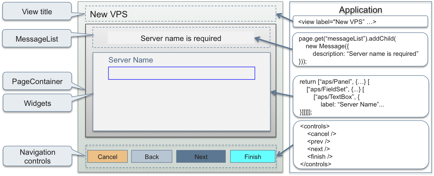
As displayed in the above diagram, an application builds the following UI components:
The navigation section in the
APP-META.xmlfile defines the header and footer UI components displayed beyond thePageContainer:The view label on the top, for example “New VPS”
The view navigation buttons on the bottom
Note
The view source code defines event handlers for those buttons.
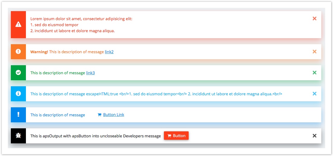
The
PageContaineralways has a container based on theMessageListmodule for displaying application messages. A view source code (JavaScript) defines dynamically the messages based onMessageto print within theMessageList.Inside
PageContainer, the view source code defines widgets to display in the main part of the screen.
Top Level Containers
Directly inside the UI root PageContainer, you can use the containers presented in the following diagram.
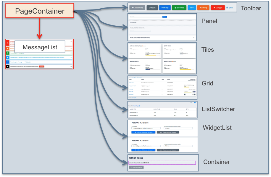
Warning
Do not add or delete the MessageList container because it must be always inside PageContainer.
Widget Hierarchy
The following table illustrates the allowed hierarchy of containers with plain widgets on the lowest levels and allowed usage of the common properties (gridSize, title, and label).
HIERARCHY |
PROPERTIES |
EXAMPLES |
|---|---|---|
ListSwitcher ( ? )
— Grid ( ? )
—— Toolbar ( ? )
——— Button ( ? )
—— columns ( ? ) [renderCell]:
——— Output ( ? )
——— Status ( ? )
——— Gauge ( ? )
——— TextBox ( ? )
——— Password ( ? )
——— Spinner ( ? )
——— DateTextBox ( ? )
——— DropDownButton ( ? )
——— Switch ( ? )
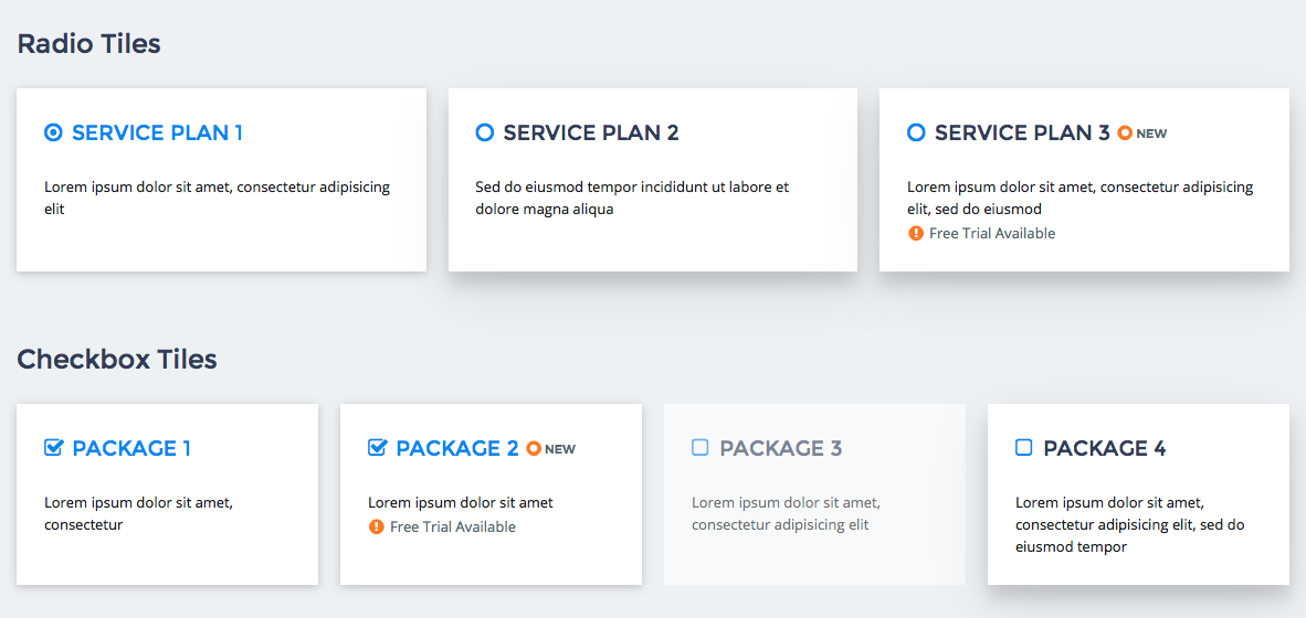
— Tiles ( ? )
—— Toolbar ( ? )
——— Button ( ? )
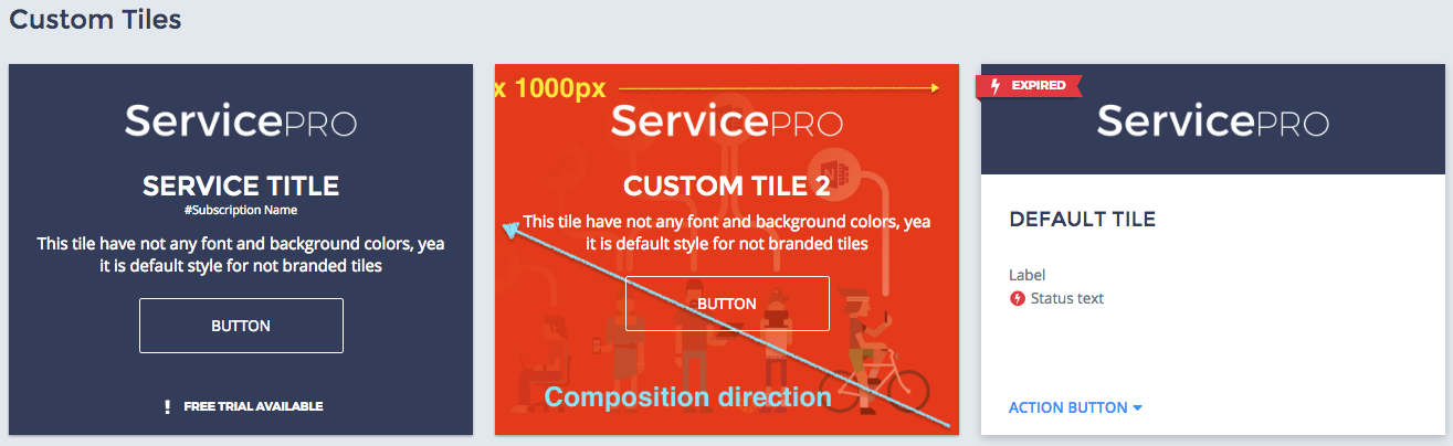
—— Tile ( ? )
——— Toolbar ( ? )
———— Button ( ? )
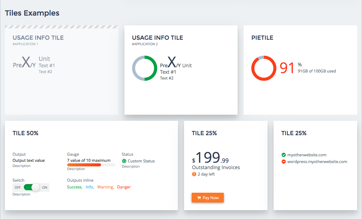
——— FieldSet ( ? )
———— Gauge ( ? )
———— Output ( ? )
———— Status ( ? )
———— ToolTip ( ? )
———— Pie ( ? )
———— UsageInfo ( ? )
———— Switch ( ? )
———— Container ( ? )
————— Gauge ( ? )
————— Output ( ? )
————— Status ( ? )
————— ToolTip ( ? )
————— Pie ( ? )
————— UsageInfo ( ? )
————— Switch ( ? )
———— UsageInfo ( ? )
—— PieTile ( ? )
|
gridSize
gridSize title
gridSize label
gridSize label
gridSize label
gridSize label
gridSize label
gridSize label
gridSize label
gridSize
gridSize
gridSize
gridSize
|
|
WidgetList ( ? )
— Tiles ( ? )
—— Tile ( ? )
——— Toolbar ( ? )
———— Button ( ? )
——— FieldSet ( ? )
———— Gauge ( ? )
———— Output ( ? )
———— Status ( ? )
———— ToolTip ( ? )
———— Pie ( ? )
———— UsageInfo ( ? )
———— Switch ( ? )
———— Container ( ? )
————— Gauge ( ? )
————— Output ( ? )
————— Status ( ? )
————— ToolTip ( ? )
————— Pie ( ? )
————— UsageInfo ( ? )
————— Switch ( ? )
———— UsageInfo ( ? )
—— PieTile ( ? )
— Grid ( ? )
—— Toolbar ( ? )
——— Button ( ? )
—— columns ( ? ) [renderCell]:
——— Output ( ? )
——— Status ( ? )
——— Gauge ( ? )
——— TextBox ( ? )
——— Password ( ? )
——— Spinner ( ? )
——— DateTextBox ( ? )
——— DropDownButton ( ? )
——— Switch ( ? )
— Panel ( ? )
—— Toolbar ( ? )
——— Button ( ? )
—— FieldSet ( ? )
——— Gauge ( ? )
——— Output ( ? )
——— Status ( ? )
——— ToolTip ( ? )
——— Pie ( ? )
——— UsageInfo ( ? )
——— Switch ( ? )
——— Container ( ? )
———— Gauge ( ? )
———— Output ( ? )
———— Status ( ? )
———— ToolTip ( ? )
———— Pie ( ? )
———— UsageInfo ( ? )
———— Switch ( ? )
|
gridSize
gridSize title
gridSize label
gridSize label
gridSize label
gridSize label
gridSize label
gridSize label
gridSize label
gridSize
gridSize
gridSize
gridSize
gridSize title
gridSize label
gridSize label
gridSize label
gridSize label
gridSize label
gridSize label
gridSize label
gridSize
gridSize
gridSize
gridSize
|
|
Tiles ( ? )
— Tile ( ? )
—— Toolbar ( ? )
——— Button ( ? )
—— FieldSet ( ? )
——— Gauge ( ? )
——— Output ( ? )
——— Status ( ? )
——— ToolTip ( ? )
——— Pie ( ? )
——— UsageInfo ( ? )
——— Switch ( ? )
——— Container ( ? )
———— Gauge ( ? )
———— Output ( ? )
———— Status ( ? )
———— ToolTip ( ? )
———— Pie ( ? )
———— UsageInfo ( ? )
———— Switch ( ? )
—— UsageInfo ( ? )
— PieTile ( ? )
|
gridSize
gridSize title
gridSize label
gridSize label
gridSize label
gridSize label
gridSize label
gridSize label
gridSize label
gridSize
gridSize
gridSize
gridSize
|
|
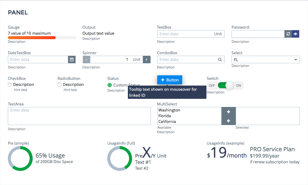
Panel ( ? )
— FieldSet ( ? )
—— Gauge ( ? )
—— Output ( ? )
—— TextBox ( ? )
—— Password ( ? )
—— DateTextBox ( ? )
—— Spinner ( ? )
—— ComboBox ( ? )
—— Select ( ? )
—— CheckBox ( ? )
——— Inputs ( ? )
—— RadioButton ( ? )
——— Inputs ( ? )
—— Status ( ? )
—— ToolTip ( ? )
—— TextArea ( ? )
—— MultiSelect ( ? )
—— Pie ( ? )
—— UsageInfo ( ? )
—— Button ( ? )
—— Switch ( ? )
—— Container ( ? )
——— Gauge ( ? )
——— Output ( ? )
——— TextBox ( ? )
——— Password ( ? )
——— DateTextBox ( ? )
——— Spinner ( ? )
——— ComboBox ( ? )
——— Select ( ? )
——— CheckBox ( ? )
———— Inputs ( ? )
——— RadioButton ( ? )
———— Inputs ( ? )
——— Status ( ? )
——— ToolTip ( ? )
——— Pie ( ? )
——— UsageInfo ( ? )
——— Switch ( ? )
— Container ( ? )
—— Gauge ( ? )
—— Output ( ? )
—— Status ( ? )
—— ToolTip ( ? )
—— Pie ( ? )
—— UsageInfo ( ? )
—— Switch ( ? )
— Grid ( ? )
—— Toolbar ( ? )
——— Button ( ? )
—— columns ( ? ) [renderCell]:
——— Output ( ? )
——— Status ( ? )
——— Gauge ( ? )
——— TextBox ( ? )
——— Password ( ? )
——— Spinner ( ? )
——— DateTextBox ( ? )
——— DropDownButton ( ? )
——— Switch ( ? )
|
gridSize title
gridSize label
gridSize label
gridSize label
gridSize label
gridSize label
gridSize label
gridSize label
gridSize label
gridSize label
gridSize label
gridSize label
gridSize label
gridSize label
gridSize label
gridSize label
gridSize
gridSize label
gridSize label
gridSize
gridSize
gridSize
gridSize
gridSize
gridSize
gridSize
gridSize
gridSize
gridSize
gridSize label
gridSize
gridSize
gridSize
gridSize
|