Main Components
A skin package has the following file structure.
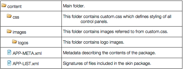
Skins used in the platform control panels include cascading style sheets (CSS) and, optionally, the related logos and artwork that are bundled together and delivered as an APS package.
In this document:
custom.css¶The custom.css file contains blocks of settings each representing a certain element of the
control panel UI. This document follows the structure of the custom.css file that you will edit to
modify the control panel’s appearance - please use it as a reference while modifying
custom.css.
The images and logos folders contain images and logos used by custom.css. When modifying the contents
of these folders, make sure that all images and logos are saved as PNG images and the file
names match the respective links to graphics in custom.css.
The custom.css file includes several blocks of settings named by the UI elements whose
appearance they define.
You can adjust the colors, background images, size, and weight of texts appearing in different
UI elements by editing blocks of settings related to each element.
For example, to change the style of tooltips so they have white text on a blue background:
In custom.css, find the /* - Tooltip - */ block of settings.
By default, the settings are:
/* - Tooltip - */

.tooltip {
    border-color: #aaa;
    color: #444;
    background: #ffc;
    box-shadow: 0 2px 3px #999;
}
.sid-top .tooltip {
    text-shadow: 0 1px 0 #fff;
    box-shadow: none;
}
Change the color value to white and the background value to blue, like this:
/* - Tooltip - */

.tooltip {
   border-color: #aaa;
   color: white;
   background: blue;
   box-shadow: 0 2px 3px #999;
}
.sid-top .tooltip {
   text-shadow: 0 1px 0 #fff;
   box-shadow: none;
}
Save your changes.
Note
The following attributes are not supported in the platform skins and should not be
added to custom.css: display, visibility, float, z-index, position, overflow,
padding, margin, top, left, bottom, right, text-align, height, min-height, width, min-width, and text-indent.
Otherwise the resulting skin will not be approved by the APS team.
To check the results of your editing, upload the custom.css file back to the website (brand)
and then follow the Secure access URL link on the General page of your website (brand) settings in
System > Settings > Brands.
Styles in custom.css are grouped in sections applied to different parts of control panels.
The following sections can be used not only in the platform control panels, but also in other products.
| Section Name | Description |
|---|---|
| Base | Applied to all parts of all platform control panels. See also: Links, Typography, and Forms. |
| Links | Hyperlinks. |
| Typography | Fonts. |
| Top Frame | Including corporate logo, username, help link and a search field. |
| Left Frame | Title area and the navigation tree. |
| Layout | Overall appearance of the customer control panel: top bar, footer and main area. |
| Login Screen | The front page with a prompt to log in to the panel. |
| Top Search Results | Reserved for future versions. |
| Header | Reserved for future versions. |
| Top Navigation | The very top tab menu. |
| Pathbar | Breadcrumbs in the top of the content area. |
| Homepage | Administrator’s account front page in the platform customer control panel. |
| Active List | Active List tiles and grid styles |
| Panels | Administrator’s account in the customer control panel. See also: Admin Panel Home, Statistics. |
| Admin Panel Home | Administrator’s account start page. |
| Tools Area | A bar displaying context-related information (for example, hints). See also: Tools List Area. |
| Tools List Area | Detailed styles for tools list items. |
| List Area | Any type of items output as a list. |
| Toolbar | Collection of tools. |
| Tabs | Tabs in the content area. |
| Messages | Information and warning messages appearing above the main content frame. |
| Line Indicators | Progress bars representing the current status of a specific process/item. |
| Pop-up Blocks | Pop-up blocks in the platform control panels. See also: Confirmation Dialog, Tooltip, Popup Box, More Actions Block Popup, Popup Panel, Service Node Popup. |
| Tooltip | A pop-up text with complimentary information relevant to the current page/action. |
| Pop-up Box | General styling of all pop-up boxes (see also Access Info Pop-up, Link to Folder Pop-up). See also: Access Info Pop-up, Link to Folder Pop-up. |
| Buttons | General styles for buttons. |
| Forms | Styles for any HTML form elements (for example, password field and text area). The other part of CSS with the same title (Forms) defines styling for elements specific for Odin Automation. |
The following style sections in custom.css apply only to the platform.
| Section Name | Description |
|---|---|
| Wizards | Guides a provider through a multi-step procedure. |
| My Profile | The link on the Top Frame that leads to the vendor account profile dashboard. |
| Left Search | The platform screens search. Performed by the whole word or part of the word, with prefill by the search results. The scope of search are all the static screens in the platform. |
| APS section | Miscellaneous styles for APS widgets. |
You can set a user password to be highlighted each time it is displayed on a related platform panel after its random generation. To do so:
On a server on which the branding domain is hosted, open the custom.css file.
In this file, find the /* = Misc = section (at the end of the file content) and add to this
section the .generated-password class that contains all necessary
customization for password highlighting.
If you use a sample custom package, you may find this class with commented properties.
Remove the comments to highlight the field as in the following example:
.generated-password { color: red; }
Save your changes. The password highlighting customization is set.