Table Of Contents
Application Packaging Standard
Last updated 18-Mar-2019Status Management
A set of widgets in this group are specialized on monitoring and managing status of resources, their properties, and status of widgets in a custom view.
In this document:
Display Status
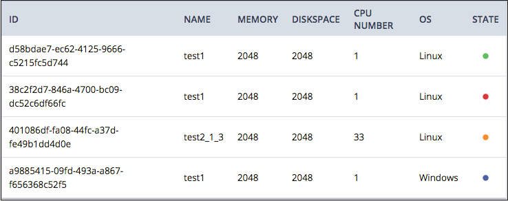
It is important to attract a customer attention to a changed status of a resource. For this purpose,
the aps/Status widget was designed. By default, the widget is able to display different icons for different
statuses it represents. They are ready, disabled, inProgress, warn, and error.
You can place a widget into a container in accordance with the Layout Rules, for example, into an aps/Grid
column:
It is possible to use an aps/Status widget with its default configuration or customize the set of statuses to display
in a custom view.

API Reference provides the complete description of the widget.
Manage Status
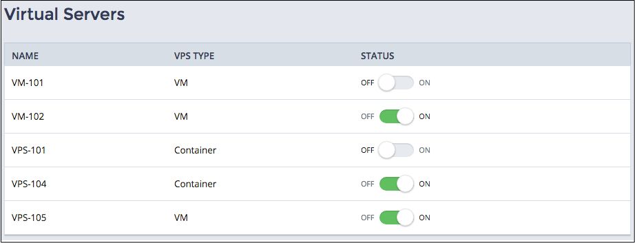
An aps/Switch widget is aimed to help users manage status of other widgets in the same container or in the same view,
for example, make them enabled or disabled.
The onClick handler of the widget is a convenient way to analyze the status of the widget and change status of its
the widget itself as well as the status of other bound widgets. Since the handler can call any function, it can start
an operation with respective resources, for example, start or stop a selected server.
You can insert the widget into various containers in accordance with the Layout Rules, for example, into
an aps/Grid column:
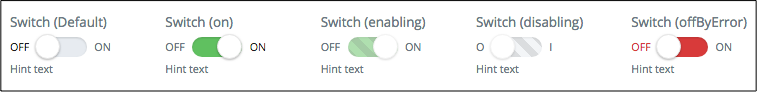
The widget has two static statuses (on, off, and offByError) and two transient statuses (enabling and disabling) as in the following example:
API Reference provides the complete description of the widget.