Buttons
APS JS SDK provides a set of buttons to run some actions bound through handlers to the respective buttons.
In this document:
Regular Buttons
A single button based on the aps/Button module can be used in other containers (usually, in aps/FieldSet)
in accordance with Layout Rules.
The iconClass, type, and disabled properties provide a wide range of button presentations:

If you need more than one button in a widget container, it is better to use an aps/Toobar with a set of enclosed
aps/ToolbarButton widgets.
In any case, every declared button requires the definition of a handler in the view JS code.
API Reference provides the complete description of the widget.
Toolbar
In accordance with Layout Rules an aps/Toolbar can be in various containers and it can contain
a set of various aps/ToolbarButton widgets (similar to aps/Button) separated by aps/ToolbarSeparator.

API Reference provides the complete description of the widget.
Drop-down Action Buttons
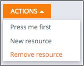
The aps/DropDownButton widget implements a drop-down list of actions with a handler bound to each action item.
You can add a widget into an aps/Grid column using the renderCell method of the grid column.


API Reference provides the complete description of the widget.

