Table Of Contents
Application Packaging Standard
Last updated 18-Mar-2019Layout
Once a designer refined the list of views and for each view, it is clear the type of data to be displayed and the actions to be available for a user, the next step is to estimate possible layout for every view.
In this document:
Predefined Layout
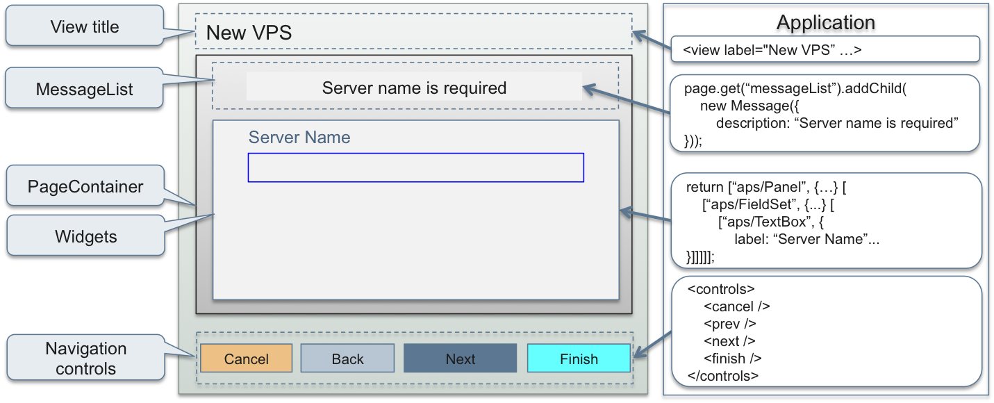
To ensure UI consistency from view to view on the top level, the platform user panel puts a custom view or wizard within a predefined outer layout.

The predefined layout includes the following elements:
The view title - always on top
An application assigns a value to it by the view
labelattribute in the metadata declaration.Navigation controls - always on bottom
An application requires the needed controls in the view metadata declaration. The view JS code can redefine the button event handlers or leave the default handlers as is.
PageContainer- the top level container based on theaps/PageContainerJS moduleThe APS build utility adds this container to every APS package for all views of an application, thus implementing the single-page technique in UX1.
MessageList- a predefined container based onaps/MessageListwith the predefined widget ID"messageList"A view JS code identifies this container by its ID to manage messages inside it, that is to create, edit and remove messages.
The rest space called “Widgets” here - the space where a view lays out its widgets
A view JS code loads here its widgets based on APS JS modules.
Top Level Containers
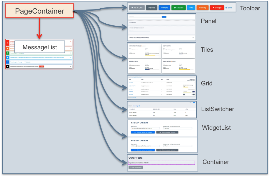
Although APS JS SDK provides many widget containers, a view JS code can use only a few of them on the top level,
that is inside PageContainer, as presented in the following diagram:

Use those containers on the top level for the following purposes:
Toolbar- defines a set of buttons. The view JS code must also define a handler for each button.Panel- typically used to implement an HTML form with various widgets inside it to show and configure a resource or a set of resources.Tiles- contains widgets based on theaps/Tileand its derivatives to present a short list of resources. UseGridfor a long list of resources.Grid- a complex container with a table, a toolbar, and a search engine to present and manage unlimited list of resources in the most flexible way.ListSwitcher- a complex container that includes a pair ofTilesandGriddefinitions as the two modes to present data. This allows a user to see a resource list in a selected mode.WidgetList- provides a convenient way for a user to dynamically add or delete resource in a list through a bound data model.
The Layout Rules document provides the complete information about widget layout hierarchy and rules.
Layout Grid
As explained in the Context Sensitive Properties section, some containers
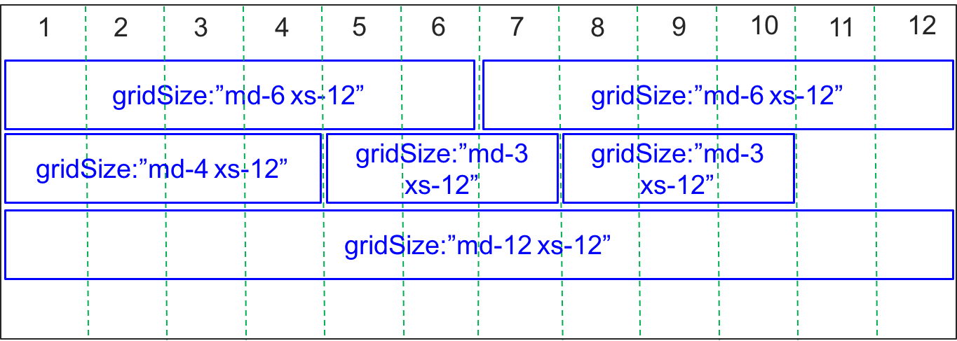
make their widgets use the gridSize property. This property allows a developer to align the child
widgets as needed inside a container. The gridSize property also makes the widget layout responsive to the display mode
(medium size md for desktops and extra-small size xs for phones) by assigning the widget size differently
for those two modes, for example:

Since total size of all widgets in a row cannot exceed 12, it is easy to do various layouts as demonstrated in the above
example for the md display. The widgets of
the same configuration in a phone will be aligned vertically, because xs-12 is assigned for every widget.