Table Of Contents
Application Packaging Standard
Last updated 18-Mar-2019Resource Profile
A view presenting resource details (resource profile) presents the resource properties, resource usage, and actions. A resource profile is defined by the APS type used to create that resource and thus the profile complexity can be very different, changing from very simple, containing a couple of properties, to very complex with tons of properties, usage counters, and activities. It highly depends on the designer whether the view will be user-friendly and compliant with the UX1 principles. That is why in this document you will find general considerations and proposals that you can modify as you need in your design.
In this document:
Use Cases
The view layout principles considered in this document are valid in the following cases:
- When creating a resource in a wizard, this can be a view in a wizard step.
- This is a resource configuration viewer or editor.
Layout
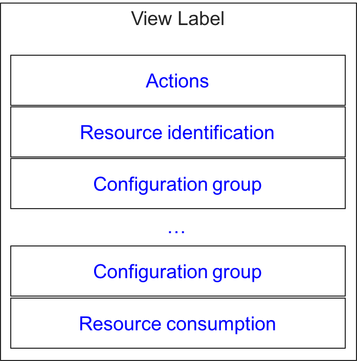
Since a view layout highly depends on the resource complexity, it makes sense to consider probable groups of visual elements typical for a view in a user panel:
- Resource identification - contains the resource name and other identification properties (for example, domain name and IP address) as well as the identification of the resource owner and the resource description.
- Configuration group - a set of properties grouped by a criteria, for example, group of DNS records. A view can contain several configuration groups. A content of a group can depend on the selection of a parameter in another group.
- Resource consumption - a set of counters that show the resource usage counters versus limits, for example the usage of memory and disk space.
- Actions - typically some buttons to start an action, for example, “Enable service”, “Disable service”, or “Open web site”.
Typically, the above groups are presented in a view as separate sections based on widget containers allowed at the top level in accordance with the Layout Rules:
Layout Inside Sections
Inside a visual group, a set of widgets and their layout considerably depend on the type of data to be presented. The following sections provide typical approach for various view groups introduced earlier.
Actions
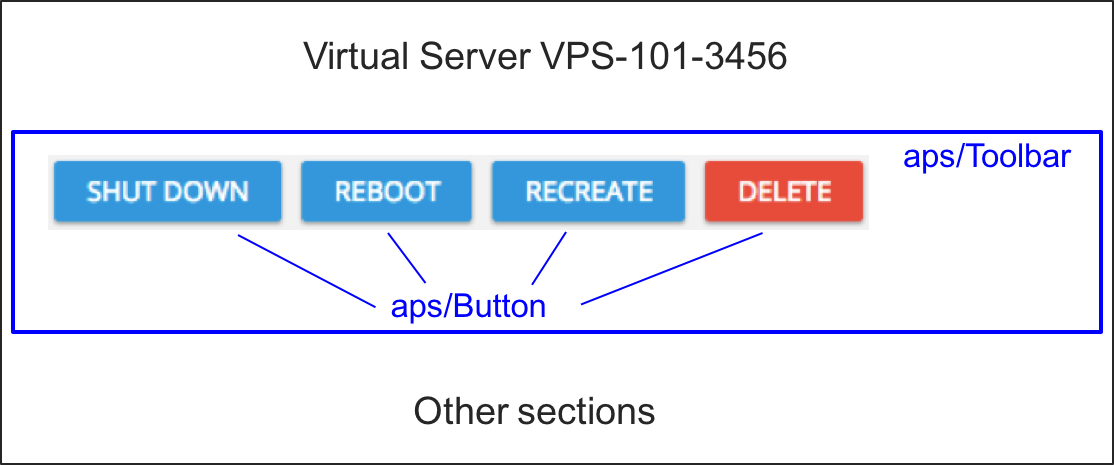
If a resource allows some procedures, you can start them by adding an aps/Toolbar containing
the buttons based on aps/Button, for example:
Resource Identification
The identification (general) section typically presents general data about a resource in the textual format although the implementations may vary.
Configuration
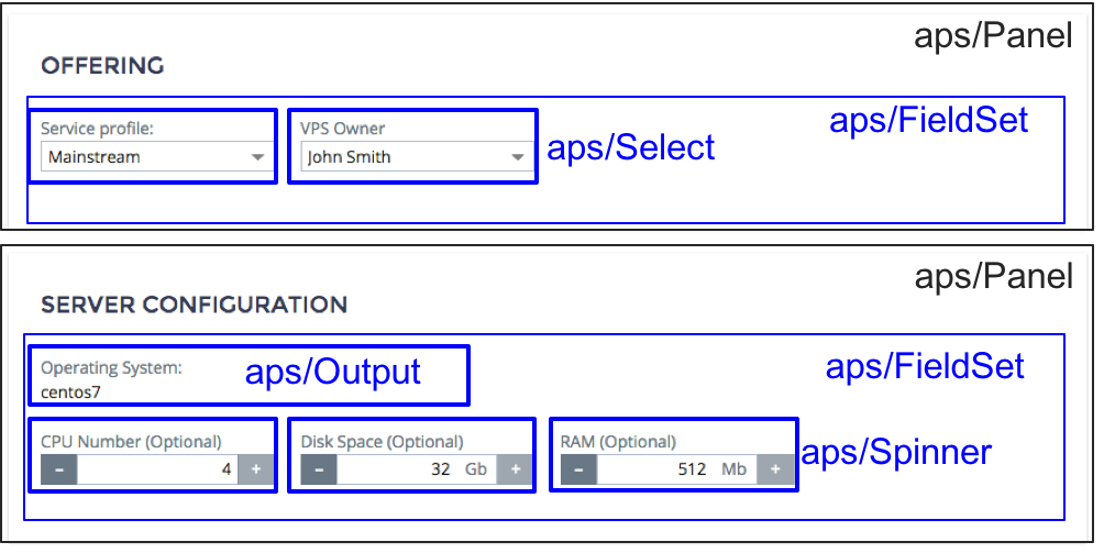
To configure a group of properties, an application provides widgets from the Inputs category and rarely from the Outputs category as in the following example presenting two configuration sections:
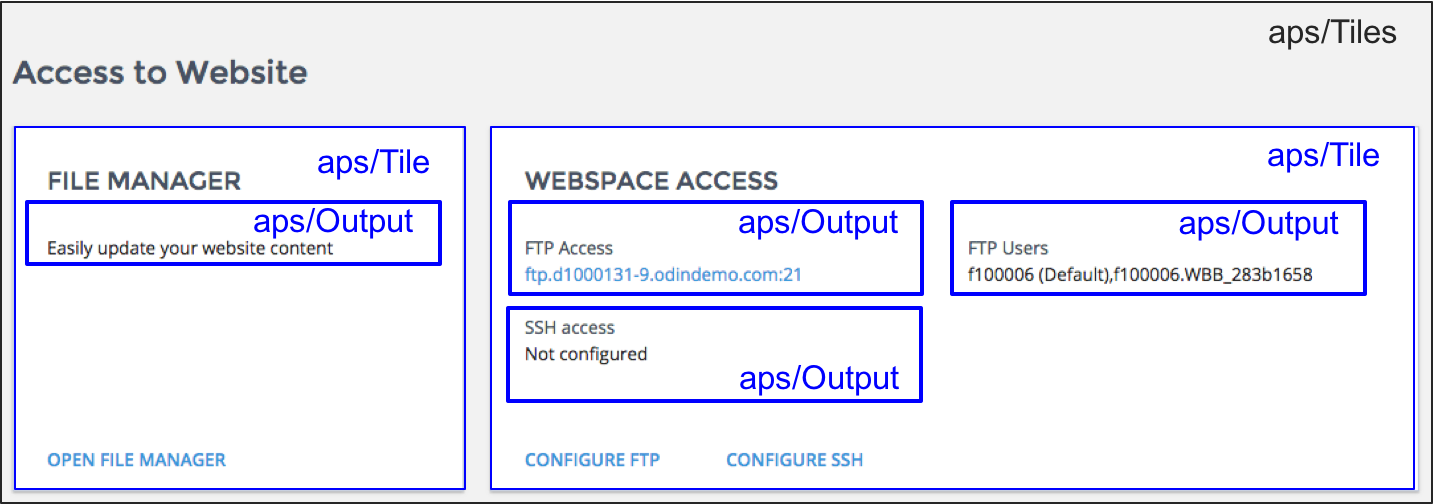
A resource can require a number of complex configurations that is hard to present in sections on the same page. In this case, you can place links to separate internal or external view-editors. For example, a web site requires separate configuration of the FTP access and Web access:
Containerization
When designing a view or a section in a view, you should understand the underlying concepts of various widget containers available in APS JS SDK. A container can include other containers or simple widgets. For the full list of rules and restrictions refer to Widget Hierarchy.
In this section:
Note
The section does not touch the containers presenting a list of resource as this is explained in the Resource List section of another document.
Containers
The following table compares APS containers used to present and manage resources and their properties.
Note
This table presents not a full set of features, but rather best practice recommendations.
| PARAMETER | Panel | Tile | Container | FieldSet |
|---|---|---|---|---|
| JS Module | aps/Panel | aps/Tile | aps/Container | aps/FieldSet |
| Purpose | Implementation of a traditional HTML form with various output/input widgets and action buttons. The panel width is 100% of the parent width. | Placement of widget groups in various tiles with specified widths arranged in a line or in multiple lines.
Creating a set of selectable options, each presented by a tile.
|
Automatic alignment of child widgets in a row with a single label and hint for the whole group. | Flexible alignment of child widgets with an individual label assigned to each child. |
| Parents | aps/PageContaineraps/WidgetList |
aps/Tiles only |
aps/PageContaineraps/Panelaps/FieldSet |
aps/Panelaps/Tile |
| Children | aps/FieldSetaps/Containeraps/Grid |
aps/Toolbaraps/FieldSet |
Various widgets from the Inputs, Outputs, and Status Management categories in accordance with the Widget Hierarchy rules. | aps/Container and
various widgets from the Inputs, Outputs,
and Status Management categories in accordance with the Widget Hierarchy rules. |
| Container width | 100% of the parent container. | gridSize. | gridSize inside
aps/FieldSet.100% inside
aps/PageContainer. |
gridSize. |
| Alignment of children | gridSize. | gridSize. | Auto-alignment in a row.
|
gridSize |
| Typical properties | title.collapsible and collapsed. |
title and gridSize.Visual presentation -
state, background image/color, and icon.buttons - to specify actions. |
title. |
label, description, and gridSize in every child widget. |
aps/Panel
An aps/Panel container allows you to layout a whole view (aps/PageContainer is the parent)
or a section implementing a traditional interactive HTML form.
The following layout shows two typical types of child containers in an aps/Panel:

An aps/Panel can be collapsible that allows a user to simplify a view by collapsing all panels unneeded at
a moment, for example:


API Reference provides the complete description of the widget.
aps/Tile
A set of aps/Tile containers inside an aps/Tiles is an alternative to an aps/Panel with multiple
aps/FieldSet containers for the following reasons:
All properties can be split into multiple small groups, while the other approach (
aps/Panelwithaps/FieldSet) well suits to a case when complex groups of properties must be displayed.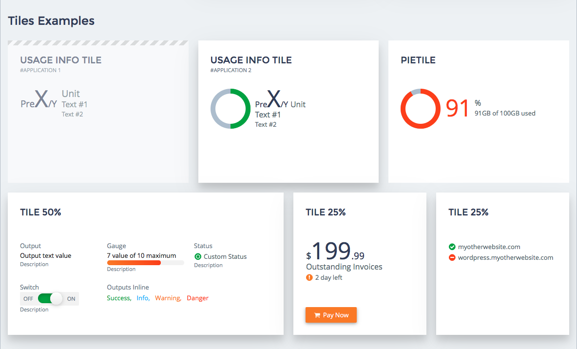
A tile can visualize the state of the whole group by means of its
stateproperty, background image/color, and icon.
Tiles can be selectable, for example, to allow a user to select a configuration as a set of configuration parameters among other configurations.
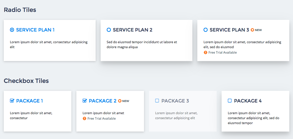
API Reference provides the complete description of the widget.
aps/Container
The container is aimed to automatically align child widgets in a row. Usually, this is necessary when the widgets are tightly bound to each other. For example, when assigning a mailbox address, a customer deals with several fields in a line:

If you place an aps/Container inside an aps/FieldSet the former will get additional properties - gridSize and
description.
API Reference provides the complete description of the widget.
aps/FieldSet
An aps/FieldSet container can combine practically unlimited variety of widgets. For every child widget,
you can assign a size, label, and description.
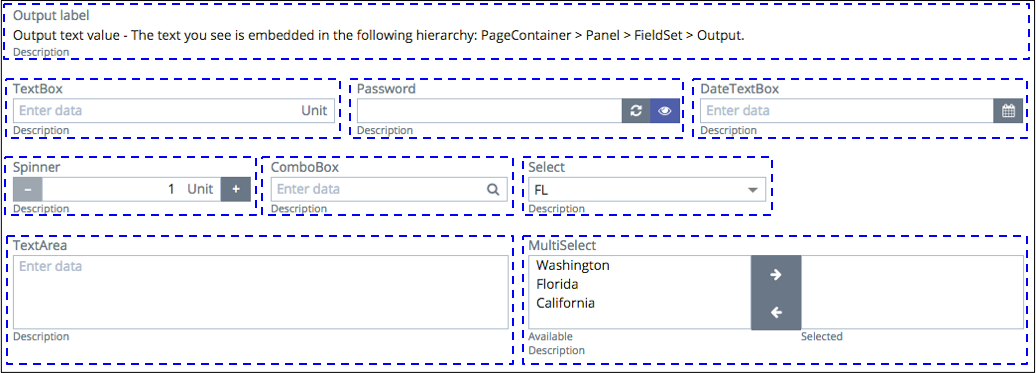
When it is necessary to align a group of widgets in a row, add them
in an aps/Container and place the latter to an aps/FieldSet.
An aps/FieldSet must be placed inside an aps/Panel or aps/Tile.
API Reference provides the complete description of the widget.


