Automatic Transformation
In this document:
Layout Adaptation
Control panel of the management platform responds to the two different formats by applying one of the following CSS classes when respectively the md or xs device mode is detected:
ccp-md
ccp-xs
Compare UI in two modes:
In the md mode, a screen can display several views. In the following example, it contains:
Navigation panel
Add New Users view
Notification panel

In the xs mode, the same views are displayed in different screens that a user has to switch to:
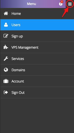
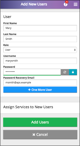
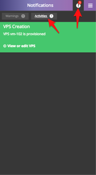
Note
In the xs mode, the menu icon on top right is used to switch to the navigation panel.
Vertical Alignment
By default, all widgets are aligned in a single column, since the default definition for a JS component
is gridSize: "md-12 xs-12".
Grid Transformation
Grid Components and Properties
Recall, an aps/Grid widget usually contains definition of the following components.
aps/Toolbarwithaps/ToolbarButtonwidgets inside it.columnsof different types influencing the responsiveness:type: "resourceName"marks the column that will be rendered as a link directing a user to the view whose ID is specified by theapsResourceViewIdproperty of the grid.type: "icon"indicates status of the object presented by a row.type: "label"has no affect on the md mode, but is used in the xs mode as the title of tile elements as described later.Warning
A column of this type can contain text only, it should not contain any variables.
selectionMode:"multiple"orselectionMode:"single"forces the grid to display the first column with check-boxes or radio-buttons respectively for row selection.Some buttons in a toolbar may require selection of at least one row -
requireItemsorrequireSingleItem.
Transformation Rules
Transformation from the md mode to the xs mode complies with the following rules:
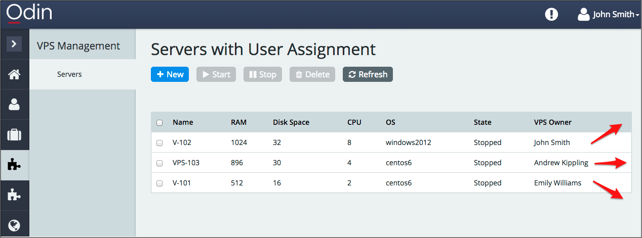

Toolbar transforms as follows:
The buttons that require row selection by means of the
requireItems:trueorrequireSingleItem:trueproperty are missed out.The other buttons are placed in a single column.
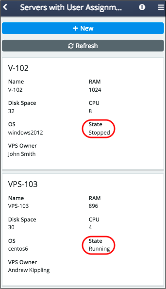
A table looks like a set of tiles aligned in a single column. Each tile presents a single object and contains the following components:
Title is assigned the value from one of the following columns (the highest priority on top):
The column with type
labelThe column with type
resourceNameThe first column in the grid
The values from the other grid columns are displayed in a list below the title.
Neither
selectionMode:"multiple"norselectionMode:"single"has any effect, that is they do not force the grid to display check-boxes or radio-buttons for selection.All properties are arranged in two columns if the
mobileLayoutproperty is undefined.The first column of type icon indicates the object status. In the following example, the server state, either “Stopped” or “Running”, is visualized through a column of type
icon.Initial code:
{ field: "state", name: "State" },
Updated code:
{ field: "state", name: "State", type: "icon",
  renderCell: function(row, state) {
     return new Status({
        status: state,
        useIcon: true,
        statusInfo: {
           Stopped: {
              "label": "",
              "type": "danger"
           },
           Running: {
              "label": "",
              "type": "success"
           }
        }
     });
  }
},

Disabled Auto-Height in APS/Tiles
In aps/Tiles containers, tiles in a row are auto-aligned by height in the md mode, but not aligned in the xs mode.
Disabled Breadcrumbs
In mobile devices, that is in the xs mode, the navigation panel looks differently and breadcrumbs are wrapped into an arrow that allows a user to get to the upper navigation level.
