Table Of Contents
Application Packaging Standard
Last updated 18-Mar-2019Consistency
Consistency is the most important principle to follow when developing a UI. It must help people to make a choice in fractions of a second, and that choice must be in favor of the services provided by your application.
In this document:
Screen Layout
A typical user is happy to find repeating elements and controls in the same locations while navigating through different screens.
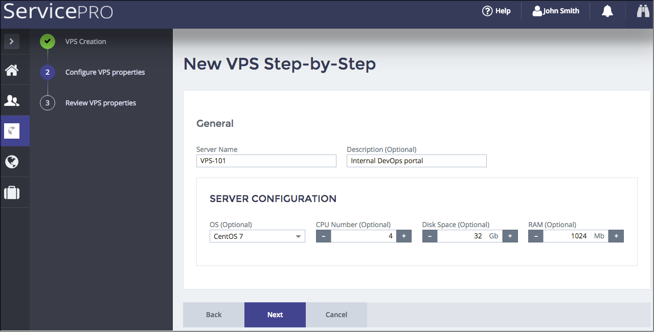
In the context of the platform user panel, this principle is noticeable, for example, in dialog forms, where the relative positions of elements is always the same.
Using the APS JS SDK modules and following the Integration Procedures with multiple demos will help you integrate your own application UI consistently into the platform user panels. The Layout Rules section explains the hierarchy of UI containers and typical layouts of the system and custom screens in user panels.
Design Patterns
The visual elements must be based on the same design style. Following the consistency principles, APS JS SDK provides a full set of widgets sufficient to cover the typical needs when integrating a custom UI into the platform user panels. The main patterns are explained in the UI Style Guidelines.
Naming Conventions
Action Buttons
Stay consistent in naming of action buttons.
For example, when editing properties of a resource to be created, use the Back, Next, and Cancel buttons.

When adding a new object, use Add or New.

Text Elements
When developing new UI elements that contain text, like a menu or list headers, descriptions of options, and other, follow the below principles:
- All words in titles and headers must be capitalized except for prepositions and conjunctions. But if the preposition or conjunction consists of more than 4 letters, it must be capitalized. For example, “with” - must be lower-cased, while “Through” must be capitalized.
- If a description in the UI is a word-combination, do not use a dot at the end. For example, “List of servers” - no dot. If a description is a sentence having a grammatical subject and/or a predicate, the dot must be used at the end. For example, “You can specify the start parameters that apply when you start the service from here.” - the dot is used. “Select the computer’s response if this service fails.” - the dot is used.
- Do not use “please” in text messages. When prompting a user to do something, use imperative mood.
- In sentences containing placeholders, position the placeholder after its definition.
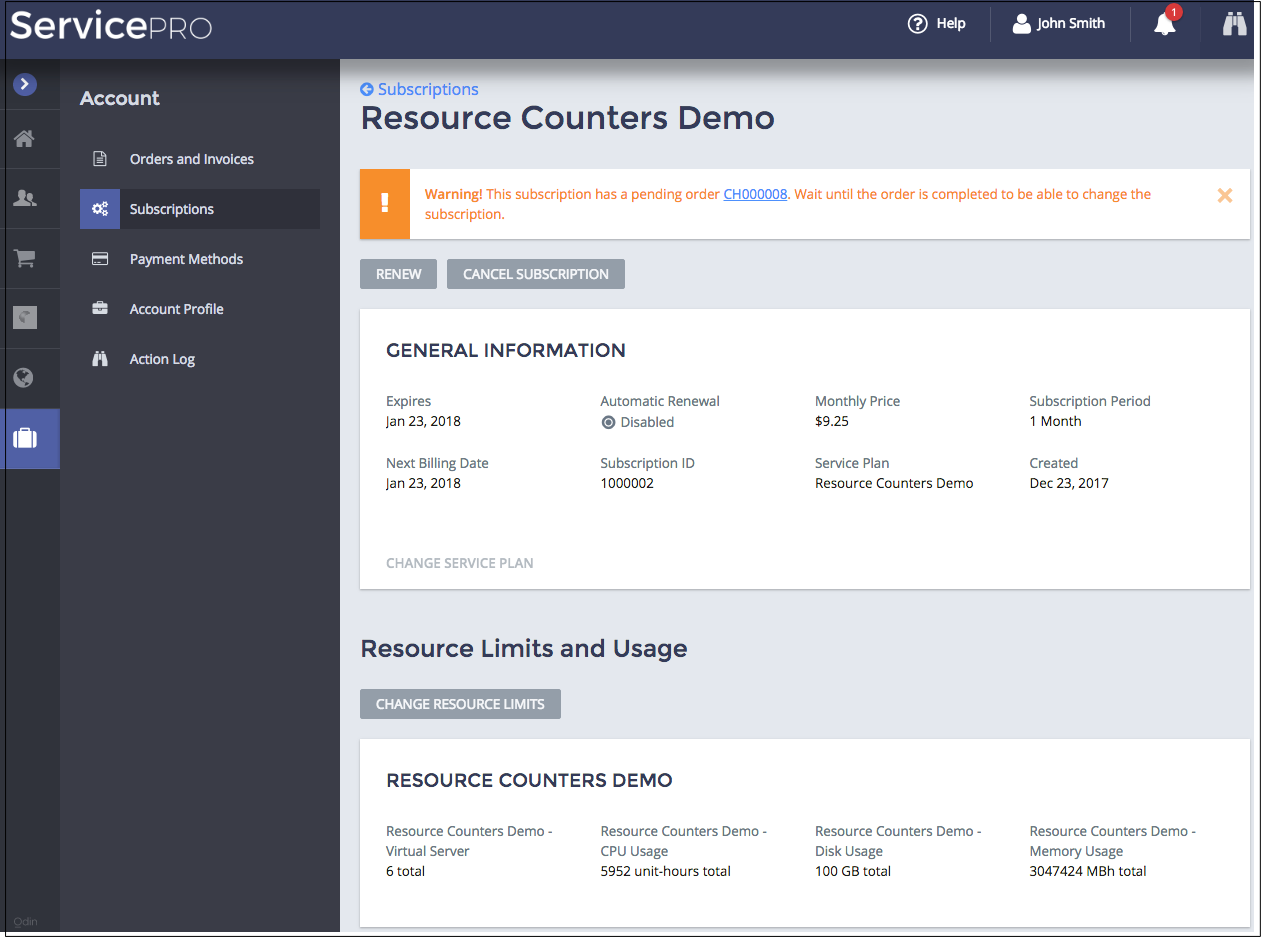
Following the above principles makes your application consistent with the platform user panel UX:
