Table Of Contents
Application Packaging Standard
Last updated 18-Mar-2019Custom Transformation
In this document:
Hide Elements
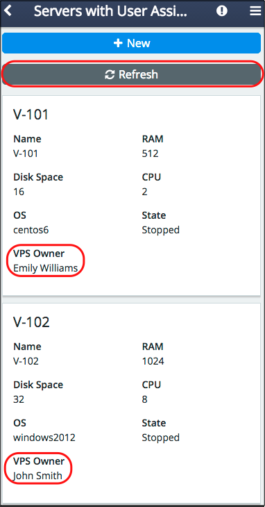
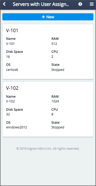
Use the hideFor property to hide buttons or grid columns. It accepts a hash-string indicating the device modes the widget will be hidden for. To hide an element in one of modes, assign the “md” or “xs” string to the property. To hide from both screen types, assign the “md xs” string to it.
The property is supported by the following UI widgets:
aps/Buttonandaps/ToolbarButton- Columns in
aps/Grid.
For example, the following code hides the Refresh button and the VPS Owner column in the grid:
load(["aps/Grid", {
      id: "srv_grid",
      ...
      columns: [
         ...
         { field: "userName", name: "VPS Owner", hideFor: "xs" },...
      ]
   },[
      ["aps/Toolbar", [
         ...
         ["aps/ToolbarButton", { id: "srv_refresh",... hideFor: "xs"  }]
      ]]
   ]
],...)
Widget Size
Use the gridSize property of a widget to specify its width separately in the md and xs modes.
Grid Layout
The mobileLayout property of an aps/Grid widget defines the grid conversion:
“grid” - the grid is displayed the same way as in the desktop md mode, but only 3 columns are visible. It shows only those first three columns that are not hidden by means of the
hideForproperty.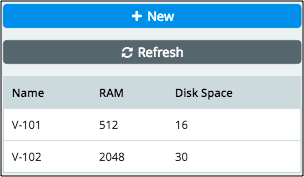
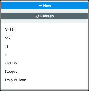
“short” - also known as the cards layout, makes each grid row displayed as a separate tile with all properties arranged in one column.
“long” or
undefined(default) - also known as the two-panel cards layout, makes each grid row displayed as a separate tile with all properties arranged in two columns.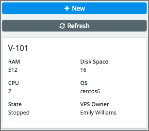
Other Customizations
By analyzing the current mode carried by the aps.context.modeView variable, an application
can show or hide any elements or change their properties. The variable may be assigned one of
the values, either “md” or “xs”.
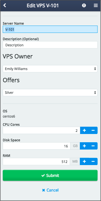
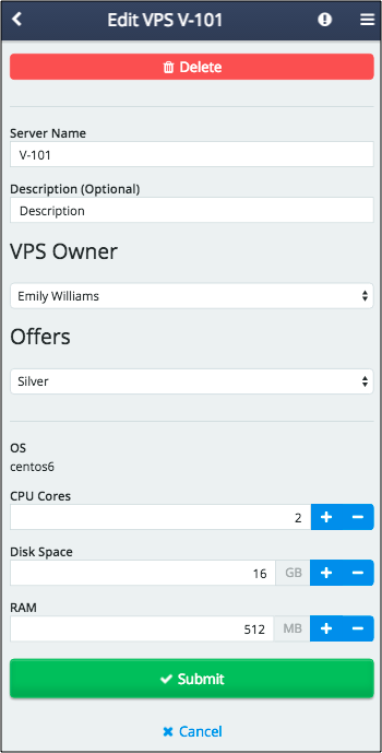
For example, since in the xs mode the Delete button is not available as it requires multi-selection,
an application can add this button to the custom editor.
For this effect, in the following example, we modified the widgets component in the custom editor.
The additional code defines a toolbar and adds the Delete button to it only if the xs mode
is detected:
var widgets = ["aps/Container", { id: "srvEdit_page" }, [
   ["aps/Toolbar", aps.context.visibleMode === "xs" ? [
         ["aps/Button", { id: "srv_mobile_delete", iconClass:"fa-trash", type: "danger",
                          label: "Delete" }]
       ]: []
   ],
   ["aps/FieldSet", { id: "srvEdit_general", title: true }, [
       ["aps/TextBox", ...],
       ...
   ]],
   ...
]]