Table Of Contents
Application Packaging Standard
Last updated 18-Mar-2019Input Types
In this document:
Purposes
In the previous documents, we considered the responsiveness of a mobile display to different types of output data.
Mobile devices are also responsive to the input field type
when a user enters some data, as explained for example,
on the mobiForge site.
Generally, when adding an input widget to UI, you can specify the widget type
property to expect that mobile devices will provide the most convenient keyboard
or another tool, for example, calendar, for the widget users.
Embedded Responsiveness
Most of the input widgets do not require to specify the type property,
and actually, the latter does not affect the tool used for entering data in those widgets on mobile devices.
Mainly, the type property is oriented on its usage in the TextBox widget as explained in
TextBox Types.
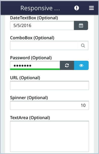
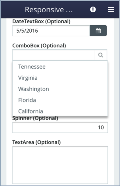
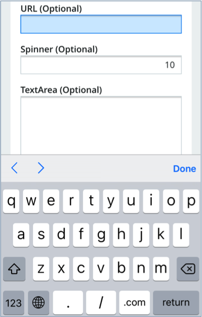
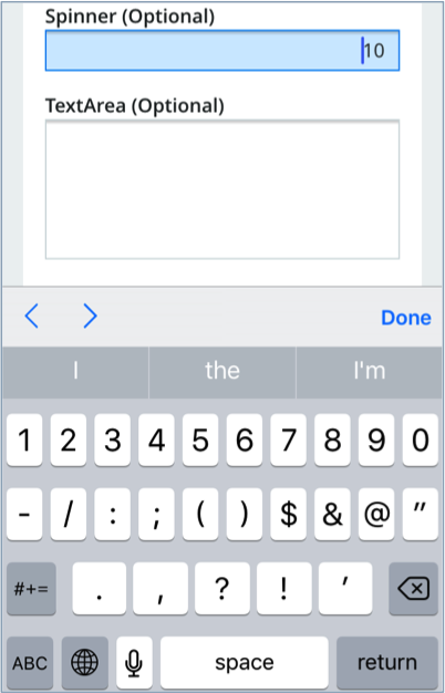
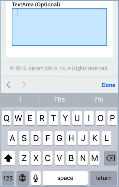
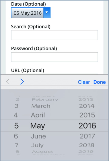
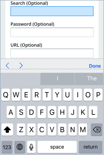
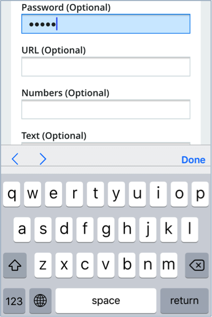
The following examples show a set of input widgets as displayed on an iPhone:
TextBox Types
The TextBox widget allows you to effectively use the type property
to influence the input tools on mobile devices:
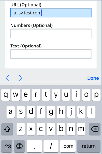
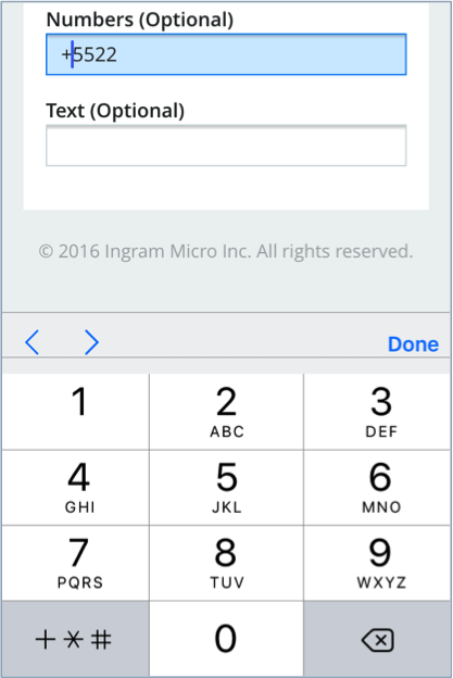
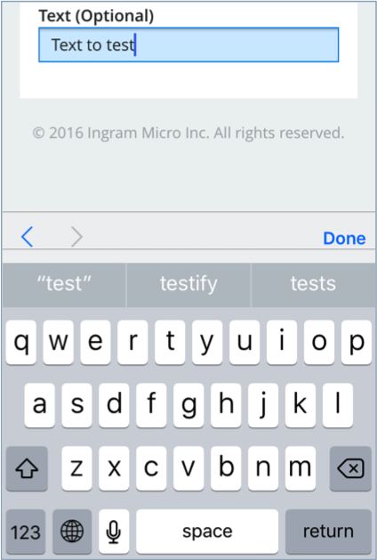
| TYPE | INPUT TOOL |
|---|---|
| “date” | Scrollable list of dates defaulted to the current day |
| “email” | Alphabet and the @ symbol |
| “month” | Scrollable list of months defaulted to the current month |
| “number” | Numbers with special symbols, such as -, +, and /. |
| “tel” | Numbers and a key to select a special symbol, one of +, *, or #. |
| “time” | Scrollable list to set the time |
| “url” | Alphabet and special symbols used in a URL string |
To test the property, use a script similar to the following:
define([
	"dojo/_base/declare",
	"aps/_View"
], function(declare, _View) {

	return declare(_View, {
		init: function() {

			return ["aps/Panel", {title: "Form Elements"}, [
				["aps/FieldSet", [
					["aps/TextBox", {
						label: "Date",
						type: 'date'
					}],
					["aps/TextBox", {
						label: "Search",
						type: 'search'
					}],
					["aps/TextBox", {
						label: "Password",
						type: 'password'
					}],
					["aps/TextBox", {
						label: "URL",
						type: 'url'
					}],
					["aps/TextBox", {
						label: "Numbers",
						type: 'tel'
					}],
					["aps/TextBox", {
						label: "Text",
						type: 'text'
					}]
				]]
			]];
		},

		onShow: function() {

		}
	});
});
The input fields defined by the above script will be available for iPhone users as follows:
You can download the sample package containing the above script
and install it on your lab platform. The application deployment and provisioning
is simplified. It does not require you to subscribe to any services. Go through the following steps
to enable the test JavaScript in UX1:
- Import the sample package to PCP.
- Install an application instance using, for example,
the
https://localhost:8081/pa/rest/fake/endpoint URL. - Open UX1 on behalf of any customer using an iPhone.
- On the navigation panel, select the Mobile Test item.