Table Of Contents
Skin Creation
In this document:
Bootstrap Structure
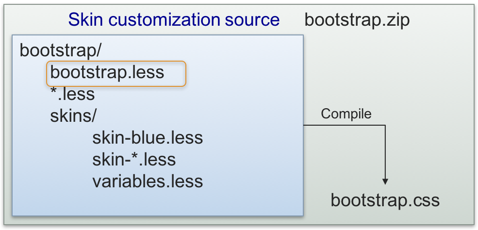
The structure of the bootstrap.zip used in the platform as the source
of the skins for UX1 is presented here just for your better understanding of the concepts.

The skin customization source files are *.less files
downloaded from https://github.com/twbs/bootstrap/tree/v3.2.0 as well as UX1 custom *.less files in the
f_a folder (font references and configuration) and a set of predefined skins in the skins/ folder.
bootstrap.less is the main file containing the @import directives to add all other *.less files.
During compilation, the LESS compiler merges all imported files and compiles them all into
the output file that must be bootstrap.css in our case.
The skins/ folder contains:
The
skin-service_pro.lessfile that is the basis of all skins and it is loaded before a customized skin.Several sample skins, for example,
skin-blue.lessorskin-green.less, that help you get started with creation of your own skin package.The
variables.lessfile is the only file in the project that you should edit. The file is initially empty (zero size) and it is loaded through a chain of@importdirectives started bybootstrap.less.
Note
When someone upgrades the platform, the upgrade procedure does not touch the variables.less file
although it can upgrade the other parts of the skin packages. This keeps the skin customization safe
from any platform upgrades.
Development Process
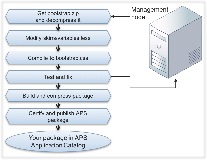
The following diagram presents a typical development workflow:

Although the only file you need to edit is
skins/variables.less, your local LESS compiler needs all*.lessfiles and other files bound with them. Therefore, download the wholebootstrap.zipfile from the management node.When you decompress the file, its contents will be placed into the
bootstrap/folder.Modify the
skins/variables.lessfile as needed. Since initially the file is empty, you can copy to it one of the sample light-weight skin contents, such asskin-blue.lessorskin-green.less, and then modify it.Warning
Do not edit the
skins/skin-service_pro.lessfile as it is the basis of all other skins. Nevertheless, you can copy some settings from it to theskins/variables.lessfile to customize those settings.Use a LESS compiler to compile the project into the
bootstrap.cssfile. You will need this file to test and debug the project as explained in the next step.During development and debugging phase, the simplest way is to replace the pre-installed
bootstrap.cssfile in the following path in your lab system:$ scp bootstrap.css \ root@a.isv1.apsdemo.org/usr/local/pem/wildfly-10.1.0.Final/ext/webgate/static/skins/v3/ccp2/
Note
The internal WildFly version
10.1.0is valid at the moment of writing this section and can be changed later.Warning
Do not use this way on a production system as it can make its UI unavailable. Operations with brands restore the default contents of the
bootstrap.cssfile on the above-mentioned path.Edit the uploaded file and verify the changes in UX1. To make the browser update the rendered view, enable the APS development mode and switch on the development tools on your browser. In this case, the browser refresh operation will render the panel without using cache.
Once the UX1 look and feel meets your expectations, the developed
variables.lessfile is ready to build the skin package. Use the described package structure and copy that file to thecontent/ccp2/folder. Compress the package into a*.zipfile to use it for the skin certification.Follow the Validation and Publication step to certify and publish the skin.
Customizable Elements
Although it is not allowed to edit the skin-service_pro.less file, use it to identify the elements
that you can safely redefine in your custom skin. You can modify the following groups of elements:
Font definition - definition of fonts using the base64 coding
Color theme - a set of color definitions named as @brand-color-<suffix> used in other sections
Buttons - definition of buttons
Statuses - definition of status messages
Panels - definition of panels
Other
In the predefined skins/*.less files, you will find examples on customization of the above-mentioned elements.
In a case you need more complex customization that includes customization of some elements originally
defined in the *.less files other than the elements defined in skin-service_pro.less,
address this task to professionals.
Warning
We do not recommend you to change a size of any UX1 skin elements since the aspect ratio of each element was automatically calculated and a ratio change will affect the layout and make the customized skin incompatible with the further UX1 skin updates.
