Table Of Contents
Application Packaging Standard
Last updated 18-Mar-2019Developing UI Navigation Trees
Custom UI can be created for different control panels in hosting platforms. In the platform , it is possible to create control panels for service providers (PCP), customers (CCP), and end-users (MyCP). For each customized CP, developers need to define a navigation tree that specifies the hierarchy of navigation tabs and views bound to them.
Note
There is a complete description of APS user interface and demonstration of its development in demo projects.
In this document:
Navigation Concepts
Generally, a navigation tree may have the following elements (nodes):
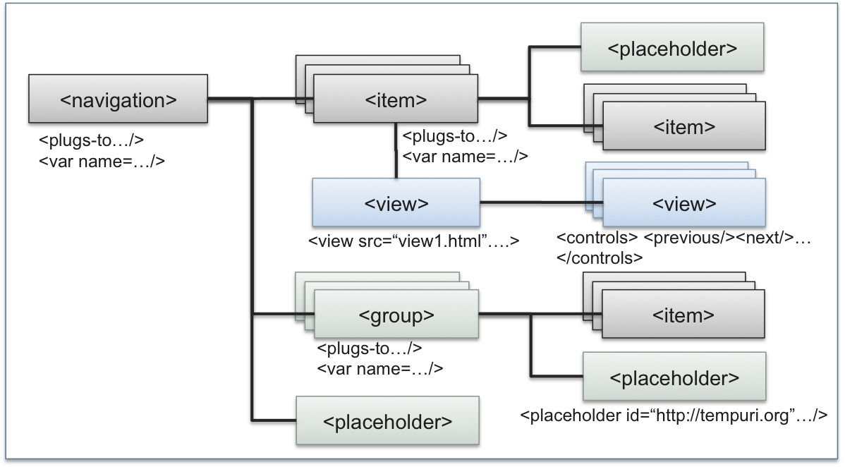
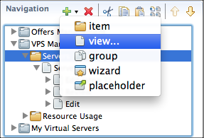
- <navigation> - is the root of the tree. It must be plugged into a <placeholder> specified in a CP or in an application.
- <item> is a visualized tree node, for example, it is a tab in an the platform CP. It is plugged into one of tree elements:
- <navigation>
- <item>
- <group>
- <placeholder>
- <group> - is similar to <item>. The difference is that it is not visualized in a UI.
- <placeholder> - defines a node in the tree where other elements of a navigation tree can be plugged into.
- <view> - is visualized through the HTML file specified by the view. The HTML file name is specified implicitly through the view ID of explicitly through the src attribute.
- <controls> - defines navigation controls for a view, such as:
- <previous> and <next> - to move forward and backward in a multi-step wizard
- <finish> or <submit> - to complete the current edit operation
- <cancel> - to cancel the current edit operation
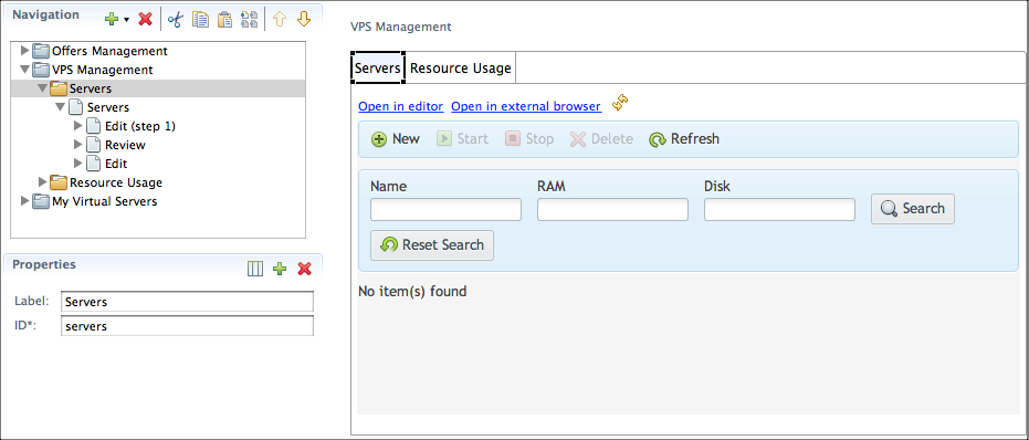
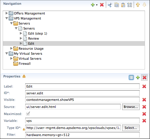
The Navigation page contains the following panels:
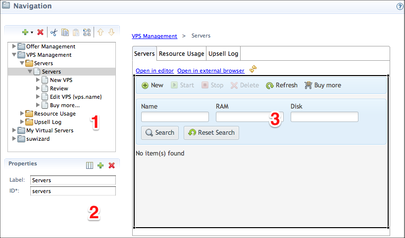
- Navigation Tree - defines the navigation tree structure.
- Properties - defines properties of the element selected in the navigation tree.
- UI Viewer - is a WYSIWYG panel used to preview the selected navigation element.
Navigation Tree
A navigation tree is built using the toolbar located on top of the Navigation Tree panel. This panel allows a number of operations described in the following sections.
Adding Navigation Tree
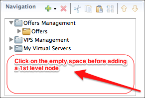
- Focus the pointer somewhere in the empty area.
- Click the
 sign in the toolbar, and then select navigation in the drop-down list.
New tree is added to the list.
sign in the toolbar, and then select navigation in the drop-down list.
New tree is added to the list.
Adding Node in Arbitrary Position
- Select the tree node (folder) that must be the parent of the new node. The selected node becomes highlighted.
- Click the sign in the toolbar, and select the element type in the drop-down list.
- Fill out the form with properties. New node is added to the tree.
Removing Node
- Select the node you want to remove from the tree.
- Click the
 sign. The node is removed from the tree.
Changing Node Position
- Select the node you want to move.
- Use the Down and Up icons in the toolbar to change the selected node position.
Note
Nodes can be moved within their parent node only.
Copying
Use the Copy icon in the toolbar to copy the selected element to the internal buffer and then use the Paste icon to insert the copied element to the selected parent in the tree.
Cutting and Pasting
The operation is similar to copying and moving. Unlike copying, it moves the selected item to another position. Unlike moving by using Up and Down buttons, it can move the selected item to any position not restricted by its current parent. To accomplish this operation, select the needed item and click the Cut icon in the toolbar to cut the element from the tree and copy it to the internal buffer. Then, select the destination parent in the tree and click the Paste icon to insert the element there.
Cloning
This is one-button copying of the selected item within its parent. To ensure uniqueness of the new element ID, the copy_ prefix is added to the ID value of the new element.
Properties
List of Properties
When an element is selected in the navigation tree, it is possible to configure the following properties:
- Label - specifies the label that will be visible in the control panel.
- ID - is an ID that uniquely specifies the element in the navigation tree.
- Visible - makes the element visible on condition. For example, contextmanagement.showVPS means the element is visible if the showVPS property of the contextmanagement variable is true.
- Source - explicitly specifies an HTML file for the view element. All view files must be in the
uifolder. If this property is missed, the view ID specifies it by default. In the latter case, the file name is assigned the view ID and its extension is.html. - Maximized - makes the view open as wide as possible in the CP. In the platform control panels, a maximized view will hide custom tabs and breadcrumbs on top of the view.
- Variable - declares the name of a variable that can be used in the view Javascript code.
The declared variable represents a resource as specified by the following attributes:
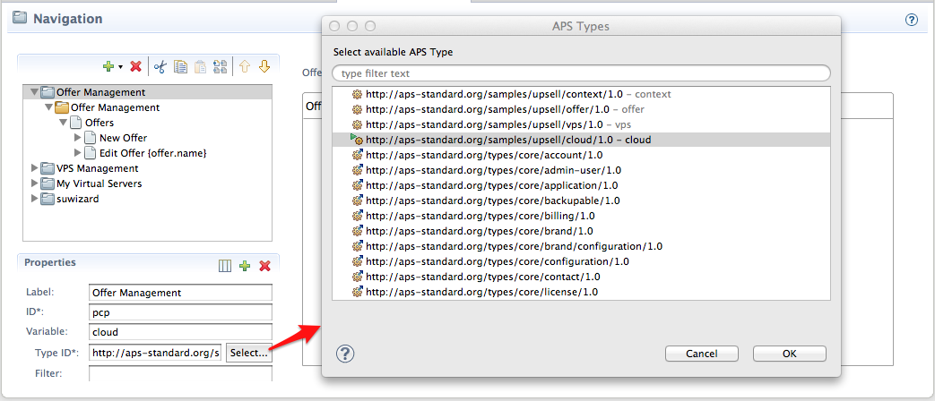
- Type ID - identifies the APS type of the resource.
- Filter - adds more restrictions on the selection of the resource, for example, hardware.memory=gt=512 means the memory property in the hardware structure must be above 512.
When setting a navigation variable, the Select APS Type dialog shows a list of available custom, APS core, and platform specific types.
Editing Properties
- In the Navigation Tree panel, select the node you want to edit. Properties of the selected node appear on the Properties panel.
- Make required changes.
Note
Property marked with the asterisk cannot be left empty. A value must be assigned to it.
Optional Properties
Optional properties can be hidden. You can add them to an existing element by using the
icon in the toolbar of the Properties panel. To remove a
property, click the icon in the top right corner
to make this icon appear next to each optional property. Clicking the
icon next to a property removes it.