Table Of Contents
Application Packaging Standard
Last updated 18-Mar-2019Outputs
The widgets and widget containers in this category allow a UX designer to select a proper way to display output data on a screen.
In this document:
Grid
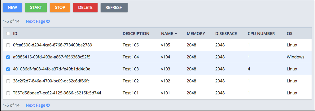
Widgets based on aps/Grid are often used to present a list of resources in the form of a table. In many applications,
the widget is used in the main service view to show all resources provisioned
for the customer or assigned to a user. It allows making a view flexible due to the following features:
- Row selection
- Row sorting by a column or by a category and sub-category
- Filtering
- Paging navigation
- Operating the selected rows using an embedded aps/Toolbar
- Placing in a column an arbitrary active widget by means of the Method renderCell
API Reference provides the complete description of the widget.
Text Data
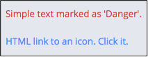
Use the aps/Output widget when you need to print out simple text, data based on a text template, or text using
an HTML code.
It allows you to mark up the printed text by means of the alertType property.
Note
This is the only recommended way to output text marked up as HTML for security reasons. Be aware of the Probable Threats when using this capability.
The widget can be inside various containers in accordance with the Layout Rules.
API Reference provides the complete description of the widget.
Graphical Data
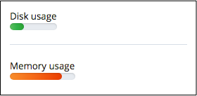
When you need to attract attention to some data, typically to resource usage, the aps/Gauge and aps/Pie widgets
are the suitable graphical tools. They clearly display a ratio of the current value to the upper limit of a property
or a value in the range from the lower limit to the upper limit.
Gauge
An aps/Gauge widget displays a property in the linear form. The classesMap structure allows customizing the
gauge visualization by means of the ratio-to-light mapping.
API Reference provides the complete description of the widget.
Pie
An aps/Pie widget diplays a property in a compact circle form that can optionally include a descriptive legend.
API Reference provides the complete description of the widget.
Combined Text and Graphics
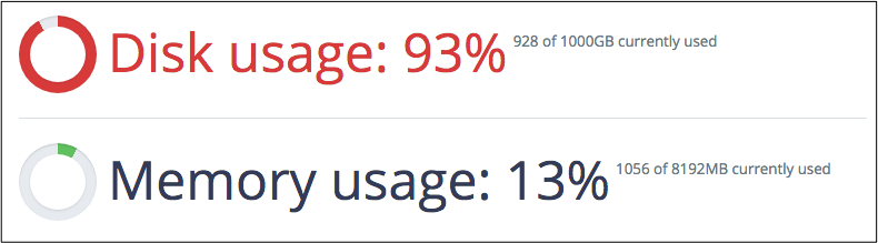
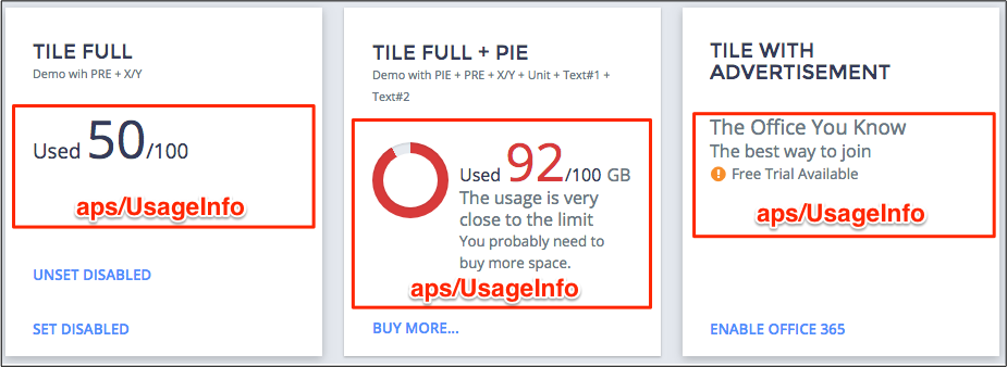
UsageInfo
The aps/UsageInfo was specially designed for resource usage presentation. It combines text, numbers, and a pie diagram
as requested. Typically, it is placed inside an aps/Tile to present a resource usage, and its parent adds some
buttons for various activities as in the following example.
API Reference provides the complete description of the widget.