Table Of Contents
Application Packaging Standard
Last updated 18-Mar-2019aps/Gauge
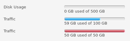
Displays a level of a resource usage.
A gauge shows one of 3 states: normal, warn, and over. This is useful for indicating resource usage status.
Table of contents
Compatibility
All user panels - CP and UX1
Overview
With the aps/Gauge widget, you can display the usage of a resource.
Find the nested rules for this widget in the recommended Widget Hierarchy.
You can dynamically change the widget’s value or bind it with a data model. The length and color of the progress bar will automatically change after each change of the widget’s value. You can also bind the information displayed next to the progress bar with the data contained in the widget with help of standard template syntax. In this case the information will also change automatically after each change of the widget’s value.
Examples
Declaration Through Loader
require(["aps/load", "aps/ready!"],
function(load) {
    "use strict";
    load(["aps/Panel", [
        ["aps/Gauge", {
            legend: "Disk usage",
            value: 30
        }],
        ["aps/Hr", { visible: true }],
        ["aps/Gauge", {
            legend: "Memory usage",
            value: 80
    }]]]);
});
Programmatic Declaration
require(["aps/Gauge", "aps/Panel", "aps/PageContainer", "aps/ready!"],
  function(Gauge, Panel, PageContainer){
    "use strict";

    var page = new PageContainer({}, "simpleGauge");
    var panel = new Panel();
    panel.addChild(new Gauge({
      label:      "Disk Usage",
      legend:     "${value} of ${maximum} GB used",
      minimum:    0,
      maximum:    500,
      value:      300,
      classesMap: {
              "200": "warn",
              "400": "over"
      }
    }));
    page.addChild(panel);
    page.startup();
});
For more detailed information on widget declaration, refer to Declarations.
Public Properties
| PROPERTY | TYPE | DEFAULT | DESCRIPTION |
|---|---|---|---|
| classesMap | object | Ratio values mapped to gauge lights. | |
| disabled | boolean | false | Specifies if the widget will respond to user input. |
| gridSize | string | undefined | This specifies the widget width that is relevant only for widgets inside Container, FieldSet, or Tiles. |
| isBusy | boolean | false | If the widget is busy then this property is true. |
| label | string | “” | Text that is shown as a label if the widget is placed inside a aps/FieldSet. |
| legend | sting | ” - PCP / CCP v1, | Legend or description of a gauge. |
| maximum | number | 100 | Maximum value. |
| minimum | number | 0 | Minimum value. |
| noneText | string | None | if the “maximum” property is 0 then the widget shows the noneText string. |
| percent | string | 0% | Scale value in %. Property is readonly. |
| precision | number | 2 - PCP / CCP v1, 0 - CCP v2 | Percents precision. |
| unitText | string | “” | Presents the unit of measure. |
| unknownUsageText | string | ${maximum} ${unitText} total | If the value property is undefined then the widget shows the unknownUsageText. |
| unlimitedText | string | ${value} ${unitText} used (Unlimited) | If the maximum property is undefined then the widget shows the unlimitedText instead of the bar. |
| value | number | 0 | Absolute value of the scale. |
| visible | boolean | true | If this property value is set to true, then the widget is visible. |
| width | number | 200 - PCP / CCP v1, 0 - CCP v2 | Scale width used in PCP / CCP v1 only. |
classesMap object
Ratio values mapped to gauge lights.
{ "20": "warn", "25": "over" }
Default value: {'0%': '', '37%': 'warn', '62%': 'over'} - PCP / CCP v1,
{'0%': 'progress-bar-success', '37%': 'progress-bar-warning', '62%': 'progress-bar-danger'} - CCP v2.
These are gauge marks representing the boundary values of resource usage levels.
There are three usage levels. The default widget style is applied for the first level.
The “warn” CCS class is applied for the second level. And for the third, it is the “over” class. The value of this property must be an associative array with keys “warn” and “over” and values which are the boundary values.
gridSize string
This specifies the widget width that is relevant only for widgets inside Container, FieldSet, or Tiles. In other cases it will be ignored.
gridSize string contains few options with number values (from 1 to 12) separated by spaces, which specify the grid size of the widget in different layouts:
- md - desktop
- xs - phone
For example, gridSize: “md-4 xs-2”.
All values below 1, e.g. “md-0”, will be replaced with the empty string (“”), values above 12, e.g. “md-14”, will be reduced to 12 (“md-12”).
Default value: undefined.
label string
Text that is shown as a label if the widget is placed inside a aps/FieldSet.
Default value: “”.
legend sting
Legend or description of a gauge. Default value: “” - PCP / CCP v1, “${value} of ${maximum} ${unitText} used” - CCP v2.
maximum number
Maximum value. Default value: 100. If maximum set to 0 then will be show only noneText instead of a bar itself. If maximum set to undefined then will be show only unlimitedText instead of a bar itself.
minimum number
Minimum value. Default value: 0.
noneText string
if the “maximum” property is 0 then the widget shows the noneText string. Default value: “None”
percent string readonly
Scale value in %. Calculated from value. Default value: “0%”
precision number
Percents precision. Default value: 2 - PCP / CCP v1, 0 - CCP v2.
unitText string
Presents the unit of measure. Default value: “”.
unknownUsageText string
If the value property is undefined then the widget shows the unknownUsageText. Default value: “${maximum} ${unitText} total”.
unlimitedText string
If the maximum property is undefined then the widget shows the unlimitedText instead of the bar. Default value: “${value} ${unitText} used (Unlimited)”.
value number
Absolute value of the scale. Default value: 0. For some resource types, the usage information may not be relevant at all. For example, in a VPS, RAM and CPU usage fluctuates significantly, and there is no sense in displaying the usage to a customer in context of billing information. In this case, the “undefined” value should be assigned to the “value” property to show only the “maximum” amount of the resource that the VPS can use.
visible boolean
If this property value is set to true, then the widget is visible.
Default value: true.
width number
Scale width used in PCP / CCP v1 only. Default value: 200 - PCP / CCP v1, 0 - CCP v2. It can be defined by a number or by a string. The latter must be a correct value for the HTML attribute width, that is either it contains a unit of measure or it is assigned the key-word “auto”. In CCP v2, use gridSize instead.
Public Methods
| METHOD | RETURN | DESCRIPTION |
|---|---|---|
| cancel () | object
|
Sets the isBusy property to false |
| destroy () | undefined
|
Destroys this widget |
| get () | any
|
Get a property of the Stateful instance |
| getParents () | array
|
Discover and return all parents of the widget |
| placeAt () | dijit/_widgetbase
function
|
Place this widget somewhere in the DOM based on standard dojo/dom-construct::place() conventions |
| set (name) | function
|
|
| startup () | undefined
|
Gets started after the DOM fragment is added to the document |
destroy
Destroys this widget. Will also destroy any resources (including widgets) registered via this.own(). This method will also destroy internal widgets such as those created from a template.
Return: undefined
get
Get a property of the Stateful instance. Get a named property of the Stateful object. The property may potentially be retrieved via a getter method in subclasses.
In the base class, this just retrieves the object’s property.
Return: any
placeAt
Place this widget somewhere in the DOM based on standard dojo/dom-construct::place() conventions. A convenience function providing a simple shorthand mechanism to put an existing (or newly created) widget somewhere in the DOM, and allow chaining.
Return: dijit/_widgetbase function
startup
Gets started after the DOM fragment is added to the document Called after the widget and its children have been created and added to the page, and all related widgets have finished their create() cycle, up through postCreate().
Note that startup() may be called while the widget is still hidden, for example if the widget is inside a hidden dijit/Dialog or an unselected tab of a dijit/layout/TabContainer. For widgets that need to do layout, it’s best to put that layout code inside resize(), and then extend dijit/layout/_LayoutWidget so that resize() is called when the widget is visible.
Return: undefined
Public Events
| EVENT | RETURN | DESCRIPTION |
|---|---|---|
| onClick () | undefined
|
The method is called when a user clicks on the widget |
onClick
The method is called when a user clicks on the widget.