Table Of Contents
Application Packaging Standard
Last updated 18-Mar-2019Inputs
The input category of widgets embraces all APS JS widgets typically used to assign values to resource properties or select items (resources, properties, or operations) from a list. APS JS SDK provides a range of input widgets to be effectively used depending on the input data types.
In this document:
Text
Text data is needed to assign a resource name, enter description, and assign some other properties that cannot be assigned from a predefined list or range.
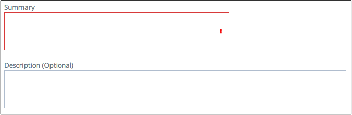
TextArea
An aps/TextBox widget displays an area
that allows a user to enter any text. Normally, this is for pretty big content that aps/TextBox cannot
embrace, for example, to paste a hashed key or enter a full description of a resource.
API Reference provides the complete description of the widget.
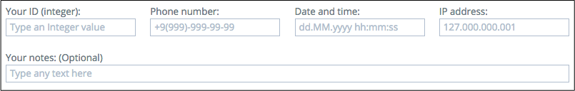
TextBox
An aps/TextBox widget contains an input field controlled by a number of widget
properties that can set necessary restrictions on the input value and validate the entered data.
It allows entering not only a simple text but also effectively use masks, patterns, and tooltips to assist a user
to enter valid data, for example:
API Reference provides the complete description of the widget.
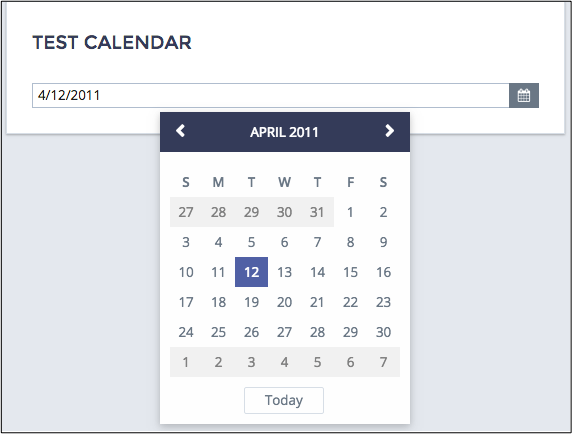
Date and Time
An aps/DateTextBox date-time picker is a convenient UI tool to help a user to specify a date and time, for example:
API Reference provides the complete description of the widget.
Selection
An application can provide a predefined list of options for selection by means of the widgets considered in this section.
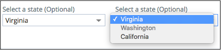
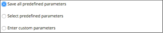
Select
An aps/Select widget provides a drop-down list of predefined options, from which a user can select one.
An application can dynamically change the list of options.
API Reference provides the complete description of the widget.
ComboBox
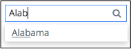
An aps/ComboBox widget combines the above mentioned aps/Select with an input box based on aps/TextBox on top.
When a user types a text
in the input box, the widget provides all options that partially match the entered text.
The widget allows customization of its search rules.
API Reference provides the complete description of the widget.
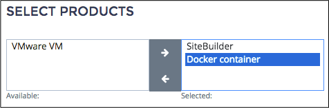
MultiSelect
Unlike the previously mentioned selection widgets, an aps/MultiSelect widget allows a user to select several
items from a list. For this purpose, the widget contains a list of available options and a list of selected options.
API Reference provides the complete description of the widget.
Small Set of Options
While the Selection group of widgets is valid for both long and short lists, this section considers selection of options from a short list.
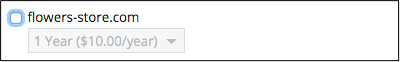
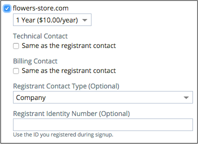
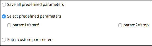
CheckBox
Similar to aps/MultiSelect, a group of aps/CheckBox widgets allows a user
to select several options.
An aps/CheckBox can also contain other widgets. In that case, the child widgets are in the active
state only when their parent aps/CheckBox is selected.
API Reference provides the complete description of the widget.
RadioButton
Similar to aps/Select and aps/ComboBox,
a group of aps/RadioButton widgets allow a user to select only one of available options.
An aps/RadioButton can also contain other widgets. In that case, the child widgets are in the active
state only when their parent aps/RadioButton is selected.
API Reference provides the complete description of the widget.
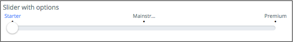
Slider
In some cases, a design approach may require using an aps/Slider for selection, although it is normally used
to set a numeric value. Get more details about setting a number in another Slider
section of this document. Unlike the other selection widgets, this one allows only a few options.
API Reference provides the complete description of the widget.
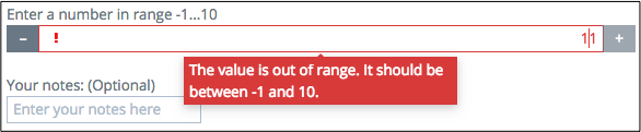
Numbers
The group of widgets considered in this section allows a user to select a number from a range with a certain iteration step between available values. They do not allow getting outside the range.
Spinner
An aps/Spinner widget allows a user to enter a number in the input field or use the “+” and “-” buttons to increase
and decrease the number in the input field by the step specified in the widget.
API Reference provides the complete description of the widget.
Slider
An aps/Slider widget allows a developer to specify an allowed range of numbers using one of the two set of parameters:
- Lower limit, upper limit, and iteration step - a regular range
- A set of options - an arbitrary range
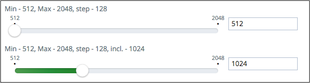
API Reference provides the complete description of the widget.
Password
An aps/Password widget was designed entirely to provide the most secure way of entering a password.
If necessary, you can change its default configuration as follows:
- Set your own password strength policy or, in a simple case, set password restrictions within the default policy.
- Make one or both of the two buttons (“Generate Password” and “Hide/Show Password”) visible or hidden.
- Change messages displayed in cases when the password strength validation fails.
- Other settings.
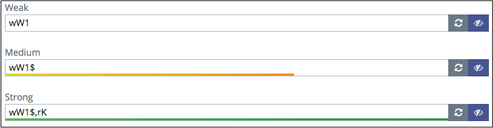
The aps/Password widget is included into a popup window created by the Change Password
method.
API Reference provides the complete description of the widget.
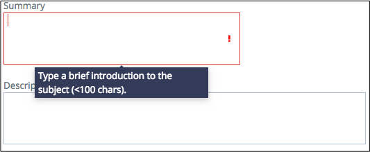
Tool Tip
To make an input form more friendly, add an aps/Tooltip bound to those widgets where your users will need help.
When a user hovers a mouse over a bound widget, the tip will pop up.
API Reference provides the complete description of the widget.