Table Of Contents
Application Packaging Standard
Last updated 18-Mar-2019aps/Grid
This is a grid widget with paginator, sorting, filtering, and ability to select one or many rows. It also supports a toolbar that can be used to do some actions on objects selected in the Grid.
You can change the structure of columns, store, and the number of objects to be shown on a given page The current page number can be set using method set().
Table of contents
Compatibility
All user panels - CP and UX1
Overview
With the aps/Grid widget, you can display a table with data and toolbars.
It also allows you to present active tabulated data through:
See JS API reference guide for all methods and properties.
Structure
Generally, a grid consists of two parts:
Gridwith Public Properties and Public Methods including definition of columns- Declaration of one or more toolbars as child elements
["aps/Grid", {
      /* Properties */
      id: "srv_grid",
      store: vpsStore,
      ...
      columns: [
      /* Each element of the array defines a column */
             { field: "name",             name: "Name",
               filter: { title: "Name" }, type: "resourceName" },
             { field: "hardware.memory",  name: "RAM",
               filter: { title: "RAM" }},
             ...
      ] // End of column definition
   },    // End of properties

   [
     /* Toolbars as child elements */
     ["aps/Toolbar", [
             ["aps/ToolbarButton", { id: "srv_new",  iconClass: "sb-add-new",
               label: "New" }],
             ...
     ]]
   ]
]
Toolbar
You can define a Toolbar using the Toolbar container and add it as a child element using one of widget declaration methods.
The only child elements of a toolbar are buttons based on aps/Button (preferable in UX1) or aps/ToolbarButton.
Toolbar Button
All properties and methods of toolbar buttons are inherited from APS/Button and other widgets. Some of the properties important for processing tabulated data are presented below.
| PROPERTY | TYPE | DEFAULT | DESCRIPTION |
|---|---|---|---|
requireSingleItem |
Boolean | false | If this property is set to true, the button will be enabled for clicking when a single row is selected in the table. |
requireItems |
Boolean | false | If this property is set to true, the button will be enabled for clicking only when one or more rows are selected in the table. |
Note
In a case one of the above properties is true, the button will be hidden in mobile devices in accordance with the Transformation Rules.
Tabulated Data
The appearance and functionality of the table with data are determined by the following settings:
- columns - properties of each column
- rows selection mode - selecting rows for data processing
- row sorting - sorting data by columns
- page navigation - page size and page control elements
- information messages - predefined messages displayed on various occasions
Data for the table is defined with help of the store component specified through
the store property or using the setStore method.
Columns
The settings for table columns are specified by the columns property and described
by an array of objects. Each object describes one column and contains a list of properties. Some of
the properties are presented in the table:
| PROPERTY | TYPE | DEFAULT | DESCRIPTION |
|---|---|---|---|
align |
Enum:
- “left”
- “right”
- “center”
|
undefined | Determines the horizontal alignment. This property is ignored, when the type property is set to “icon”. |
description |
String | “” | Text displayed below the column title. |
field |
String | “” | Full name of the data source property displayed in this column. Nesting of properties is specified by the “dot” symbol. For example: “hardware.cpu.number”. |
filter |
Boolean
or an Object containing:
- “title”
- “options”
- “value”
|
undefined |
Determines ability to filter the table by this column. The simplest way is to assign true to the property.
The other way is to assign an object with custom attributes as explained in the Search Engine section
and illustrated by the Table and Filters example. |
name |
String | “” | The header of the column. |
nowrap |
Boolean | undefined | If this property is set to true, the value in the column will be displayed in one line. Otherwise, it is wrapped to match the shrunk column width. |
renderCell |
function(row,data) |
null | Used to process data before presenting a value in table cells.
If this method is not defined for a column, then a cell displays
as usual text the data from a data object field specified by the Warning To have a predictable result do not insert more than one primitive widget (non-container category) inside a cell. |
sortable |
Boolean | true | Determines ability to sort the table by this column. |
type |
Enum:
- “icon”
- “string”
- “resourceName”
- “integer”
- “number”
- “boolean”
- “date”
- “datetime”
- “label”
|
undefined |
Determines the value type and column visual style. Explanation of non-evident values:
-
"icon" - the column becomes as thin as possible and center aligned as demonstrated
in an example. The icon indicates the object status.- “resourceName” - the column is a clickable string. When it is clicked,
the view defined by the
apsResourceViewId property is called.- “date” - a date in the format defined by the current locale.
If the
filter property is used,
it can filter rows by date or by a range of dates, using the start and end attributes
in the filter value definition.- “datetime” - date and time in the format defined by the current locale.
The filter works the same way as
for the “date” type and accepts only date.
- “label” - is used for the mobile xs mode and specifies the title of
the object presented in the mobile device.
Warning A column of this type can contain text only, it should not contain any variables. |
visible |
Boolean | true | If this property is set to false, the current column will not be displayed in the table.
However, the data from this column will be included into the first argument of the renderCell method of other columns. |
Row Children
A table can display children of a row if such exist. For example in a domain list, it is possible to display all subdomains of a domain immediately below the latter.
In this case, the data store must declare the childrenProperty property whose value specifies
the name of an array inside a row. The array can be empty or contain a list of children as illustrated
in the Child Rows example.
Filtering and sorting cannot move child rows from their parent rows:
- If you sort rows by a property, all parents will be sorted by the property, and then inside each parent, its children are sorted by the same property.
- Filtering directly by children does not work. If a parent is filtered out, all its children will be filtered out as well.
Row Selection
The selectionMode property defines the mode for rows selection in a table.
The property may take one of two values:
- “multiple” - allows selecting several rows simultaneously.
- “single” - only a single row can be selected.
The selectionArray property is provided for operations with the selected rows.
The property is an object of the dojox/mvc/StatefulArray type, and
all changes in the selection are completely synchronized
with it. To trace strings selected by a user, you can simply trace
changes in selectionArray by means of the watchElements method:
grid.get("selectionArray").watchElements(function(index, removals, adds){
  console.log(
      "Grid changed",
      this /* selectionArray */,
      removals /* IDs of removed rows */,
      adds /* IDs of added rows */
  );
});
You can programmatically select a row in a table by simply
adding it into the selectionArray object.
Likewise, removing a row from the object will remove visual highlighting of the row. If you want that right after a table is created some rows to be selected, simply pass a StatefulArray object with the required set of row IDs to the widget constructor.
Warning
When you select some records in a grid, they are placed
to selectionArray. If you delete the selected records from the grid,
you need to delete them explicitly from the selectionArray as well.
You can do it as follows:
selectionArray.splice(arr.indexOf("a9885415-09fd-493a-a867-f656368c52f5"), 1);
In this example, the indexOf method accepts the object ID as specified by the data
source. The splice function accepts the index of the first string and the
number of subsequent strings that must be removed.
You can get the selectionArray object with help of the get
method, but you will be able to define your object only when creating an
aps/Grid widget. For operations with selected rows thereafter, use the
object passed to the constructor or received using the get method.
If working with the data model is not suitable for you for some reason, you
can always get an associative array in which the keys will be the IDs of
all selected rows by calling the get method with the selection
parameter.
Example:
require([
      "aps/Memory",
      "aps/Container",
      "aps/Grid",
      "dojox/mvc/StatefulArray",
      "aps/PageContainer",
      "aps/ready!"
    ], function(Memory, Container, Grid, StatefulArray, PageContainer){
        "use strict";
/* Array **data** must be initialized here */

		var store = new Memory({ data: data, idProperty: "aps.id" });
		var layoutSimpleGrid = [
          { "name": "ID",          "field": "aps.id" },
          { "name": "Name",        "field": "name",	"description": "DNS or hostname" },
          { "name": "OS",          "field": "platform.os.name" }
		];
		var page = new PageContainer({}, "simpleGrid");
		var con = new Container({ title: "Simple Grid" });
		var selectionArray = new StatefulArray([]);
		var simpleGrid = new Grid({
          columns:          layoutSimpleGrid,
          store:            store,
          selectionMode:    "multiple",
          selectionArray:   selectionArray
		});

		con.addChild(simpleGrid);
		page.addChild(con);
		page.startup();

		setTimeout(function(){
        			selectionArray.push("d58bdae7-ec62-4125-9666-c5215fc5d744");
        		}, 2000
		);
});
Row Sorting
With the sort property, you can perform programmatic sorting of table rows.
The sorting format is described by an object containing two properties:
attribute- contains afieldname (not a column name!) by which the sorting is performed.descending- defines the sorting direction in the boolean format.
To define the sorting start during widget creation, specify a property value when calling the constructor.
To cancel all sort settings, you must specify assign null to the sort property.
Breaking into Categories
The categoryProperty property allows you to break all grid rows into categories and, if necessary,
break each category into subcategories.
If the categoryProperty is a string, the latter specifies a property in the grid store that
specifies the category names. This makes the grid show all rows groupped into categories.
It presents the categories in the alphabectical order.
If the value of the categoryProperty is an array containing two strings, the first string
specifies categories, and the second string specifies subcategories.
The grid splits all rows by categories first and then within
each category it splits the rows by subcategories.
Refer to an example illustrating this.
Information Messages
In an aps/Grid widget, you can set up output of the following information:
A message about successful completion of data loading.
It is specified by the
loadMessageproperty. The message is printed out only if it is defined.A message about an error during data loading.
It is specified by the
errorMessageproperty. The message is printed out only if it is defined.Text in place of a table with data if an empty set of data is received from the data source.
It is specified by the
noEntriesFoundproperty. The default value is “no items found”.
If an error occurs while receiving table data from the source,
the errorHandler(err) method will be called. The error object
will be passed to the method as the argument.
Search Engine
The aps/Grid module provides a search engine to filter the table by columns.
Column Filter
When you define a column, use the filter property to add this column as a filter entry in the search engine.
If true is assigned to the filter, then the
entry field will be named as specified by the name property of the column.
Otherwise define the filter property as an object that may have the following properties.
"title"- title of the respective entry field on the search engine."options"- an array of selection options. If this property is not specified, the filtering toolbar displays a simpleaps/TextBox. If specified - it displays a drop-down list of options. For details, see aps/Select. The first option of the drop-down list is always the"All"item added automatically."value"- if this property is specified, the Grid is filtered by this value during table generation.
The type property of the column defines the way the search engine processes the default values assigned in the filter
definition as well as the values entered by a user in the control panel.
Pay attention to the following specifics for some types:
- For the
"date"column type, you can define the value as a date or a pair of dates in the form ofvalue:{start:"",end""}that specifies a range of dates. - For the
stringcolumn type, it is possible to enter a part of the target string.
Grid Filters
On the Grid level, you can define the filters property to assign values to some column filters
in the following format:
"filters": {
   "<field-1>": <value-1>,
   "<field-1>": <value-1>,
   ...
}
In the above named list, a key value equals the field property of the respective column.
For example, when a view with a Grid is called from another view, the latter can tune the filters
on the called view.
There is an example illustrating the column filter and Grid filters objects.
Refreshing
Table data can be refreshed using the refresh() method.
As a result of calling this method, the widget will repeat a request to
the data store for the table data of the current page
taking into account all current settings:
applied filters, sorting, etc. The method does not take
any arguments.
Grid Loading
In some cases, the data presented by a grid requires substantial time to load. For example, the data store is so long that the grid is split into several pages and the store must be loaded with new data when the user moves from page to page.
The isLoading property indicates if all data is loaded.
Until then, the property is true and the screen displays the “loading” cursor.
If you need to programmatically disable some controls while data is loading, a typical way is to use the watch
method:
// var grid = ...
var loadingWatch = grid.watch('isLoading', function(name, old_value, new_value) {
   // ...
   if(new_value == false) {
      // ... Enable controls
      loadingWatch.unwatch();
   }
   grid.refresh();
}
Empty List
There are two cases when the Grid table is empty. Depending on it, the Grid hides some visual elements and prints out a predefined message:
- If the data store is empty, then the Grid displays the text defined by
noDataTextand hides the following:- The search bar
- The toolbar if all its buttons require selected items of the grid
- If the data store is not empty, but the search engine returns an empty list, then the Grid displays
the text define by
noEntriesFoundText
Saving Session State
The saveState property defines if the aps/Grid widget stores its state used in the current session.
The state includes current page, the number of records, and sorting configuration.
By default the property is true meaning that when you open the same screen next time, the saved
state is restored. You can disable it by setting the saveState property to false.
If you need to open the screen always in a predefined
state, you should create needed settings in the screen code by means of
the set method.
Examples
In this section:
Simple Example
The code draws a simple grid using widget constructors.
require([
      "aps/Memory",
      "aps/Container",
      "aps/Grid",
      "aps/PageContainer",
      "aps/ready!"
    ], function(Memory, Container, Grid, PageContainer){
        "use strict";
/* Array **data** must be initialized here */

        var store = new Memory({ data: data, idProperty: "aps.id" });
        var layoutSimpleGrid = [
            {"name": "ID",          "field": "aps.id"},
            { "name": "Name",        "field": "name"},
            {
              "name": "Memory",
              "field": "hardware.memory",
              "sortable": false
            },
            { "name": "Diskspace",   "field": "hardware.diskspace"},
            { "name": "CPU Number",  "field": "hardware.cpu.number"},
            { "name": "OS",          "field": "platform.os.name"}
        ];

        var page = new PageContainer({}, "simpleGrid");
        var con = new Container({ title: "Simple Grid" });
        var simpleGrid = new Grid({
            columns:       layoutSimpleGrid,
//        mobileLayout: "short",
            store:         store
        });

        con.addChild(simpleGrid);
        page.addChild(con);
        page.startup();
});
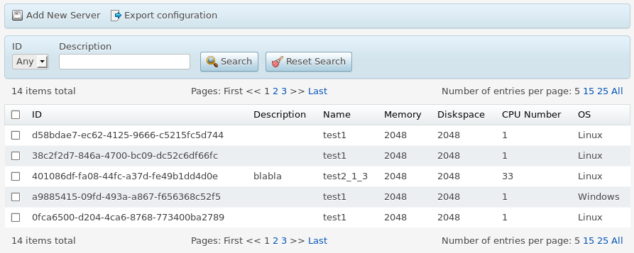
Table and Toolbar
Let us add a toolbar.
require([
      "aps/Memory",
      "aps/Container",
      "aps/Grid",
      "aps/Toolbar",
      "aps/ToolbarButton",
      "aps/PageContainer",
      "aps/ready!"
    ], function(Memory, Container, Grid, Toolbar, ToolbarButton, PageContainer){
        "use strict";
/* Array **data** must be initialized here */

        var store = new Memory({
            data: data,
            idProperty: "aps.id"
        });
        var layoutSimpleGrid = [
            { "name": "ID",          "field": "aps.id" },
            { "name": "Name",        "field": "name" },
            {
              "name": "Memory",
              "field": "hardware.memory",
              "sortable": false
            },
            { "name": "Diskspace",   "field": "hardware.diskspace" },
            { "name": "CPU Number",  "field": "hardware.cpu.number" },
            { "name": "OS",          "field": "platform.os.name" }
        ];

        var page = new PageContainer({}, "gridToolbar");
        var con = new Container({ title: "Grid with toolbar" });
        var toolbar = new Toolbar();

        toolbar.addChild(new ToolbarButton({
           id:         "buttonAddNewCustomer",
           label:      "Add New Server",
           iconClass:  "sb-add-new-server",
           onClick:    function(){ alert("hello!"); }
        }));

        toolbar.addChild(new ToolbarButton({
           id:         "buttonExportCustomers",
           label:      "Export configuration",
           iconClass:  "sb-export",
           onClick:    function(){ alert("hello!"); }
        }));

        var gridWithToolbar = new Grid({
           columns:    layoutSimpleGrid,
           store:      store,
           selectionMode:    "multiple"
        });

        gridWithToolbar.addChild(toolbar);
        con.addChild(gridWithToolbar);
        page.addChild(con);
        page.startup();
});
Table and Filters
The following code allows filtering the table.
require(["aps/Memory", "aps/Container", "aps/Grid", "aps/PageContainer", "aps/ready!"],
    function(Memory, Container, Grid, PageContainer) {
        "use strict";
/* Array **data** must be initialized here */
var store = new Memory({
            data: data,
            idProperty: "aps.id"
        });
        var layout = [{
            "name": "Name",
            "field": "name",
            "filter": true
        }, {
            "name": "VM",
            "field": "hardware.vm",
            "type": "boolean",
            "filter": true
        }, {
            "name": "Date",
            "field": "date",
            "type": "date",
            "filter": {
                title: "Creation date",
                value: {
                    start: "2014-01-01",
                    end: new Date()
                }
            }
        }, {
            "name": "Memory",
            "field": "hardware.memory",
            "type": "integer",
            "filter": true
        }, {
            "name": "Diskspace",
            "field": "hardware.diskspace"
        }, {
            "name": "CPU Number",
            "field": "hardware.cpu.number"
        }, {
            "name": "OS",
            "field": "platform.os.name",
            "filter": {
                "options": [{
                    value: 'Linux',
                    label: 'Linux'
                }, {
                    value: 'Windows',
                    label: 'Windows'
                }],
                "title": "OS"
            }
        }];

        var gridWithSearch = new Grid({
            columns: layout,
            store: store,
            filters: {"hardware.memory": 2048},
				noDataText: "No servers provisioned",
				noEntriesFoundText: "No servers meet your search criteria"
        });

        var page = new PageContainer({}, "gridSearch");
        var con = new Container({
            title: "Grid with search"
        });
        con.addChild(gridWithSearch);
        page.addChild(con);
        page.startup();
    });
Sorting by Columns
The following is an example of sorting the rows by a column.
require([
      "aps/Memory",
      "aps/Container",
      "aps/Grid",
      "dojox/mvc/StatefulArray",
      "aps/PageContainer",
      "aps/ready!"
    ], function(Memory, Container, Grid, StatefulArray, PageContainer){
        "use strict";
/* Array **data** must be initialized here */

        var store = new Memory({ data: data, idProperty: "aps.id" });
        var layoutSimpleGrid = [
            {"name": "ID",          "field": "aps.id"},
            {"name": "Name",        "field": "name"},
            {"name": "OS",          "field": "platform.os.name"}
        ];

        var page = new PageContainer({}, "simpleGrid");
        var con = new Container({ title: "Simple Grid" });
        var selectionArray = new StatefulArray([]);
        var simpleGrid = new Grid({
          columns:          layoutSimpleGrid,
          store:            store,
          selectionMode:    "multiple",
          selectionArray:   selectionArray,
          sort:             { attribute: "platform.os.name", descending: true }
        });

        con.addChild(simpleGrid);
        page.addChild(con);
        page.startup();

        setTimeout(function(){
        			simpleGrid.set("sort", { attribute: "name", descending: true });
        		}, 2000
        );
});
Grouping by Categories
The following example shows how to sort a table by two columns using categoryProperty.
require([
    "aps/Memory",
    "aps/load",
    "aps/ready!"
], function(Memory, load) {
    "use strict";

    /* Array **data** must be initialized here */
var store = new Memory({
        data: data,
        idProperty: "aps.id"
    });

    var layoutSimpleGrid = [{
        "name": "ID",
        "field": "aps.id"
    }, {
        "name": "Name",
        "field": "name"
    }, {
        "name": "OS",
        "field": "platform.os.name"
    }, {
        "name": "Version",
        "field": "platform.os.version"
    }];

    load(["aps/PageContainer", [
        ["aps/Container", {
            title: "Virtual Servers"
        },
            [
                ["aps/Grid", {
                    store: store,
                    columns: layoutSimpleGrid,
                    categoryProperty: ["platform.os.name", "platform.os.version"]
                }]
            ]
        ]
    ]]);
});
Table with Selection of Rows
Let us allow users to select several rows.
require([
        "aps/Memory",
        "aps/Container",
        "aps/Grid",
        "aps/PageContainer",
        "aps/Toolbar",
        "aps/ToolbarButton",
        "aps/ready!"
      ], function(Memory, Container, Grid, PageContainer, Toolbar, ToolbarButton){
        "use strict";
/* Array **data** must be initialized here */

        var store = new Memory({ data: data, idProperty: "aps.id" });
        var layoutSimpleGrid = [{"name": "ID",          "field": "aps.id"},
				{"name": "Name",        "field": "name"},
            {"name": "Memory",      "field": "hardware.memory",      "sortable": false},
            {"name": "Diskspace",   "field": "hardware.diskspace"},
            {"name": "CPU Number",  "field": "hardware.cpu.number"},
            {"name": "OS",          "field": "platform.os.name"}
        ];
        var toolbar = new Toolbar();

        toolbar.addChild(new ToolbarButton({
            id:         "buttonAddNewCustomer",
            label:      "Add New Server",
            iconClass:  "sb-add-new-server",
            onClick:    function(){ alert("hello!"); }
        }));

        toolbar.addChild(new ToolbarButton({
            id:         "buttonExportCustomers",
            label:      "Export configuration",
            iconClass:  "sb-export",
            onClick:    function(){ alert("hello!"); }
        }));

        var gridMultipleSelection = new Grid({
           columns:          layoutSimpleGrid,
           selectionMode:    "multiple",
           store:            store
        });
        gridMultipleSelection.addChild(toolbar);
        var page = new PageContainer({}, "gridMultipleSelectionDiv");
        var con = new Container({ title: "Grid with multiple selection" });
        con.addChild(gridMultipleSelection);
        page.addChild(con);
        page.startup();
});
Table with Custom Number of Rows per Page
A long list is better to split into pages as illustrated here.
 require([
      "aps/Memory",
      "aps/Container",
      "aps/Grid",
      "aps/PageContainer",
      "aps/ready!"
    ], function(Memory, Container, Grid, PageContainer){
        "use strict";
/* Data source must be defined here */

        var store = new Memory({ data: data, idProperty: "aps.id" });
        var layoutSimpleGrid = [
            {"name": "ID",          "field": "aps.id"},
            {"name": "Name",        "field": "name"},
            {
              "name": "Memory",
              "field": "hardware.memory",
              "sortable": false
            },
            {"name": "Diskspace",   "field": "hardware.diskspace"},
            {"name": "CPU Number",  "field": "hardware.cpu.number"},
            {"name": "OS",          "field": "platform.os.name"}
        ];

        var page = new PageContainer({}, "gridChangeRowCountDiv");
        var con = new Container({ title: "Change row count" });
        var gridChangeRowCount = new Grid({
           rowsPerPage:   12,
           columns:       layoutSimpleGrid,
           store:         store
        });

        con.addChild(gridChangeRowCount);
        page.addChild(con);
        page.startup();
});
Method renderCell
Custom Column Type
In this example, the table displays server states with proper icons in the State column. When testing the demo in APS Fiddle, make sure you are in the UX1 mode.
require([
    "aps/Memory",
    "aps/Container",
    "aps/Grid",
    "aps/PageContainer",
    "aps/Status",
    "aps/ready!"
	], function(Memory, Container, Grid, PageContainer, Status) {
    "use strict";
/* Data source must be defined here */

    var store = new Memory({
        data: data,
        idProperty: "aps.id"
    });

    var layout = [{
        "name": "ID",
        "field": "aps.id"
    }, {
        "name": "Name",
        "field": "name"
    }, {
        "name": "Memory",
        "field": "hardware.memory",
        "sortable": false
    }, {
        "name": "Diskspace",
        "field": "hardware.diskspace"
    }, {
        "name": "CPU Number",
        "field": "hardware.cpu.number"
    }, {
        "name": "OS",
        "field": "platform.os.name"
    }, {
        "name": "State",
        "field": "state",
        type: "icon",
        renderCell: function(row, state) {
            return new Status({
                status: state,
                useIcon: true,
                statusInfo: {
                    stopped: {
                        "label": "",
                        "type": "danger"
                    },
                    started: {
                        "label": "",
                        "type": "success"
                    },
                    stopping: {
                        "label": "",
                        "type": "warning"
                    },
                    starting: {
                        "label": "",
                        "type": "info"
                    }
                }
            });
        }
    }];

    var page = new PageContainer({}, "servers");
    var con = new Container({
        title: "Simple Grid"
    });

    var simpleGrid = new Grid({
        columns: layout,
        store: store
    });

    con.addChild(simpleGrid);
    page.addChild(con);
    page.startup();
});
Data Processing in Cell
require(["aps/Memory", "aps/load", "aps/ready!"],
    function(Memory, load) {
        "use strict";
/* Array **data** must be initialized here */

        var store = new Memory({
            data: data,
            idProperty: "aps.id"
        });

        load(["aps/PageContainer", [
            ["aps/Container", {
                    title: "Virtual Servers"
                },
                [
                    ["aps/Grid", {
                            columns: [{
                                name: "Name",
                                field: "name"
                            }, {
                                name: 'VPS type',
                                field: "hardware.vm",
                                renderCell: function(row, data) {
                                    return data ? "VM" : "Container";
                                }
                            }, {
                                name: "Memory",
                                field: "hardware.memory"
                            }],
                            store: store
                        }
                    ]
                ]
            ]
        ]]);
});
Synchronizing through Model
require([
    "aps/Memory",
    "aps/load",
    "aps/CheckBox",
    "aps/Spinner",
    "aps/Gauge",
    "dojox/mvc/at",
    "dojox/mvc/getStateful",
    "aps/ready!"
], function(Memory, load, CheckBox, Spinner, Gauge, at, getStateful) {
    "use strict";
    var renderSelected = function(row) {
        var cb = new CheckBox({
            checked: at(row.model, "selected")
        });
        cb.startup();
        return cb;
    };
    var renderAmount = function(row, data) {
        var spinner = new Spinner({
            disabled: at(row.model, "selected").transform({
                format: function(value) {
                    return !value;
                }
            }).direction(at.from),
            value: at(row.model, "amount"),
            minimum: 0
        });
        spinner.startup();
        return spinner;
    };
    var renderUsage = function(row, data) {
        var gauge = new Gauge({
            minimum: 0,
            maximum: row.limit,
            value: at(row.model, "amount")
        });
        gauge.startup();
        return gauge;
    };
    var serviceStore = new Memory({
        data: [{
            "offerId": "c5",
            "selected": "Yes",
            "name": "Silver",
            "amount": 0,
            "usage": 0,
            "limit": 10,
            "model": new getStateful({
                "selected": true,
                "amount": 0
            })
        }, {
            "offerId": "d5",
            "selected": "Yes",
            "name": "Gold",
            "amount": 0,
            "usage": 0,
            "limit": 5,
            "model": new getStateful({
                "selected": false,
                "amount": 0
            })
        }],
        idProperty: "offerId"
    });

    load(["aps/PageContainer", [
        ["aps/Container", {
                title: "Virtual Servers"
            },
            [
                ["aps/Grid", {
                    id: "wizardNew_grid",
                    store: serviceStore,
                    columns: [{
                        name: "Select",
                        field: "selected",
                        renderCell: renderSelected
                    }, {
                        name: "Offer",
                        field: "name"
                    }, {
                        name: "Amount",
                        field: "amount",
                        renderCell: renderAmount
                    }, {
                        name: "Usage",
                        field: "usage",
                        renderCell: renderUsage
                    }]
                }]
            ]
        ]
    ]]);
});
Method onRowClick
The custom onRowClick(row) method accepts the clicked row and processes it as illustrated in this example:
require([
    "aps/Memory",
    "aps/load",
    "dijit/registry",
    "aps/ready!"
], function(Memory, load, registry) {
    "use strict";
/* Array **data** must be initialized here */

	var store = new Memory({
		data: data,
      idProperty: "aps.id"
   });

   load(["aps/PageContainer", [
		["aps/Container", {
				title: "Virtual Servers"
         },
         [
         	["aps/Grid", {
					store: store,
					onRowClick: function(row) {
               	registry.byId("outputRow").set("content",
               		"Selected server: name - " + row.name + ", state - "
               		+ row.status.state + ", CPU - " + row.hardware.cpu.number);
               },
               columns: [{
               		name: "Name",
               		field: "name"
                  }, {
                    name: "Memory",
                    field: "hardware.memory"
                  } , {
                    name: "State",
                    field: "status.state"
               }]
            }],
            ["aps/Output", { id: "outputRow" }]
      ]]
   ]]);
});
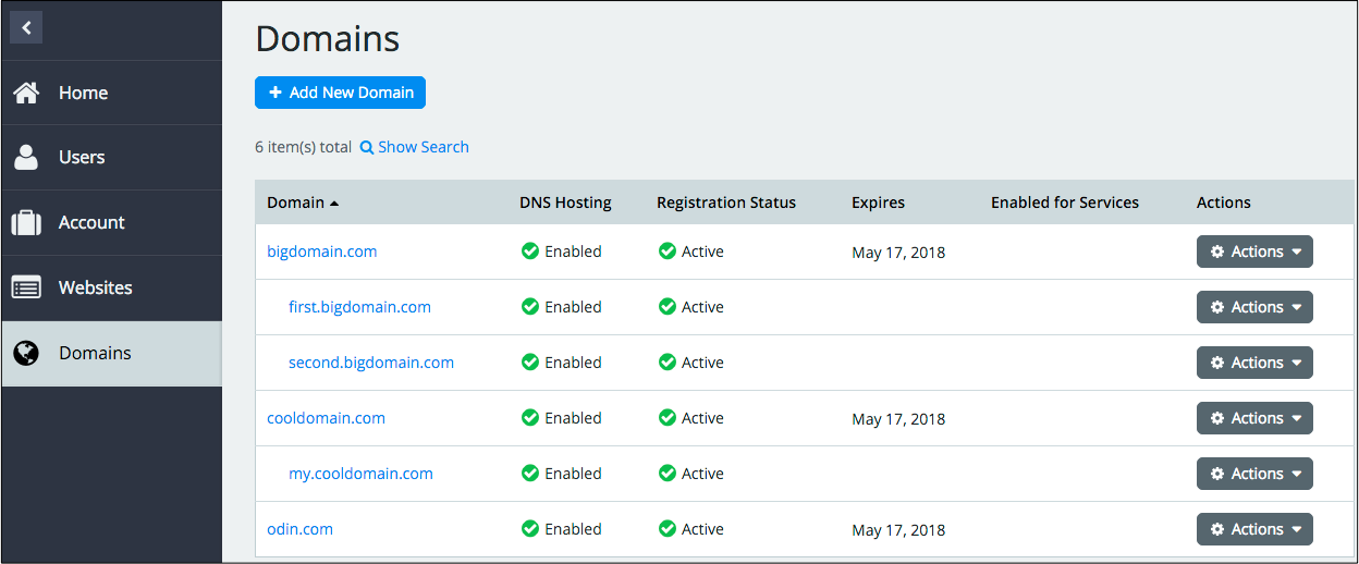
Child Rows
The following example illustrates how a table can present domains along with their subdomains as child rows:
require(["aps/load", "aps/Memory", "aps/ready!"],
    function(load, Memory) {
        "use strict";
        load(["aps/Grid", {
            columns: [{
                name: "Name",
                field: "name"
            }, {
                name: "Creation date",
                field: "date"
            }],
            store: new Memory({
                data: [{
                    name: "odin.com",
                    subdomains: [],
                    date: "2018-04-09T14:40:21Z"
                }, {
                    name: "cooldomain.com",
                    subdomains: [{
                        name: "my.cooldomain.com",
                        date: "2018-04-09T14:41:46Z"
                    }],
                    date: "2018-04-09T10:41:46Z"
                }, {
                    name: "bigdomain.com",
                    subdomains: [{
                        name: "first.bigdomain.com",
                        date: "2018-04-12T14:40:21Z"
                    }, {
                        name: "second.bigdomain.com",
                        date: "2018-04-15T14:40:21Z"
                    }],
                    date: "2018-04-10T14:40:21Z"
                }],
                childrenProperty: "subdomains"
            })
        }]);
});
Public Properties
| PROPERTY | TYPE | DEFAULT | DESCRIPTION |
|---|---|---|---|
| apsResourceViewId | string | “” | ID of an APS view of a “detail” view in the “master-detail” scenario. |
| categoryProperty | string | undefined | If the property is a string, the latter specifies the name of the _key_ used to sort the source data. |
| columns | array | null | The grid is rendered based on its “columns” array. |
| currentPage | number | 1 | The number of the current page. |
| disabled | boolean | false | Specifies if the widget will respond to user input. |
| errorMessage | string | “” | If the data loading is ended with an error, then this string will be shown. |
| filterOptAllText | string | “All” | Text that is shown in filter (for a column) to display entries matching all options. |
| filters | objects | {} | The key-value set with properties to filter and their values. |
| gridSize | string | undefined | This specifies the widget width that is relevant only for widgets inside Container, FieldSet, or Tiles. |
| hideFilterButtonText | string | “Hide filter” | The default value is “Hide filter”. |
| isBusy | boolean | false | If the widget is busy then this property is true. |
| isLoading | boolean | false | Calculated property that shows the current internal state of the Grid. Property is readonly. |
| label | string | “” | Text that is shown as a label if the widget is placed inside a aps/FieldSet. |
| loadMessage | string | “” | If loading data is ended successfully, then this string will be shown. |
| mobileLayout | string | long | Possible values are: “grid”, “short”, “long” (default). |
| nextPageText | string | Next Page | Text that is shown in next page button. |
| noDataText | string | “No data” | Shown if the answer of the server is empty. |
| noEntriesFoundText | string | “No items(s) found” | Text in place of a table if an empty set of data is received from the store. |
| numberOfItemPerPageText | string | “Number of entries per page:” | The default value is “Number of entries per page:”. |
| onRowClick | function | null | Callback handler called when a row is clicked. |
| pageSizeOptions | array | [10, 25, 100, “GRID_UNLIMITED”] | An array of choices for the ``rowsPerPage`` property. |
| prevPageText | string | Previous Page | Text that is shown in previous page button. |
| recordsTotalText | string | “__value__ item(s) total” | Text about records number in the Grid. |
| resetSearchButtonText | string | “Reset Search” | Text on the reset search button. |
| rowsPerPage | int | The number of items to show on a given page. | |
| saveState | boolean | Specifies if the Grid state in the current session must be saved. | |
| searchButtonText | string | “Search” | Text on the search button. |
| selectionArray | dojox/mvc/statefularray | null | Stateful array containing IDs of the selected rows. |
| selectionMode | string | “” | Enables users to select one (single) or many (multiple) rows in the grid as explained in the Row Selection section. |
| showFilterButtonText | string | “Show filter” | The default value is “Show filter”. |
| showPaging | boolean | true | If this property is set to false, then the paging controls are not shown. |
| sort | object | {attribute: “”, descending: null} | Specifies a column and sort direction: ``attribute`` is a string to specify a property to sort by. |
| store | aps/store | null | Source of the tabulated data specified as an instance of the aps/Store object to fetch data from. |
| visible | boolean | true | If this property value is set to true, then the widget is visible. |
apsResourceViewId string
ID of an APS view of a “detail” view in the “master-detail” scenario. If this attribute is defined, a column with “type”:”resourceName” will be rendered as a link. On clicking this link, a user will be automatically redirected to the view whose ID is specified by the “apsResourceViewId” property. Default value: “”.
categoryProperty string array
If the property is a string, the latter specifies the name of the _key_ used to sort the source data. All objects with the same key value are presented as a single group (category) whose title is the key value. If the property is an array, it contains two strings. The first string specifies a _category_ as in the previous case. The second string specifies a _subcategory_. It allows you to sort resources by _categories_, and inside each category sort them by _subcategories_. Default value: undefined.
columns array
The grid is rendered based on its “columns” array. Every entry in the array is an object that defines a column. It includes some properties explained in the Columns section. ``name`` (string) is the header of the column. ``description`` (string) is the grey text after the header of the column. ``escapeHTML`` (bool, default value is true) determines if the “name” and “description” properties should be escaped. ``field`` (string) is the name of property in the data model mapped with the column. ``sortable`` (bool) - if true then the respective column is sortable. ``align`` (string) adjusts the column content in accordance with the assigned value - “left”, “right”, or “center”. ``type`` (string) is the type of content rendering: undefined is the default value. ``icon`` - column becomes as thin as possible and ignores align property. ``resourceName`` - the column is clickable - when clicked, the view defined by “apsResourceProperty” is called. ``label`` is used in the xs (mobile) mode to assign a text to the object title. ``nowrap`` - if this property is set to true, the value in the column will be displayed in one line. Otherwise, it is wrapped to match the shrunk column width.
You can render a cell using the renderCell(object, data) method. The input ``object`` is the current row, and ``data`` is the current cell value. The method can return a string, node, or widget, for example:
{
      {"name": "Description", "field": "description"},
      {"name": "Name",        "field": "name"},
      {"name": "Memory",      "field": "hardware.memory", "sortable": false},
      {"name": "myRenderCell","field": "enhancedCell",
                  renderCell: function(object, data){ return "<div>...</div>" } }
}
Default value: null.
currentPage number
The number of the current page. Default value: 1.
errorMessage string
If the data loading is ended with an error, then this string will be shown. Default value: “”.
filterOptAllText string
Text that is shown in filter (for a column) to display entries matching all options. The default value is “All”.
filters objects
The key-value set with properties to filter and their values. Default value: {}. Refer to the Search Engine section for more details.
gridSize string
This specifies the widget width that is relevant only for widgets inside Container, FieldSet, or Tiles. In other cases it will be ignored.
gridSize string contains few options with number values (from 1 to 12) separated by spaces, which specify the grid size of the widget in different layouts:
- md - desktop
- xs - phone
For example, gridSize: “md-4 xs-2”.
All values below 1, e.g. “md-0”, will be replaced with the empty string (“”), values above 12, e.g. “md-14”, will be reduced to 12 (“md-12”).
Default value: undefined.
hideFilterButtonText string
The default value is “Hide filter”.
isLoading boolean readonly
Calculated property that shows the current internal state of the Grid. True if a potentially long-running operation which changes the Grid’s content is being performed at the moment. Default value: false. The Grid Loading section provides more details.
label string
Text that is shown as a label if the widget is placed inside a aps/FieldSet.
Default value: “”.
loadMessage string
If loading data is ended successfully, then this string will be shown. Default value: “”.
mobileLayout string
Possible values are: “grid”, “short”, “long” (default). Only for CCP v2. ``grid`` - aps/Grid is shown as a table, with a maximum of 3 columns. Useful for short summaries like a receipt. ``short`` - items are shown as cards, cell contents are organized into one column without labels. This can be used for short representation of an item with description and status, or for views offering per-item controls for data modification. ``long`` - items are shown as cards, cell contents are organized into two columns with labels. Useful for compact read-only representation of items. Default value: “long”
nextPageText string
Text that is shown in next page button. Only for CCP v2. Default value: “Next Page”
noDataText string
Shown if the answer of the server is empty. The default value is “No data”.
noEntriesFoundText string
Text in place of a table if an empty set of data is received from the store. The default value is “No items(s) found”.
numberOfItemPerPageText string
The default value is “Number of entries per page:”.
onRowClick function
Callback handler called when a row is clicked. The input is an object presenting the clicked row. Refer to the example illustrating this method. Default value: null.
pageSizeOptions array
An array of choices for the ``rowsPerPage`` property. The option “GRID_UNLIMITED” shows all rows on a page. Default value: [10, 25, 100, “GRID_UNLIMITED”]. [5, 15, 25, “GRID_UNLIMITED”]
prevPageText string
Text that is shown in previous page button. Only for CCP v2. Default value: “Previous Page”
recordsTotalText string
Text about records number in the Grid. The default value is “__value__ item(s) total”.
resetSearchButtonText string
Text on the reset search button. The default value is “Reset Search”.
rowsPerPage int
The number of items to show on a given page. Default value: 10 - PCP / CCP v1, 40 - CCP v2.
saveState boolean
Specifies if the Grid state in the current session must be saved. Default values: true for CCPv1; false for CCPv2.
searchButtonText string
Text on the search button. The default value is “Search”.
selectionArray dojox/mvc/statefularray
Stateful array containing IDs of the selected rows. You can manage the selected list by means of ``get``, ``put``, ``watch`` and other methods of the stateful array as explained in more details in the Row Selection section. Default value: null.
selectionMode string
Enables users to select one (single) or many (multiple) rows in the grid as explained in the Row Selection section. Supported values: “single” and “multiple”: ``single`` - a user can select only one row. ``multiple`` - a user can select many rows. Default value: “”.
showFilterButtonText string
The default value is “Show filter”.
showPaging boolean
If this property is set to false, then the paging controls are not shown. The default value of this property is true.
sort object
Specifies a column and sort direction: ``attribute`` is a string to specify a property to sort by. That must be the “field” value of the respective column. ``descending`` must be true to sort in the descending order. Default value: {attribute: “”, descending: null}.
store aps/store
Source of the tabulated data specified as an instance of the aps/Store object to fetch data from. Default value: null.
visible boolean
If this property value is set to true, then the widget is visible.
Default value: true.
Public Methods
| METHOD | RETURN | DESCRIPTION |
|---|---|---|
| addChild (child, insertIndex) | undefined
|
Makes the given widget a child of this widget |
| buildRendering () | undefined
|
Search for declarative announcements columns |
| cancel () | object
|
Sets the isBusy property to false |
| destroy () | undefined
|
Destroys this widget |
| errorHandler () | undefined
|
The function that should be called when a promise is rejected |
| focus () | aps/_grid
function
|
Focusing the first toolbar button or a suitable child |
| get () | any
|
Get a property of the Stateful instance |
| getChildren () | array
|
Returns all direct children of this widget, i |
| getData (idPropertyValues) | array
|
Returns an array of cached items for given values of the property marked as “isProperty” |
| getParents () | array
|
Discover and return all parents of the widget |
| isFiltersEmpty () | boolean
|
Check that all filters are empty |
| isRowSelectable () | boolean
|
Disable or enable checkbox for the row |
| placeAt () | dijit/_widgetbase
function
|
Place this widget somewhere in the DOM based on standard dojo/dom-construct::place() conventions |
| refresh () | undefined
|
Refresh a page |
| removeAll () | undefined
|
Remove all children in the widget |
| removeChild (widget) | undefined
|
Removes the passed widget instance from this widget and destroys it |
| reset () | undefined
|
Reset the widget’s value to what it was at initialization time |
| resetFilters () | undefined
|
Reset all filters to empty values |
| set () | object
function
|
Set a property of the Stateful instance |
| startup () | undefined
|
Gets started after the DOM fragment is added to the document |
| submitFilters () | undefined
|
Apply all filters from search panel |
| toDefaultFilters () | undefined
|
Reset all filters to their default values (from columns |
| validate () | boolean
|
Called by oninit, onblur, and onkeypress |
addChild
Makes the given widget a child of this widget. Inserts specified child widget’s dom node as a child of this widget’s container node, and possibly does other processing (such as layout).
Return: undefined
| ARGUMENT | TYPE | DESCRIPTION |
|---|---|---|
child |
Widget
|
Child widget |
insertIndex |
Number
String
|
Position child in the parent widget |
destroy
Destroys this widget. Will also destroy any resources (including widgets) registered via this.own(). This method will also destroy internal widgets such as those created from a template.
Return: undefined
get
Get a property of the Stateful instance. Get a named property of the Stateful object. The property may potentially be retrieved via a getter method in subclasses.
In the base class, this just retrieves the object’s property.
Return: any
getChildren
Returns all direct children of this widget, i.e. all widgets underneath this.containerNode whose parent is this widget. Note that it returns not all descendetns, but only the direct children. Analogous to Node.childNodes, except containing widgets rather than DOMNodes.
The result intentionally excludes internally created widgets (a.k.a. supporting widgets) outside of this.containerNode.
Note the returned array is a simple array. The application code should not assume existence of methods like forEach().
Return: array
getData
Returns an array of cached items for given values of the property marked as “isProperty”. If there is no item on current page corresponding to the given value, it is skipped. If the parameter is missing, returns all items on the current page.
Return: array
| ARGUMENT | TYPE | DESCRIPTION |
|---|---|---|
idPropertyValues |
array
|
Array of items’ ID-s |
isFiltersEmpty
Check that all filters are empty. Returns true if all filters have empty values. Returns false if some filter has a non-empty value,
Return: boolean
placeAt
Place this widget somewhere in the DOM based on standard dojo/dom-construct::place() conventions. A convenience function providing a simple shorthand mechanism to put an existing (or newly created) widget somewhere in the DOM, and allow chaining.
Return: dijit/_widgetbase function
removeChild
Removes the passed widget instance from this widget and destroys it. You can also pass in an integer indicating the index within the container to remove (ie, removeChild(5) removes the sixth widget).
Return: undefined
| ARGUMENT | TYPE | DESCRIPTION |
|---|---|---|
widget |
Widget
Int
|
Child widget or index |
set
Set a property of the Stateful instance. Sets named properties of the stateful object and notifies the watchers of the property. A programmatic setter may be defined in subclasses.
Return: object function
startup
Gets started after the DOM fragment is added to the document Called after the widget and its children have been created and added to the page, and all related widgets have finished their create() cycle, up through postCreate().
Note that startup() may be called while the widget is still hidden, for example if the widget is inside a hidden dijit/Dialog or an unselected tab of a dijit/layout/TabContainer. For widgets that need to do layout, it’s best to put that layout code inside resize(), and then extend dijit/layout/_LayoutWidget so that resize() is called when the widget is visible.
Return: undefined
toDefaultFilters
Reset all filters to their default values (from columns.filter.value)
Return: undefined
validate
Called by oninit, onblur, and onkeypress. Show missing or invalid messages if appropriate, and highlight textbox field.
Return: boolean
Public Events
| EVENT | RETURN | DESCRIPTION |
|---|---|---|
| onClick () | undefined
|
The method is called when a user clicks on the widget |
onClick
The method is called when a user clicks on the widget.