Table Of Contents
Application Packaging Standard
Last updated 18-Mar-2019aps/Slider
A form widget which allows a user to sel a value using the horizontal draggable handle.
Table of contents
Compatibility
All user panels - CP and UX1
Overview
Structure
The aps/Slider widget enables you to display an input element for selecting the following:
A numeric value falling within certain limits - interval slider
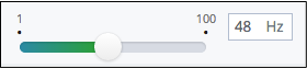
A widget of the this type contains:
- A horizontal slider
- An input field, the
aps/TextBox, that displays the selected value as a number and validates it - Unit of measure or another parameter specified by the
legend(optional property)
The horizontal slider and the input field keep input data synchronous.
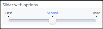
A string value from a set of options - optional slider
Find the nested rules for this widget in the recommended Widget Hierarchy.
Error Messages
The widget validates if a value is assigned and if the latter complies with the widget limits. In a case of violation, it displays a tooltip with one of the following predefined error messages:
| MESSAGE | EXPLANATION |
|---|---|
| “Fill in the field.” | No value is entered in the input box. |
| “This field can only contain an integer number. No spaces or other characters allowed.” | The content of the input box is not an integer. |
| “This field can contain an integer number from __minimumValue__ to __maximumValue__ with step __stepSize__. No spaces or other characters allowed.” | The content of the text box is not an integer and the required step is higher than 1. |
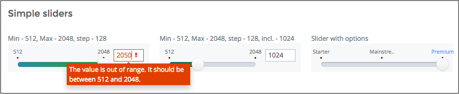
| “The value is out of range. It should be between __minimumValue__ and __maximumValue__.” | The entered value is below the __minimumValue__ or above the __maximumValue__. |
| “The value should be between __minimumValue__ and __maximumValue__ with step __stepSize__.” | The entered value is not a multiple of the slider step or it is beyond the limits. |
To translate those messages to another language, follow the Internationalization and Localization document. In this case, a PO file
you use for translation to a certain language must contain msgid entries with the above predefined strings
and paired with them msgstr entries with translated strings.
Example
The following example illustrates various widget properties, such as:
- Min to mox interval with a specified step
- Included value
- A set of options
require(["aps/load", "aps/ready!"],
    function(load) {
        "use strict";
        load(
            ["aps/Panel", [
                ["aps/FieldSet", {
                        title: "Simple sliders"
                    },
                    [
                        ["aps/Slider", {
                            gridSize: "md-4",
                            label: "Min - 512, Max - 2048, step - 128",
                            minimum: 512,
                            maximum: 2048,
                            value: 512,
                            step: 128,
                            required: true
                        }],
                        ["aps/Slider", {
                            gridSize: "md-4",
                            label: "Min - 512, Max - 2048, step - 128, incl. - 1024",
                            minimum: 512,
                            maximum: 2048,
                            value: 1024,
                            step: 128,
                            included: 1024,
                            required: true
                        }],
                        ["aps/Slider", {
                            gridSize: "md-4",
                            label: "Slider with options",
                            options: [{
                                value: "value1",
                                label: "Starter"
                            }, {
                                value: "value2",
                                label: "Mainstream"
                            }, {
                                value: "value3",
                                label: "Premium"
                            }],
                            required: true
                        }]
                    ]
                ]
        ]]);
});
Public Properties
| PROPERTY | TYPE | DEFAULT | DESCRIPTION |
|---|---|---|---|
| allowCustomValues | boolean | false | If users are allowed to enter values that are not multiple of the slider step. |
| autoSize | boolean | true | Only for PCP / CCP v1. |
| description | string | “” | Textual description to be displayed as a small greyed text under the control. |
| disabled | boolean | false | Disabling of the widget for making changes. |
| gridSize | string | undefined | This specifies the widget width that is relevant only for widgets inside Container, FieldSet, or Tiles. |
| hint | string | “” | Help information in a widget. |
| inputSize | number | 5 | Size of the TextBox element. |
| isBusy | boolean | false | If the widget is busy then this property is true. |
| label | string | “” | Text that is shown as a label if the widget is placed inside a aps/FieldSet. |
| legend | string | “” | Additional text which, as a rule, provides measurement units. |
| maximum | number | 100 | Upper allowed limit. |
| minimum | number | 5 | Lower allowed limit. |
| name | string | “” | Name used when submitting the form; same as the “name” attribute in plain HTML elements. |
| optionalText | string | (Optional) | Text for optional widgets of the Input category. |
| outStepMessage | string | The value should be between <strong>minimumValue</strong> and <strong>maximumValue</strong> with step <strong>stepSize</strong>. | Value should be multiple of the slider step. |
| required | boolean | false | User is required to enter data in the input field. |
| scrollOnFocus | boolean | false | On focus, the widget must shrink to fit the view. |
| step | number | 1 | Slider step value. |
| value | number | 0 | Current value. |
| visible | boolean | true | If this property value is set to true, then the widget is visible. |
allowCustomValues boolean
If users are allowed to enter values that are not multiple of the slider step. Default value: false.
autoSize boolean
Only for PCP / CCP v1. If this property value is set to “true”, then a CSS class is assigned to the widget based on the value of the “size” property: size <= 7 - f-small-size (40px) 7 < size <= 33 - f-middle-size (215px) 33 < size - f-big-size (240px) The default value of this property is true. If you want to use your own CSS class for defining the widget’s size, you should set this property value to “false” and specify your class name in the widget’s “class” property. Default value: true
description string
Textual description to be displayed as a small greyed text under the control. Default value: “”.
disabled boolean
Disabling of the widget for making changes. The slider disappears, data entry into the text entry field becomes disabled. Default value: false.
gridSize string
This specifies the widget width that is relevant only for widgets inside Container, FieldSet, or Tiles. In other cases it will be ignored.
gridSize string contains few options with number values (from 1 to 12) separated by spaces, which specify the grid size of the widget in different layouts:
- md - desktop
- xs - phone
For example, gridSize: “md-4 xs-2”.
All values below 1, e.g. “md-0”, will be replaced with the empty string (“”), values above 12, e.g. “md-14”, will be reduced to 12 (“md-12”).
Default value: undefined.
hint string
Help information in a widget. It is shown under the content of the widget. Deprecated in CCP v2. Default value: “”.
inputSize number
Size of the TextBox element. It is determined by CSS classes f-small-size, f-middle-size and f-big-size. Default value: 5.
label string
Text that is shown as a label if the widget is placed inside a aps/FieldSet.
Default value: “”.
legend string
Additional text which, as a rule, provides measurement units. Default value: “”.
maximum number
Upper allowed limit. The entered value cannot be above it. If a user enters a number above this limit, they will get an error message. The default value is 100.
minimum number
Lower allowed limit. The entered value cannot be below it. If a user enters a number below this limit, they will get an error message. The default value is 5.
name string
Name used when submitting the form; same as the “name” attribute in plain HTML elements. Default value: “”.
optionalText string
Text for optional widgets of the Input category. Default value: “(Optional)”.
outStepMessage string
Value should be multiple of the slider step. Default value: “The value should be between minimumValue and maximumValue with step stepSize.”
required boolean
User is required to enter data in the input field. Default value: false.
scrollOnFocus boolean
On focus, the widget must shrink to fit the view. Default value: false.
step number
Slider step value. It cannot be used together with the discreteValues property. The step property is recommended instead of discreteValues. If an entered number is not a multiple of the step, an error message will be displayed. The default value is 1.
value number
Current value. The default value is 0.
visible boolean
If this property value is set to true, then the widget is visible.
Default value: true.
Public Methods
| METHOD | RETURN | DESCRIPTION |
|---|---|---|
| cancel () | object
|
Sets the isBusy property to false |
| destroy () | undefined
|
Destroys this widget |
| focus () | aps/slider
function
|
Focusing on focusNode of the current object |
| get () | any
|
Get a property of the Stateful instance |
| getParents () | array
|
Discover and return all parents of the widget |
| placeAt () | dijit/_widgetbase
function
|
Place this widget somewhere in the DOM based on standard dojo/dom-construct::place() conventions |
| reset () | Resets the widget’s value and state | |
| set () | object
function
|
Set a property of the Stateful instance |
| startup () | undefined
|
Processing after the DOM fragment is added to the document |
destroy
Destroys this widget. Will also destroy any resources (including widgets) registered via this.own(). This method will also destroy internal widgets such as those created from a template.
Return: undefined
get
Get a property of the Stateful instance. Get a named property of the Stateful object. The property may potentially be retrieved via a getter method in subclasses.
In the base class, this just retrieves the object’s property.
Return: any
placeAt
Place this widget somewhere in the DOM based on standard dojo/dom-construct::place() conventions. A convenience function providing a simple shorthand mechanism to put an existing (or newly created) widget somewhere in the DOM, and allow chaining.
Return: dijit/_widgetbase function
reset
Resets the widget’s value and state. tags: Public returns: undefined
set
Set a property of the Stateful instance. Sets named properties of the stateful object and notifies the watchers of the property. A programmatic setter may be defined in subclasses.
Return: object function
startup
Processing after the DOM fragment is added to the document. Called after a widget and its children have been created and added to the page and all related widgets have finished their creation cycle, that is after the postCreate() function is successfully completed for each of the related widgets. Note that startup() may be called while the widget is still hidden.
Return: undefined
Public Events
| EVENT | RETURN | DESCRIPTION |
|---|---|---|
| onClick () | undefined
|
The method is called when a user clicks on the widget |
onClick
The method is called when a user clicks on the widget.