Table Of Contents
Application Packaging Standard
Last updated 18-Mar-2019aps/Spinner
Analogue to the HTML spinner.
Table of contents
Compatibility
All user panels - CP and UX1
Overview
Structure
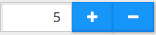
The widget contains a text field to enter a number and two buttons to increase and decrease the number respectively with a defined step. The widget also allows using the computer keyboard to increase or decrease the number by pressing the UP or DOWN key respectively.
Find the nested rules for this widget in the recommended Widget Hierarchy.
Keyboard Usage
Users can change the number in a spinner by means of the computer keyboard as follows.
| KEY | ACTION |
|---|---|
| UP | Increases the number by one step |
| DOWN | Decreases the number by one step |
| HOME | Assigns the lower limit to the number |
| END | Assigns the upper limit to the number |
Validation
Built-in Validation
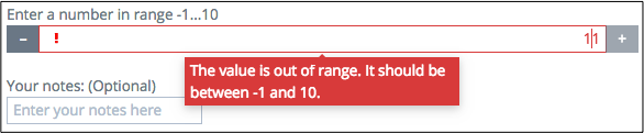
The widget validates if a value is assigned and if the latter complies with the widget limits. In a case of violation, it displays a tooltip with one of the following predefined error messages:
| MESSAGE | EXPLANATION |
|---|---|
| “Fill in the field.” | The value cannot be empty. |
| “This field can only contain numbers and one dot. No spaces or other characters allowed.” | The content of the input box is not a number. |
| “The value is out of range. It should be between __minimumValue__ and __maximumValue__.” | The entered value is below the __minimumValue__ or above the __maximumValue__. |
| “The value should start with a number and may contain one dot as a decimal separator.” | Although the entered value can be a decimal fractional number, it should not start with a dot. |
| “The entered number is too small. It should be greater than or equal to __minimumValue__.” | The upper limit was not set and the entered value is lower than the lower limit. |
| “The entered number is too large. It should not exceed __maximumValue__.” | The lower limit was not set and the entered value is higher than the upper limit. |
Extra Validation
The widget allows you to define the extraValidator method to add more restrictions on the entered value.
If the method returns false, the widget rejects the entered value and prints out the error message defined
by the invalidMessage property.
In the following example, the widget requires a user to enter an integer value only:
extraValidator: number.isInteger,
invalidMessage: "Only integers allowed"
Example
require([
    "aps/load",
    "aps/validate/number",
    "aps/ready!"
], function(load, number) {
    load(["aps/Panel", [
        ["aps/Spinner", {
            minimum: -1,
            maximum: 10,
            extraValidator: number.isInteger,
            invalidMessage: "Only integers allowed"
    }]]]);
});
Public Properties
| PROPERTY | TYPE | DEFAULT | DESCRIPTION |
|---|---|---|---|
| autoSize | boolean | true | Only for PCP / CCP v1. |
| description | string | “” | Only for CCP v2. |
| disabled | boolean | false | Specifies if the widget will respond to user input. |
| gridSize | string | undefined | This specifies the widget width that is relevant only for widgets inside Container, FieldSet, or Tiles. |
| hint | string | “” | Only for PCP / CCP v1. |
| inputSize | number | 5 | Only for PCP / CCP v1. |
| invalidMessage | string | This field can only contain numbers and one dot. No spaces or other characters allowed. | Tooltip text that appears when the content of the text box is invalid. |
| isBusy | boolean | false | If the widget is busy then this property is true. |
| label | string | “” | Text that is shown as a label if the widget is placed inside a aps/FieldSet. |
| legend | string | “” | Additional text which, as a rule, provides measurement units. |
| maximum | number | null | The upper limit of the value. |
| minimum | number | null | The lower limit of the value. |
| missingMessage | string | This value is required. | Tooltip text that appears when the content of the text box is empty and the field is required. |
| optionalText | string | (Optional) | Text for optional widgets of the Input category. |
| required | boolean | false | User is required to enter data in the input field. |
| step | number | 1 | Iteration step. |
| value | number | 1 | Current value. |
| visible | boolean | true | If this property value is set to true, then the widget is visible. |
autoSize boolean
Only for PCP / CCP v1. If this property value is set to “true”, then a CSS class is assigned to the widget based on the value of the “size” property: size <= 7 - f-small-size (40px) 7 < size <= 33 - f-middle-size (215px) 33 < size - f-big-size (240px) The default value of this property is true. If you want to use your own CSS class for defining the widget’s size, you should set this property value to “false” and specify your class name in the widget’s “class” property. Default value: true
description string
Only for CCP v2. Textual description to be displayed as a small greyed text under the control. Default value: “”.
gridSize string
This specifies the widget width that is relevant only for widgets inside Container, FieldSet, or Tiles. In other cases it will be ignored.
gridSize string contains few options with number values (from 1 to 12) separated by spaces, which specify the grid size of the widget in different layouts:
- md - desktop
- xs - phone
For example, gridSize: “md-4 xs-2”.
All values below 1, e.g. “md-0”, will be replaced with the empty string (“”), values above 12, e.g. “md-14”, will be reduced to 12 (“md-12”).
Default value: undefined.
hint string
Only for PCP / CCP v1. Textual hint to be displayed as a small greyed text under the control. Deprecated in CCP v2. Default value: “”.
inputSize number
Only for PCP / CCP v1. Size of the TextBox element. It is determined by CSS classes f-small-size, f-middle-size and f-big-size. Default value: 5.
invalidMessage string
Tooltip text that appears when the content of the text box is invalid. Default value: “This field can only contain numbers and one dot. No spaces or other characters allowed.”
label string
Text that is shown as a label if the widget is placed inside a aps/FieldSet.
Default value: “”.
legend string
Additional text which, as a rule, provides measurement units. Default value: “”.
maximum number
The upper limit of the value. The number cannot increase above it. Once it is reached, the Increment button is deactivated. If a user enters a number above this limit, they will get an error message. The default value is null.
minimum number
The lower limit of the value. The number cannot decrease below it. Once it is reached, the Decrement button is deactivated. If a user enters a number below this limit, they will get an error message. The default value is null.
missingMessage string
Tooltip text that appears when the content of the text box is empty and the field is required. Default value: “This value is required.”
optionalText string
Text for optional widgets of the Input category. Default value: “(Optional)”.
required boolean
User is required to enter data in the input field. Default value: false.
step number
Iteration step. Default value: 1.
value number
Current value. The default value is 1.
visible boolean
If this property value is set to true, then the widget is visible.
Default value: true.
Public Methods
| METHOD | RETURN | DESCRIPTION |
|---|---|---|
| cancel () | object
|
Sets the isBusy property to false |
| destroy () | undefined
|
Destroys this widget |
| extraValidator () | boolean
|
Here, you can do additional verifications |
| focus () | aps/spinner
function
|
Focusing on focusNode of the current object |
| get () | any
|
Get a property of the Stateful instance |
| getCustomErrorMessage () | string
|
Here, you can return a custom error message |
| getParents () | array
|
Discover and return all parents of the widget |
| placeAt () | dijit/_widgetbase
function
|
Place this widget somewhere in the DOM based on standard dojo/dom-construct::place() conventions |
| reset () | undefined
|
Resets the widget |
| set () | object
function
|
Set a property of the Stateful instance |
| startup () | undefined
|
Processing after the DOM fragment is added to the document |
| validate () | boolean.
|
Called by oninit, onblur, and onkeypress |
destroy
Destroys this widget. Will also destroy any resources (including widgets) registered via this.own(). This method will also destroy internal widgets such as those created from a template.
Return: undefined
get
Get a property of the Stateful instance. Get a named property of the Stateful object. The property may potentially be retrieved via a getter method in subclasses.
In the base class, this just retrieves the object’s property.
Return: any
getCustomErrorMessage
Here, you can return a custom error message. The method must return a value, only if additional verifications fail. To change standard error messages, use respective properties.
Return: string
placeAt
Place this widget somewhere in the DOM based on standard dojo/dom-construct::place() conventions. A convenience function providing a simple shorthand mechanism to put an existing (or newly created) widget somewhere in the DOM, and allow chaining.
Return: dijit/_widgetbase function
set
Set a property of the Stateful instance. Sets named properties of the stateful object and notifies the watchers of the property. A programmatic setter may be defined in subclasses.
Return: object function
startup
Processing after the DOM fragment is added to the document. Called after a widget and its children have been created and added to the page and all related widgets have finished their creation cycle, that is after the postCreate() function is successfully completed for each of the related widgets. Note that startup() may be called while the widget is still hidden.
Return: undefined
validate
Called by oninit, onblur, and onkeypress. Show missing or invalid messages if appropriate, and highlight textbox field.
Return: boolean.
Public Events
| EVENT | RETURN | DESCRIPTION |
|---|---|---|
| onClick () | undefined
|
The method is called when a user clicks on the widget |
onClick
The method is called when a user clicks on the widget.