Table Of Contents
Application Packaging Standard
Last updated 18-Mar-2019aps/ComboBox
Auto-completing text box.
The drop down box’s values are populated from a class called a data provider, which returns a list of values based on the characters that the user has typed into the input box. If OPTION tags are used as the data provider via markup, then the OPTION tag’s child text node is used as the widget value when selected. The OPTION tag’s value attribute is ignored. To set the default value when using OPTION tags, specify the selected attribute on 1 of the child OPTION tags.
Table of contents
Compatibility
All user panels - CP and UX1
Overview
Structure
aps/ComboBox is a hybrid containing the aps/Select drop-down box and
the aps/TextBox input field.
The functionality of this widget completely matches the functionality of the dijit/form/ComboBox widget.
Find the nested rules for this widget in the recommended Widget Hierarchy.
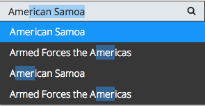
Query Expression
The queryExpr property is a pattern that specifies what query is sent to the data store,
based on what the user has typed.
Changing this expression will modify whether the results are exact match or partial match.
For the search engine, the ${0} is the text entered in the input field.
To specify a partial match, the * wildcard is added to the pattern
with the following expected results:
- ${0} - “is”, that is exact match
- ${0}* - “starts with”
- *${0} - “ends with”
- *${0}* - “contains”, the default pattern
Examples
Query Expression
In the following example, try to test different query expressions.
require([
  "aps/Memory",
  "aps/ComboBox",
  "aps/FieldSet",
  "aps/Panel",
  "aps/PageContainer",
  "aps/ready!"
], function(Memory, ComboBox, FieldSet, Panel, PageContainer){
  "use strict";
  var stateStore = new Memory({
      data: [
        {name:"Alabama", id:"AL"},
        {name:"Alaska", id:"AK"},
        {name:"American Samoa", id:"AS"},
        {name:"Arizona", id:"AZ"},
        {name:"Arkansas", id:"AR"},
        {name:"Armed Forces Europe", id:"AE"},
        {name:"Armed Forces Pacific", id:"AP"},
        {name:"Armed Forces the Americas", id:"AA"},
        {name:"California", id:"CA"},
        {name:"Colorado", id:"CO"},
        {name:"Connecticut", id:"CT"},
        {name:"Delaware", id:"DE"},
        {name:"Alabama", id:"AL2"},
        {name:"Alaska", id:"AK2"},
        {name:"American Samoa", id:"AS2"},
        {name:"Arizona", id:"AZ2"},
        {name:"Arkansas", id:"AR2"},
        {name:"Armed Forces Europe", id:"AE2"},
        {name:"Armed Forces Pacific", id:"AP2"},
        {name:"Armed Forces the Americas", id:"AA2"},
        {name:"California", id:"CA2"},
        {name:"Colorado", id:"CO2"},
        {name:"Connecticut", id:"CT2"},
        {name:"Delaware", id:"DE2"}
      ]
  });

    var page = new PageContainer();
    page.placeAt("stateSelectDiv");
    var panel = new Panel();
    var fieldSet = new FieldSet();

    fieldSet.addChild(new ComboBox({
        store: stateStore,
        queryExpr: "${0}*"
    }));
    panel.addChild(fieldSet);
    page.addChild(panel);
    page.startup();
});
Option Template
The following example illustrates the use of the optionTemplate and searchAttr properties.
require([
  "aps/Memory",
  "aps/load",
  "aps/ready!"
], function(Memory, load){
  "use strict";
  var stateStore = new Memory({
    data: [
      {name:"Alabama", id:"AL"},
      {name:"Alaska", id:"AK"},
      {name:"American Samoa", id:"AS"},
      {name:"Arizona", id:"AZ"},
      {name:"Arkansas", id:"AR"},
      {name:"Armed Forces Europe", id:"AE"},
      {name:"Armed Forces Pacific", id:"AP"},
      {name:"Armed Forces the Americas", id:"AA"},
      {name:"California", id:"CA"},
      {name:"Colorado", id:"CO"},
      {name:"Connecticut", id:"CT"},
      {name:"Delaware", id:"DE"},
      {name:"Alabama", id:"AL2"},
      {name:"Alaska", id:"AK2"},
      {name:"American Samoa", id:"AS2"},
      {name:"Arizona", id:"AZ2"},
      {name:"Arkansas", id:"AR2"},
      {name:"Armed Forces Europe", id:"AE2"},
      {name:"Armed Forces Pacific", id:"AP2"},
      {name:"Armed Forces the Americas", id:"AA2"},
      {name:"California", id:"CA2"},
      {name:"Colorado", id:"CO2"},
      {name:"Connecticut", id:"CT2"},
      {name:"Delaware", id:"DE2"}
    ]
  });

  load(["aps/PageContainer", [
    ["aps/Panel", [
        ["aps/FieldSet", [
            ["aps/ComboBox", {
                store: stateStore,
                optionTemplate: "${name} (${id})",
                searchAttr: "customName",
                queryExpr: "${0}*"
            }]

        ]]
    ]]
  ]]);
});
Public Properties
| PROPERTY | TYPE | DEFAULT | DESCRIPTION |
|---|---|---|---|
| autoSize | boolean | true | Only for PCP / CCP v1. |
| description | string | “” | Textual description to be displayed as a small greyed text under the control. |
| disabled | boolean | false | Specifies if the widget will respond to user input. |
| gridSize | string | undefined | This specifies the widget width that is relevant only for widgets inside Container, FieldSet, or Tiles. |
| hint | string | “” | Help information in a widget. |
| invalidMessage | string | The value entered is not valid. | Tooltip text that appears when the content of the text box is invalid. |
| isBusy | boolean | false | If the widget is busy then this property is true. |
| label | string | “” | Text that is shown as a label if the widget is placed inside a aps/FieldSet. |
| minLength | number | 3 | The minimum number of characters that end user should type to see autocompletion suggestions list. |
| missingMessage | string | This value is required. | Tooltip text that appears when the content of the text box is empty and the field is required. |
| optionalText | string | (Optional) | Text for optional widgets of the Input category. |
| optionTemplate | string | ${name} | Only CCP v2. |
| placeHolder | string | “” | Grayed out initial string in a field. |
| queryExpr | string | <em>${0}</em> | Defines how a pattern entered in the input field is matched against the widget store to select store elements from the drop-down list. |
| required | boolean | false | User is required to enter data in the input field. |
| searchAttr | string | name | Only CCP v2. |
| size | number | 10 - PCP / CCP v1, undefined - CCP v2 | Affects the selection of a CSS class that defines the width of the input field of the widget. |
| type | string | text | Type of input data. |
| visible | boolean | true | If this property value is set to true, then the widget is visible. |
autoSize boolean
Only for PCP / CCP v1. If this property value is set to “true”, then a CSS class is assigned to the widget based on the value of the “size” property: size <= 7 - f-small-size (40px) 7 < size <= 33 - f-middle-size (215px) 33 < size - f-big-size (240px) The default value of this property is true. If you want to use your own CSS class for defining the widget’s size, you should set this property value to “false” and specify your class name in the widget’s “class” property. Default value: true
description string
Textual description to be displayed as a small greyed text under the control. Default value: “”.
gridSize string
This specifies the widget width that is relevant only for widgets inside Container, FieldSet, or Tiles. In other cases it will be ignored.
gridSize string contains few options with number values (from 1 to 12) separated by spaces, which specify the grid size of the widget in different layouts:
- md - desktop
- xs - phone
For example, gridSize: “md-4 xs-2”.
All values below 1, e.g. “md-0”, will be replaced with the empty string (“”), values above 12, e.g. “md-14”, will be reduced to 12 (“md-12”).
Default value: undefined.
hint string
Help information in a widget. It is shown under the content of the widget. Deprecated in CCP v2. Default value: “”.
invalidMessage string
Tooltip text that appears when the content of the text box is invalid. Default value: “The value entered is not valid.”.
label string
Text that is shown as a label if the widget is placed inside a aps/FieldSet.
Default value: “”.
minLength number
The minimum number of characters that end user should type to see autocompletion suggestions list. Default value: 3.
missingMessage string
Tooltip text that appears when the content of the text box is empty and the field is required. Default value: “This value is required.”.
optionalText string
Text for optional widgets of the Input category. Default value: “(Optional)”.
optionTemplate string
Only CCP v2. A template string used to create items in the drop-down menu. If you want to show the id property too, set the optionTemplate property to “${name} (${id})”. Property searchAttr should be equal “customName” to use this property. Default value: “${name}”.
placeHolder string
Grayed out initial string in a field. For example, it can display instructions. Default value: “”.
queryExpr string
Defines how a pattern entered in the input field is matched against the widget store to select store elements from the drop-down list. Changing this expression will modify whether the results are only exact matches, a “starting with” match, and so on. It is applied to each object property. ${0} will be substituted for the user text. * is used for wildcards. ${0}* means “starts with”, *${0}* means “contains”, ${0} means “is”. Default value: “_${0}_”.
required boolean
User is required to enter data in the input field. Default value: false.
searchAttr string
Only CCP v2. Specifies an attribute in the data store entries to search for a string that a user is typing. To search a string in the ID (specified by the PropertyID in the store) and in the “name” attribute of all store entries, assign the ‘customName’ string to this property. Default value: “name”.
size number
Affects the selection of a CSS class that defines the width of the input field of the widget. See the specification for more details.
size <= 7        f-small-size (40px)
7 < size <= 33   f-middle-size (215px)
size > 33        f-big-size (240px)
Default value: 10 - PCP / CCP v1, undefined - CCP v2.
type string
Type of input data. Default value: “text”.
visible boolean
If this property value is set to true, then the widget is visible.
Default value: true.
Public Methods
| METHOD | RETURN | DESCRIPTION |
|---|---|---|
| cancel () | object
|
Sets the isBusy property to false |
| destroy () | undefined
|
Destroy this widget |
| extraValidator () | boolean
|
Here, you can do additional verifications |
| focus () | aps/_input
function
|
Focusing on the focusNode of the current object |
| get () | any
|
Get a property of the Stateful instance |
| getCustomErrorMessage () | string
|
Here, you can return a custom error message |
| getParents () | array
|
Discover and return all parents of the widget |
| labelFunc (item) | ||
| placeAt () | dijit/_widgetbase
function
|
Place this widget somewhere in the DOM based on standard dojo/dom-construct::place() conventions |
| set () | object
function
|
Set a property of the Stateful instance |
| startup () | undefined
|
Gets started after the DOM fragment is added to the document |
destroy
Destroy this widget. Will also destroy any resources (including widgets) registered via this.own(). This method will also destroy internal widgets such as those created from a template.
Return: undefined
get
Get a property of the Stateful instance. Get a named property of the Stateful object. The property may potentially be retrieved via a getter method in subclasses.
In the base class, this just retrieves the object’s property.
Return: any
getCustomErrorMessage
Here, you can return a custom error message. Overrided method. The method must return a value, only if additional verifications fail. To change standard error messages, use respective properties.
Return: string
labelFunc
| ARGUMENT | TYPE | DESCRIPTION |
|---|---|---|
item |
undefined
|
placeAt
Place this widget somewhere in the DOM based on standard dojo/dom-construct::place() conventions. A convenience function providing a simple shorthand mechanism to put an existing (or newly created) widget somewhere in the DOM, and allow chaining.
Return: dijit/_widgetbase function
set
Set a property of the Stateful instance. Sets named properties of the stateful object and notifies the watchers of the property. A programmatic setter may be defined in subclasses.
Return: object function
startup
Gets started after the DOM fragment is added to the document Called after the widget and its children have been created and added to the page, and all related widgets have finished their create() cycle, up through postCreate().
Note that startup() may be called while the widget is still hidden, for example if the widget is inside a hidden dijit/Dialog or an unselected tab of a dijit/layout/TabContainer. For widgets that need to do layout, it’s best to put that layout code inside resize(), and then extend dijit/layout/_LayoutWidget so that resize() is called when the widget is visible.
Return: undefined
Public Events
| EVENT | RETURN | DESCRIPTION |
|---|---|---|
| onClick () | undefined
|
The method is called when a user clicks on the widget |
onClick
The method is called when a user clicks on the widget.