CloudBlue Commerce API (DRAFT)
Table Of Contents
aps/ActiveItem
Composite collapsible list item.
Used as a child in an ``ActiveList`` and contains other widgets.
Table of contents
Overview
aps/ActiveItem is a complex widget consisting of a header
with its own complex structure and an embedded part that may be collapsed (hidden).
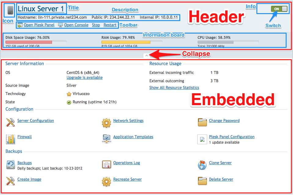
Header Properties
The widget header is defined by the following properties:
iconName- path to the icon file.title- title on top of the widget.description- plain text, HTML, widget, DOM Node, or array to display information located below the title (can be dynamic) about the resource presented by the widget.info- plain text, HTML, widget, DOM Node, or array to display additional information (can be dynamic) about the resource presented by the widget.collapsible- define if it is allowed to collapse the internal part of the widget or not.collapsed- define if the internal part is collapsed at the moment.
Child Widgets in Header
The header can contain the following child widgets:
aps/ToolbarButton - a direct child of the
ActiveItemwidget and, once defined, it is added to thetoolbarautomatically.aps/Switch - used inside another widget or assigned to a property, for example, assigned as a value to the
Infoproperty. It allows switching theActiveItemstatus to on or off.aps/InfoBoard - a direct child of the
ActiveItemand, once defined, it will be automatically placed into the location of theinformation board.
Embedded Part
In its embedded part, the aps/ActiveItem widget may contain arbitrary widgets which can have
their own child widgets. More detailed information on widget declaration see in Declarations.
We recommend that you to use as child elements only widgets of the container category,
that is aps/Container, aps/FieldSet, and so on. Widgets of other categories should be packaged in containers.
The embedded part may be hidden. To prohibit hiding and make the embedded part always
visible, you need to assign false to the collapsible property.
Example
require([
  "aps/load",
  "aps/ready!"
], function(load, Output, Switch){
    "use strict";
    load(["aps/ActiveList",
        [
            ["aps/ActiveItem", {
                title:       "Title",
                description: "Description"
            }]
        ]
    ]);
});
Public Properties
PROPERTY |
TYPE |
DEFAULT |
DESCRIPTION |
|---|---|---|---|
boolean |
true |
If this property value is set to “false”, the inner part of the widget is visible. |
|
boolean |
true |
Defines if it is allowed to wrap the contents. |
|
string |
“” |
Information located below the title (can be dynamic) about the resource presented by the widget. |
|
boolean |
false |
Specifies if the widget will respond to user input. |
|
string |
undefined |
This specifies the widget width that is relevant only for widgets inside Container, FieldSet, or Tiles. |
|
string |
“” |
Path to the icon file. |
|
string |
“” |
Additional information (can be dynamic) about the resource presented by the widget. |
|
boolean |
false |
If the widget is busy then this property is true. |
|
string |
“” |
Text that is shown as a label if the widget is placed inside a aps/FieldSet. |
|
string |
“” |
Title on top of the widget. |
|
boolean |
true |
If this property value is set to true, then the widget is visible. |
collapsed boolean
If this property value is set to “false”, the inner part of the widget is visible. Default value: true.
collapsible boolean
Defines if it is allowed to wrap the contents. Default value: true.
description string
Information located below the title (can be dynamic) about the resource presented by the widget. Can be plain text, HTML, widget, DOM Node, or array. Default value: “”.
gridSize string
This specifies the widget width that is relevant only for widgets inside Container, FieldSet, or Tiles. In other cases it will be ignored.
gridSize string contains few options with number values (from 1 to 12) separated by spaces, which specify the grid size of the widget in different layouts:
- md - desktop
- xs - phone
For example, gridSize: “md-4 xs-2”.
All values below 1, e.g. “md-0”, will be replaced with the empty string (“”), values above 12, e.g. “md-14”, will be reduced to 12 (“md-12”).
Default value: undefined.
iconName string
Path to the icon file. Default value: “”.
info string
Additional information (can be dynamic) about the resource presented by the widget. Can be plain text, HTML, widget, DOM Node or array. Default value: “”.
label string
Text that is shown as a label if the widget is placed inside a aps/FieldSet.
Default value: “”.
title string
Title on top of the widget. Default value: “”.
visible boolean
If this property value is set to true, then the widget is visible.
Default value: true.
Public Methods
METHOD |
RETURN |
DESCRIPTION |
|---|---|---|
undefined
|
Makes the given widget a child of this widget |
|
object
|
Sets the isBusy property to false |
|
undefined
|
Destroys this widget |
|
aps/_containerbase
function
|
Focusing the focusable child |
|
any
|
Get a property of the Stateful instance |
|
array
|
Returns list of own children plus ToolbarButtons |
|
array
|
Discover and return all parents of the widget |
|
dijit/_widgetbase
function
|
Place this widget somewhere in the DOM based on standard dojo/dom-construct::place() conventions |
|
undefined
|
Remove all children in the widget |
|
undefined
|
Removes the passed widget instance from this widget and destroys it |
|
undefined
|
Resets the widget |
|
object
function
|
Set a property of the Stateful instance |
|
undefined
|
Processing after the DOM fragment is added to the document |
|
boolean
|
Called by oninit, onblur, and onkeypress |
addChild
Makes the given widget a child of this widget. Inserts specified child widget’s dom node as a child of this widget’s container node, and possibly does other processing (such as layout).
Return: undefined
ARGUMENT |
TYPE |
DESCRIPTION |
|---|---|---|
|
Widget
|
Child widget |
|
Number
String
|
Position child in the parent node |
destroy
Destroys this widget. Will also destroy any resources (including widgets) registered via this.own(). This method will also destroy internal widgets such as those created from a template.
Return: undefined
get
Get a property of the Stateful instance. Get a named property of the Stateful object. The property may potentially be retrieved via a getter method in subclasses.
In the base class, this just retrieves the object’s property.
Return: any
placeAt
Place this widget somewhere in the DOM based on standard dojo/dom-construct::place() conventions. A convenience function providing a simple shorthand mechanism to put an existing (or newly created) widget somewhere in the DOM, and allow chaining.
Return: dijit/_widgetbase function
removeChild
Removes the passed widget instance from this widget and destroys it. You can also pass in an integer indicating the index within the container to remove (ie, removeChild(5) removes the sixth widget).
Return: undefined
ARGUMENT |
TYPE |
DESCRIPTION |
|---|---|---|
|
Widget
Int
|
Child widget or index |
set
Set a property of the Stateful instance. Sets named properties of the stateful object and notifies the watchers of the property. A programmatic setter may be defined in subclasses.
Return: object function
startup
Processing after the DOM fragment is added to the document. Called after a widget and its children have been created and added to the page and all related widgets have finished their creation cycle, that is after the postCreate() function is successfully completed for each of the related widgets. Note that startup() may be called while the widget is still hidden.
Return: undefined
validate
Called by oninit, onblur, and onkeypress. Show missing or invalid messages if appropriate, and highlight textbox field.
Return: boolean
Public Events
EVENT |
RETURN |
DESCRIPTION |
|---|---|---|
undefined
|
The method is called when a user clicks on the widget |
onClick
The method is called when a user clicks on the widget.