CloudBlue Commerce API (DRAFT)
Table Of Contents
aps/Tile
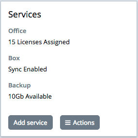
Individual tile.
This widget can contain various other widgets. However, unlike other containers, its size is limited, and it is not recommended to place too many widgets and/or complex widgets inside ``aps/Tile``.
Table of contents
Compatibility
UX1 only
Overview
Structure
The aps/Tile widget can contain various other widgets. Unlike other containers, its size is limited,
and it is not recommended to place too many widgets and/or complex widgets.
Service State Presentation
An application makes its aps/Tile widgets branded by means of the following set of properties
mentioned in the Public Properties section:
backgroundColorbackgroundImageiconNamefontColor
Note
When using a custom icon, pay attention to the Application Icon Design document.
Often, a tile visualizes the current state of a bound service by means of the state property.
When all of the branding properties are presented in a tile definition, the tile anyway will
look differently depending on its state:
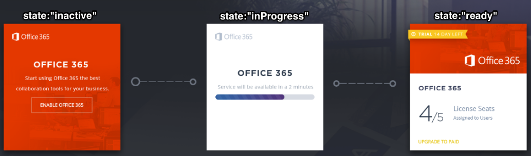
The table below explains the default presentation and typical actions.
|
Usage |
Visual elements |
Typical actions |
|---|---|---|---|
|
Presents a service for potential subscribers. |
Non-active properties:
- Child widgets
Active properties:
- Branding properties
- Only one button for an action
|
Promotes a new service to customers using the
serviceDescription and status for the promo text.On a click, changes the
state to inProgress and forwards the customer to the service purchase
process. |
|
Intermediate service state. |
Non-active properties:
- Branding properties, except for the icon
- Child widgets
Active properties:
-
serviceDescription and the icon |
Temporary placeholder to indicate a background process, usually is not available for a click. On completion
of the process changes the tile |
|
The service is provisioned to the customer. |
Non-active properties:
-
serviceDescriptionActive properties:
- Child widgets
- Branding properties
-
status- Several buttons for actions
|
Uses child widgets to show the current service usage against the service limit.
Uses buttons to start various actions on the service.
|
It is possible to change the default presentation by setting the properties directly for a certain state, for example:
onClick: function () {
         this.set( 'state', 'inProgress' );
         this.set( 'serviceDescription', 'Privisioning text here' );
         this.set( 'backgroundImage', 'image-name.png');
}
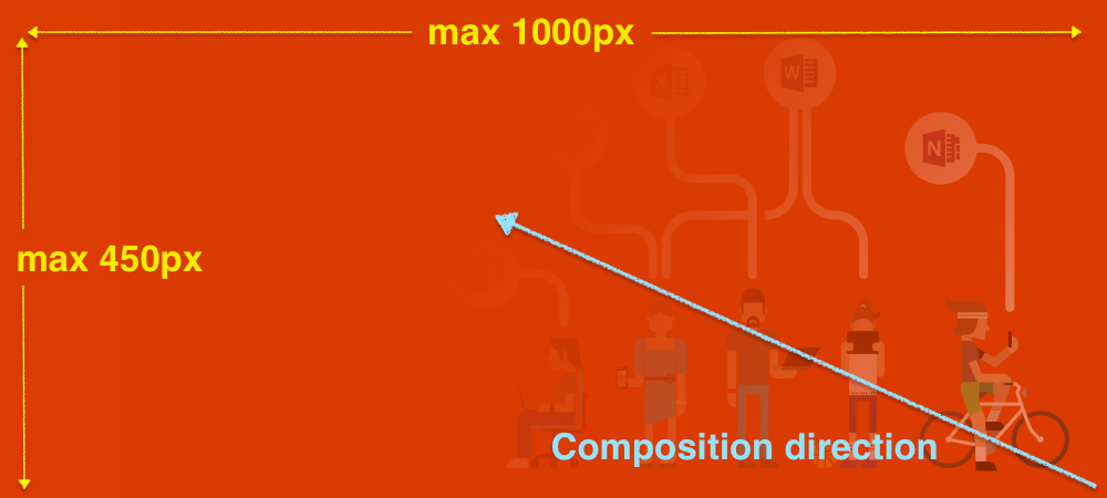
The APS JS framework scales and cuts the background image in accordance with the composition rules as the following image illustrates:
Examples
Tile with Multi-tier Buttons
require([
    "aps/load",
    "aps/ready!"
], function(load) {
    load(["aps/Tiles", [
        ["aps/Tile", {
            title: "Set of buttons",
            gridSize: "md-8",
            buttons: [{
                title: 'Just a button'
            }, {
                title: 'Open toolbar',
                items: [{
                    iconClass: "fa-cog",
                    title: 'View Settings',
                    onClick: function() {}
                }, {
                    iconClass: "fa-minus-circle",
                    title: 'Disable Widget',
                    onClick: function() {}
                }]
            }]
        }]
    ]]);
});
Alpha Button
Using a primary button to promote a new service:
require([
        "aps/load",
        "dijit/registry",
        "aps/ready!"
    ], function(load, registry) {

        function gotoRevert(btn) {
            btn.set({
                alphaButtonState: 'inactive',
                label: 'The request is added to your shop cart!',
                onClick: function() {
                    gotoNormal(btn);
                }
            });
        }

        function gotoNormal(btn) {
            setTimeout(function() {
                var tile = registry.byId("mytile");
                tile.set({
                    title: "Normal service Management",
                    buttons: [{
                        title: 'View Settings',
                        onClick: function() {}
                    }, {
                        title: 'Go to ShopCart',
                        onClick: function() {}
                    }]
                });
            }, 1000);
        }


        load(["aps/Tiles", [
            ["aps/Tile", {
                id: "mytile",
                title: "Promoting a new service for customers",
                gridSize: "md-8",
                buttons: [{
                    id: "alphabutton",
                    alphaButtonState: "active",
                    hasRevertButton: true,
                    title: 'Get it in few clicks!!!',
                    type: "primary",
                    onClick: function() {
                        gotoRevert(this);
                    }
                    //                items: []
                }]
            }]
        ]]);
});
Tile with Dynamic Brand Settings
require([
        "aps/load",
        "aps/Memory",
        "aps/Status",
        "aps/ready!"
    ],
    function(load, Memory, Status) {
        load(["aps/Tiles", {
                title: "My tiles"
            },
            [
                ["aps/Tile", {
                        id: 'service-1',
                        title: 'Service Name',
                        hint: '#APPLICATION ID',
                        iconName: '//www.apsstandard.org/images/home-slide-4-box-icon.png',
                        //backgroundImage: '/_images/tile-composition-direction.png',
                        fontColor: '#FFFFFF',
                        backgroundColor: '#2098b7',
                        serviceDescription: 'This service contains a lot of features and magic. Click for activate now!',
                        state: 'inactive',
                        onClick: function() {
                            this.set('state', 'inProgress');
                            this.set('backgroundColor', '#75bb03');
                            this.set('serviceDescription', 'Service is activating, please wait...');
                            setTimeout(function() {
                                dijit.registry.byId('service-1').set('state', 'ready');
                            }, 2000);
                        },
                        info: new Status({
                            status: "trial",
                            statusInfo: {
                                trial: {
                                    label: 'Free Trial',
                                    type: 'warning'
                                }
                            }
                        }),
                        buttons: [{
                            title: "Button",
                            autoBusy: false,
                            onClick: function() {}
                        }]
                    },
                    [ /* content */ ]
                ]
            ]
        ]);
    });
Tile in Various States
require([
    "aps/load",
    "aps/Status",
    "aps/ready!"
], function(load, Status) {
    load(["aps/Tiles", {
            title: "Resource Usage"
        },
        [
            ["aps/Tile", {
                    id: 'test',
                    title: 'Service Name',
                    serviceDescription: 'Work smarter, anywhere, with this service',
                    iconName: '../_static/examples/tiles/o365.png',
                    backgroundImage: '../_static/examples/tiles/tile-background.png',
                    fontColor: '#fff',
                    backgroundColor: '#304658',
                    state: 'inactive',
                    info: new Status({
                        status: "trial",
                        statusInfo: {
                            trial: {
                                label: 'Free Trial Available',
                                type: 'warning'
                            }
                        }
                    }),
                    onClick: function() {
                        this.set('state', 'inProgress');
                        this.set('serviceDescription', 'Provisioning is in progress');
                        setTimeout(function() {
                            dijit.registry.byId('test').set('state', 'ready');
                        }, 2000);
                    },
                    buttons: [{
                        title: "Button",
                        autoBusy: false
                    }]
                },
                [
                    ["aps/UsageInfo", {
                        value: 14,
                        maximum: 100,
                        textFirstNumber: '${value}',
                        description: 'Total',
                        showPie: false
                    }]
                ]
            ]
        ]
    ]);
});
Public Properties
PROPERTY |
TYPE |
DEFAULT |
DESCRIPTION |
|---|---|---|---|
function |
undefined |
This method specifies information which appears in the bottom of the Tile. |
|
string |
“” |
Color of the Tile background in HEX format, for example, “#C0C0C0” Default value: “”. |
|
string |
“” |
Background Image - the path to the file from the project root, for example, “images/image. |
|
array |
undefined |
Defines buttons in the toolbar inside the Tile. |
|
boolean |
false |
Specifies if the widget will respond to user input. |
|
string |
“” |
Color of the text in the Tile in HEX format, for example, “#001122” Default value: “”. |
|
string |
md-4 xs-12 |
This specifies the widget width that is relevant only for widgets inside Container, FieldSet, or Tiles. |
|
string |
“” |
iconName - the path to the file from the project root, for example, “images/image. |
|
string |
“” |
Class used by the DOMNode to display an icon in its right corner. |
|
null |
null |
This is an ``aps/Status`` widget displayed near the title. |
|
boolean |
false |
If the widget is busy then this property is true. |
|
string |
“” |
Text that is shown as a label if the widget is placed inside a aps/FieldSet. |
|
function |
undefined |
Callback method activated when a user clicks on the Tile body. |
|
string |
“” |
Textual description to be displayed as a small greyed text above the progress bar (only for “inactive” and “inProgress” states, see “state” property). |
|
string |
“” |
Influences the tile visualization to represent a bound service state as the Service State Presentation section explains. |
|
string |
“” |
Text displayed on top of the panel. |
|
boolean |
false |
Defines whether tile icon will be transformed (greyscale, invert) or original colors will be used. |
|
boolean |
true |
If this property value is set to true, then the widget is visible. |
additionalInfo function
This method specifies information which appears in the bottom of the Tile. It can return an instance, a load-structure array or a promise.
var data = [{
    id: 'tile1',
    status: 'warn'
}, {
    id: 'tile2',
    status: 'error'
}];

additionalInfo: function(data) {
    return new Status({status: data.status});
}

additionalInfo: function(data) {
    return ['aps/Status', {status: data.status}];
}

additionalInfo: function(data) {
    return load(['aps/Status', {status: data.status}]);
}
Default value: undefined.
backgroundColor string
Color of the Tile background in HEX format, for example, “#C0C0C0” Default value: “”.
backgroundImage string
Background Image - the path to the file from the project root, for example, “images/image.png”. Default value: “”.
buttons array
Defines buttons in the toolbar inside the Tile. Default value: undefined. Each button is defined as an object with the following properties:
iconClass: String         // CSS class of the button.
label: String             // Label on the button.
disabled: Boolean         // Specifies if the button will respond to user action.
type: String              // Type of the button.
onClick: function         // Callback function.
alphaButtonState: String  // Defines the state of alpha button. Possible values: "active", "inactive".
hasRevertButton: Boolean  // Specifies if there will be a revert button.
items: array              /* Defines the second level toolbar containing buttons
                             with the same set of properties as mentioned above.
                             This toolbar is available when a user clicks on
                             the top level button where the toolbar is defined. */
fontColor string
Color of the text in the Tile in HEX format, for example, “#001122” Default value: “”.
gridSize string
This specifies the widget width that is relevant only for widgets inside Container, FieldSet, or Tiles. In other cases it will be ignored.
gridSize string contains few options with number values (from 1 to 12) separated by spaces, which specify the grid size of the widget in different layouts:
- md - desktop
- xs - phone
For example, gridSize: “md-4 xs-2”.
All values below 1, for example, “md-0”, will be replaced with the empty string (“”), values above 12, for example, “md-14”, will be reduced to 12 (“md-12”).
Default value: “md-4 xs-12”.
iconName string
iconName - the path to the file from the project root, for example, “images/image.png”. Default value: “”.
iconRightCornerClass string
Class used by the DOMNode to display an icon in its right corner. Default value: “”.
info null
This is an ``aps/Status`` widget displayed near the title. Example:
["aps/Tile", {title: "Tile title", info: new Status({useIcon: false}), gridSize: 'md-12' }]
Default value: null.
label string
Text that is shown as a label if the widget is placed inside a aps/FieldSet.
Default value: “”.
onClick function
Callback method activated when a user clicks on the Tile body. Default value: undefined.
serviceDescription string
Textual description to be displayed as a small greyed text above the progress bar (only for “inactive” and “inProgress” states, see “state” property). Default value: “”.
state string
Influences the tile visualization to represent a bound service state as the Service State Presentation section explains. The value can be one of the following. “ready” - the service is provisioned and ready to use. “inProgress” - the service provisioning is in progress. “inactive”` - the service is inactive. Default value: “”.
title string
Text displayed on top of the panel. Default value: “”.
useOriginalIcon boolean
Defines whether tile icon will be transformed (greyscale, invert) or original colors will be used. Default value: false.
visible boolean
If this property value is set to true, then the widget is visible.
Default value: true.
Public Methods
METHOD |
RETURN |
DESCRIPTION |
|---|---|---|
undefined
|
Makes the given widget a child of this widget |
|
object
|
Sets the isBusy property to false |
|
undefined
|
Destroys this widget |
|
aps/_tile
|
Focusing on the focusNode of the first suitable child |
|
any
|
Get a property of the Stateful instance |
|
array
|
Returns all direct children of this widget, i |
|
array
|
Discover and return all parents of the widget |
|
dijit/_widgetbase
function
|
Place this widget somewhere in the DOM based on standard dojo/dom-construct::place() conventions |
|
undefined
|
Remove all children in the widget |
|
undefined
|
Removes the passed widget instance from this widget and destroys it |
|
undefined
|
Resets the widget |
|
object
function
|
Set a property of the Stateful instance |
|
boolean
|
Called by oninit, onblur, and onkeypress |
addChild
Makes the given widget a child of this widget. Inserts specified child widget’s dom node as a child of this widget’s container node, and possibly does other processing (such as layout).
Return: undefined
ARGUMENT |
TYPE |
DESCRIPTION |
|---|---|---|
|
Widget
|
Child widget |
|
Number
String
|
Position child in the parent widget |
destroy
Destroys this widget. Will also destroy any resources (including widgets) registered via this.own(). This method will also destroy internal widgets such as those created from a template.
Return: undefined
get
Get a property of the Stateful instance. Get a named property of the Stateful object. The property may potentially be retrieved via a getter method in subclasses.
In the base class, this just retrieves the object’s property.
Return: any
getChildren
Returns all direct children of this widget, i.e. all widgets underneath this.containerNode whose parent is this widget. Note that it returns not all descendetns, but only the direct children. Analogous to Node.childNodes, except containing widgets rather than DOMNodes.
The result intentionally excludes internally created widgets (a.k.a. supporting widgets) outside of this.containerNode.
Note the returned array is a simple array. The application code should not assume existence of methods like forEach().
Return: array
placeAt
Place this widget somewhere in the DOM based on standard dojo/dom-construct::place() conventions. A convenience function providing a simple shorthand mechanism to put an existing (or newly created) widget somewhere in the DOM, and allow chaining.
Return: dijit/_widgetbase function
removeChild
Removes the passed widget instance from this widget and destroys it. You can also pass in an integer indicating the index within the container to remove (ie, removeChild(5) removes the sixth widget).
Return: undefined
ARGUMENT |
TYPE |
DESCRIPTION |
|---|---|---|
|
Widget
Int
|
Child widget or index |
set
Set a property of the Stateful instance. Sets named properties of the stateful object and notifies the watchers of the property. A programmatic setter may be defined in subclasses.
Return: object function
startup
validate
Called by oninit, onblur, and onkeypress. Show missing or invalid messages if appropriate, and highlight textbox field.
Return: boolean