CloudBlue Commerce API (DRAFT)
Table Of Contents
aps/Tiles
Base class for panels and tiles.
Table of contents
Compatibility
UX1 only
Overview
aps/Tiles is a container for aps/Tile
and aps/tiles/PieTile as well as for other widgets used to present a set of objects.
The aps/Tile and aps/tiles/PieTile widgets can be placed only inside an aps/Tiles container.
Find the nested rules for this widget in the recommended Widget Hierarchy.
Structure
The aps/Tiles container can embed widgets declared explicitly or basing on a data source that can be an
aps/ResourceStore or aps/Memory module.
Use the store property to refer to the data source.
To bind a child widget with the data source, use the dojox/mvc/at module.
It is possible to enable users to add child objects to the container dynamically.
You can include aps/Tiles, instead of the legacy aps/ActiveList,
inside the aps/ListSwitcher widget.
Grid Size Specifics
All aps/Tile widgets inside aps/Tiles get the gridSize property.
A gridSize is a string containing few options with number values (from 1 to 12) separated by spaces that specify
the grid size of the widget in various layouts:
“md” (Middle dimension) - layout for desktop computers
“xs” (eXtra Small) - layout for phones
For example:
gridSize: "md-4 xs-2".<br/>
In a case a specified grid size goes out of the 1-12 range, it is justified as follows:
All values below 1, for example, “md-0”, will be replaced with the empty string (“”).
All values above 12, for example, “md-14”, will be reduced to 12, that is “md-12”.
Groups of Properties
For the complete list of properties, refer to Public Properties. The tables below contain only some of the container specific properties.
Layout Properties
The following properties provide general information about embedded child objects and influence their visualization.
PROPERTY |
TYPE |
DEFAULT |
DESCRIPTION |
|---|---|---|---|
|
String |
“” |
Title shown on top of the container. |
|
String |
“” |
Text that is shown in the header, but smaller than the title. |
Selection Properties
It is possible to enable selection of child objects or even require selection.
PROPERTY |
TYPE |
DEFAULT |
DESCRIPTION |
|---|---|---|---|
|
String: |
“” |
Specifies if only one ( |
|
Boolean |
|
Selection is required ( |
|
String |
“” |
Message displayed if selection is required but the selection array is empty. For example, the array was emptied by an event handler. |
|
Stateful array |
Empty stateful array |
Contains IDs of the selected objects. Sample code for watching updates:
tiles.get("selectionArray").watchElements(function(){ ... }) |
Note
If you make a group of tiles selectable, all buttons defined inside the tiles will be hidden, thus protecting the UI from incorrect user experience. It is also not recommended to add any input elements inside such tiles, since the latter are designed for selection only.
Examples
Explicit Declaration of Widgets
require([
"aps/load",
"aps/ready!"
], function(load) {
load(["aps/Tiles", {
title: "My tiles"
},
[
["aps/tiles/UsageInfoTile", {
title: "Mailboxes",
gridSize: "md-7 xs-12",
value: 11.123,
maximum: 20,
textPrefix: "Total",
precision: 2,
textSecondNumber: "${maximum}",
textSuffix: "units",
description: "Staff mailboxes",
usageHint: "${available} more mailboxes are available",
showPie: true
}],
["aps/Tile", {
title: "Services",
gridSize: "md-5 xs-12",
onClick: function() {},
buttons: [{
icon: "fa-plus",
label: "Add service"
}, {
title: "Actions",
items: [{
icon: "fa-cog",
label: "View Settings"
}, {
icon: "fa-minus-circle",
label: "Disable Widget"
}]}]
},
[
["aps/Container", {},
[
["aps/FieldSet", [
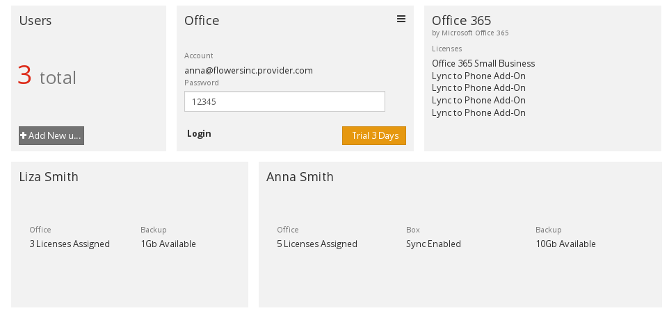
["aps/Output", {
label: "Office",
value: "15 Licenses Assigned"
}]
]],
["aps/FieldSet", [
["aps/Output", {
label: "Box",
value: "Sync Enabled"
}]
]],
["aps/FieldSet", [
["aps/Output", {
label: "Backup",
value: "10Gb Available"
}]
]]
]
]
]
],
["aps/Tile", {
title: "Anna Smith",
gridSize: "md-5 xs-12",
onClick: function() {}
},
[
["aps/FieldSet", [
["aps/Output", {
gridSize: "md-5 xs-12",
label: "Office",
value: "5 Licenses Assigned"
}],
["aps/Output", {
gridSize: "md-4 xs-12",
label: "Box",
value: "Sync Enabled"
}],
["aps/Output", {
gridSize: "md-4 xs-12",
label: "Backup",
value: "10Gb Available"
}]
]]
]
],
["aps/tiles/PieTile", {
title: "Box",
gridSize: "md-7 xs-12",
maximum: 1000,
value: 928,
legend: "${value}GB of ${maximum}GB currently used",
buttons: [{
label: "Add Storage",
type: "success"
}]
}]
]
]);
});
Declaration based on Store
require([
    "aps/load",
    "aps/Memory",
    "dojox/mvc/at",
    "aps/ready!"
], function(load, Memory, at) {
    var data = [{
        aps: {
            id: "1"
        },
        infoText: "infoText",
        info: {
            title: "Linux Server 1"
        },
        params: {
            disk: 152,
            ram: 199,
            cpu: 2
        }
    }, {
        aps: {
            id: "2"
        },
        infoText: "infoText",
        info: {
            title: "Linux Server 2"
        },
        params: {
            disk: 152,
            ram: 917,
            cpu: 965
        }
    }, {
        aps: {
            id: "3"
        },
        infoText: "infoText",
        info: {
            title: "Linux Server 3"
        },
        params: {
            disk: 152,
            ram: 919,
            cpu: 899
        }
    }, {
        aps: {
            id: "4"
        },
        infoText: "infoText",
        info: {
            title: "Linux Server 4"
        },
        params: {
            disk: 152,
            ram: 177,
            cpu: 600
        }
    }];

    var store = new Memory({
        data: data,
        idProperty: "aps.id"
    });

    load(["aps/Tiles", {
            title: "My tiles",
            store: store,
            selectionMode: "multiple",
            required: false
        },
        [
            ["aps/Tile", {
                    title: at("rel:info", "title"),
                    gridSize: "md-12 xs-12"
                },
                [
                    ["aps/Container", [
                        ["aps/Pie", {
                            title: "${value}",
                            gridSize: "md-4 xs-12",
                            maximum: 1000,
                            legend: "of ${maximum} GB Disk Space",
                            value: at("rel:params", "disk")
                        }],
                        ["aps/Pie", {
                            title: "${value}",
                            gridSize: "md-4 xs-12",
                            maximum: 1024,
                            legend: "of ${maximum} MB RAM Space",
                            value: at("rel:params", "ram")
                        }],
                        ["aps/Pie", {
                            title: "${value}",
                            gridSize: "md-4 xs-12",
                            maximum: 1000,
                            legend: "of ${maximum} MHz CPU Power",
                            value: at("rel:params", "cpu")
                        }]
                    ]]
                ]
            ]
        ]
    ]);
});
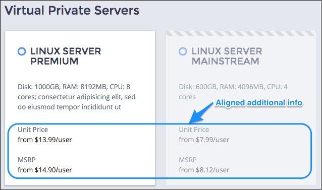
Alignment of Additional Info
The additionalInfo property of child widgets is used to display a bottom-aligned content:
require([
    "aps/load",
    "aps/Memory",
    "dojox/mvc/at",
    "aps/ready!"
], function(load, Memory, at) {
    var data = [{
        aps: {
            id: "1"
        },
        title: "Linux Server premium",
        state: "inactive",
        serviceDescription: "Disk: 1000GB, RAM: 8192MB, CPU: 8 cores; consectetur adipisicing elit, sed do eiusmod tempor incididunt ut",
        additionalInfo: function(data) {
            return [
                ["aps/FieldSet", [
                    ["aps/Output", {
                        label: 'Unit Price',
                        content: 'from $13.99/user'
                    }],
                    ["aps/Output", {
                        label: 'MSRP',
                        content: 'from $14.90/user'
                    }]
                ]]
            ];
        }
    }, {
        aps: {
            id: "2"
        },
        title: "Linux Server mainstream",
        state: "inProgress",
        serviceDescription: "Disk: 600GB, RAM: 4096MB, CPU: 4 cores",
        additionalInfo: function(data) {
            return [
                ["aps/FieldSet", [
                    ["aps/Output", {
                        label: 'Unit Price',
                        content: 'from $7.99/user'
                    }],
                    ["aps/Output", {
                        label: 'MSRP',
                        content: 'from $8.12/user'
                    }]
                ]]
            ];
        }
    }];

    var store = new Memory({
        data: data,
        idProperty: "aps.id"
    });

    load(["aps/Tiles", {
        title: "Virtual Private Servers",
        store: store,
        selectionMode: "singe"
    },
        [
            ["aps/Tile", {
                title: at("rel:", "title"),
                gridSize: "md-4 xs-12",
                state: at("rel:", "state"),
                serviceDescription: at("rel:", "serviceDescription"),
                additionalInfo: at("rel:", "additionalInfo")
            }]
        ]
    ]);
});
Public Properties
PROPERTY |
TYPE |
DEFAULT |
DESCRIPTION |
|---|---|---|---|
number |
1 |
Number of the current page. |
|
string |
“” |
Text that is shown in the header, but smaller than the title. |
|
boolean |
false |
Specifies if the widget will respond to user input. |
|
boolean |
false |
If it is true the widget’s id will be extended. |
|
string |
undefined |
This specifies the widget width that is relevant only for widgets inside Container, FieldSet, or Tiles. |
|
boolean |
false |
If the widget is busy then this property is true. |
|
number |
10 |
Quantity of items to show on a given page. |
|
string |
“” |
Text that is shown as a label if the widget is placed inside a aps/FieldSet. |
|
string |
This selection is required. |
The message to display if selection is empty and is required. |
|
string |
“No data” |
Shown if the answer of the server is empty. |
|
boolean |
false |
If true then at least one tile should be selected, otherwise validation will fail. |
|
array |
null |
StatefulArray of the ids of selected tiles. |
|
string |
“” |
If you want to mark tiles, you can specify this property. |
|
aps/store |
null |
An instance of the “aps/Store” model, from which to fetch data. |
|
string |
“” |
Text that is shown in the header. |
|
boolean |
true |
If this property value is set to true, then the widget is visible. |
currentPage number
Number of the current page. Default value: 1.
description string
Text that is shown in the header, but smaller than the title. Default value: “”.
extendedId boolean
If it is true the widget’s id will be extended. It can be useful when some widgets (e.g. aps/Tiles) use the same store with defined id-s. Default value: false.
gridSize string
This specifies the widget width that is relevant only for widgets inside Container, FieldSet, or Tiles. In other cases it will be ignored.
gridSize string contains few options with number values (from 1 to 12) separated by spaces, which specify the grid size of the widget in different layouts:
- md - desktop
- xs - phone
For example, gridSize: “md-4 xs-2”.
All values below 1, e.g. “md-0”, will be replaced with the empty string (“”), values above 12, e.g. “md-14”, will be reduced to 12 (“md-12”).
Default value: undefined.
itemsPerPage number
Quantity of items to show on a given page. Default value: 10.
label string
Text that is shown as a label if the widget is placed inside a aps/FieldSet.
Default value: “”.
missingMessage string
The message to display if selection is empty and is required. The translated string value is read from the message file by default. Default value: “This selection is required.”
noDataText string
Shown if the answer of the server is empty. The default value is “No data”.
required boolean
If true then at least one tile should be selected, otherwise validation will fail. Default value: false.
selectionArray array
StatefulArray of the ids of selected tiles. Default value: null.
selectionMode string
If you want to mark tiles, you can specify this property. Supported values: “single” and “multiple”. single - user can mark only one tile. multiple - user can mark many tiles. Default value: “”.
store aps/store
An instance of the “aps/Store” model, from which to fetch data. Default value: null.
title string
Text that is shown in the header. Default value: “”.
visible boolean
If this property value is set to true, then the widget is visible.
Default value: true.
Public Methods
METHOD |
RETURN |
DESCRIPTION |
|---|---|---|
object
|
Sets the isBusy property to false |
|
undefined
|
Destroys this widget |
|
aps/_containerbase
function
|
Focusing the focusable child |
|
any
|
Get a property of the Stateful instance |
|
array
|
Returns all direct children of this widget, i |
|
array
|
Discover and return all parents of the widget |
|
dijit/_widgetbase
function
|
Place this widget somewhere in the DOM based on standard dojo/dom-construct::place() conventions |
|
undefined
|
Redrawis the set of tiles |
|
undefined
|
Remove all children in the widget and make selectionArray empty |
|
undefined
|
Removes the passed widget instance from this widget and destroys it |
|
undefined
|
Resets the widget |
|
object
function
|
Set a property of the Stateful instance |
|
undefined
|
Gets started after the DOM fragment is added to the document |
|
undefined
boolean
|
Called by oninit, onblur, and onkeypress |
addChild
ARGUMENT |
TYPE |
DESCRIPTION |
|---|---|---|
|
undefined
|
|
|
undefined
|
Position child in the parent widget |
destroy
Destroys this widget. Will also destroy any resources (including widgets) registered via this.own(). This method will also destroy internal widgets such as those created from a template.
Return: undefined
get
Get a property of the Stateful instance. Get a named property of the Stateful object. The property may potentially be retrieved via a getter method in subclasses.
In the base class, this just retrieves the object’s property.
Return: any
getChildren
Returns all direct children of this widget, i.e. all widgets underneath this.containerNode whose parent is this widget. Note that it returns not all descendetns, but only the direct children. Analogous to Node.childNodes, except containing widgets rather than DOMNodes.
The result intentionally excludes internally created widgets (a.k.a. supporting widgets) outside of this.containerNode.
Note the returned array is a simple array. The application code should not assume existence of methods like forEach().
Return: array
placeAt
Place this widget somewhere in the DOM based on standard dojo/dom-construct::place() conventions. A convenience function providing a simple shorthand mechanism to put an existing (or newly created) widget somewhere in the DOM, and allow chaining.
Return: dijit/_widgetbase function
refresh
Redrawis the set of tiles. Redraws the set of tiles to present the current data in the Store.
Return: undefined
removeAll
Remove all children in the widget and make selectionArray empty. Calls “destroy” on all tiles and their descendants.
Return: undefined
removeChild
Removes the passed widget instance from this widget and destroys it. You can also pass in an integer indicating the index within the container to remove (ie, removeChild(5) removes the sixth widget).
Return: undefined
ARGUMENT |
TYPE |
DESCRIPTION |
|---|---|---|
|
Widget
Int
|
Child widget or index |
set
Set a property of the Stateful instance. Sets named properties of the stateful object and notifies the watchers of the property. A programmatic setter may be defined in subclasses.
Return: object function
startup
Gets started after the DOM fragment is added to the document Called after the widget and its children have been created and added to the page, and all related widgets have finished their create() cycle, up through postCreate().
Note that startup() may be called while the widget is still hidden, for example if the widget is inside a hidden dijit/Dialog or an unselected tab of a dijit/layout/TabContainer. For widgets that need to do layout, it’s best to put that layout code inside resize(), and then extend dijit/layout/_LayoutWidget so that resize() is called when the widget is visible.
Return: undefined
validate
Called by oninit, onblur, and onkeypress. Show missing or invalid messages if appropriate, and highlight textbox field.
Return: undefined boolean
Public Events
EVENT |
RETURN |
DESCRIPTION |
|---|---|---|
undefined
|
The method is called when a user clicks on the widget |
onClick
The method is called when a user clicks on the widget.