CloudBlue Commerce API (DRAFT)
Table Of Contents
aps/Panel
Highlighted block that can contain widgets.
Table of contents
Compatibility
UX1 only
Overview
Structure
It is a separate visual block containing other widgets. The widget can show its status, for example, Loading.
Find the nested rules for this widget in the recommended Widget Hierarchy.
You can add widgets to aps/Panel in the same way as you would do it for aps/Container.
Status
The busy or loading status prevents users from submission of a method when the previous method is not completed yet.
If you need to set a panel to the busy or loading status, set respectively the isBusy or isLoad property
to true. When the panel is busy, it is visible but not available for operations.
When the panel is loading, the loadLabel property is displayed. Method cancel turns off both of the statuses,
busy and loading.
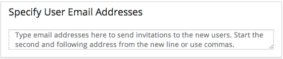
Example
In the following sample code, the Panel contains a TextArea widget with a text inside it.
require([
    "aps/load",
    "aps/ready!"
], function(load) {
    load(["aps/Panel", {
            title: "Specify User Email Addresses"
        },
        [
            ["aps/TextArea", {
                placeHolder: "Type email addresses here" +
                	"to send invitations to the new users." +
                  "Start the second and following address" +
                	"from the new line or use commas.",
                rows: 3
            }]
        ]
    ]);
});
Public Properties
PROPERTY |
TYPE |
DEFAULT |
DESCRIPTION |
|---|---|---|---|
array |
undefined |
Defines buttons in the toolbar inside the Tile. |
|
boolean |
<strong>false</strong> |
If this property value is set to false, the inner part of the panel is visible. |
|
boolean |
<strong>false</strong> |
If the value is false, the panel cannot be collapsed. |
|
string |
“” |
Text displayed below the title. |
|
boolean |
false |
Specifies if the widget will respond to user input. |
|
string |
undefined |
This specifies the widget width that is relevant only for widgets inside Container, FieldSet, or Tiles. |
|
string |
“” |
Text displayed below the description. |
|
boolean |
false |
If the widget is busy then this property is true. |
|
boolean |
<strong>false</strong> |
If a panel is disabled and its content is hidden then this property is true. |
|
string |
“” |
Text that is shown as a label if the widget is placed inside a aps/FieldSet. |
|
string |
“Loading” |
Text displayed while the panel is loading. |
|
string |
“” |
Text displayed on top of the panel. |
|
boolean |
true |
If this property value is set to true, then the widget is visible. |
buttons array
Defines buttons in the toolbar inside the Tile. Default value: undefined. Each button is defined as an object with the following properties:
iconClass: String         // CSS class of the button.
label: String             // Label on the button.
disabled: Boolean         // Specifies if the button will respond to user action.
type: String              // Type of the button.
onClick: function         // Callback function.
alphaButtonState: String  // Defines the state of alpha button. Possible values: "active", "inactive".
hasRevertButton: Boolean  // Specifies if there will be a revert button.
items: array              /* Defines the second level toolbar containing buttons
                             with the same set of properties as mentioned above.
                             This toolbar is available when a user clicks on
                             the top level button where the toolbar is defined. */
collapsed boolean
If this property value is set to false, the inner part of the panel is visible. The default value is false.
collapsible boolean
If the value is false, the panel cannot be collapsed. The default value is false.
description string
Text displayed below the title. Default value: “”.
gridSize string
This specifies the widget width that is relevant only for widgets inside Container, FieldSet, or Tiles. In other cases it will be ignored.
gridSize string contains few options with number values (from 1 to 12) separated by spaces, which specify the grid size of the widget in different layouts:
- md - desktop
- xs - phone
For example, gridSize: “md-4 xs-2”.
All values below 1, e.g. “md-0”, will be replaced with the empty string (“”), values above 12, e.g. “md-14”, will be reduced to 12 (“md-12”).
Default value: undefined.
hint string
Text displayed below the description. Deprecated in CCP v2. Default value: “”.
isLoad boolean
If a panel is disabled and its content is hidden then this property is true. The default value is false.
label string
Text that is shown as a label if the widget is placed inside a aps/FieldSet.
Default value: “”.
loadLabel string
Text displayed while the panel is loading. The default value is “Loading”.
title string
Text displayed on top of the panel. Default value: “”.
visible boolean
If this property value is set to true, then the widget is visible.
Default value: true.
Public Methods
METHOD |
RETURN |
DESCRIPTION |
|---|---|---|
undefined
|
Makes the given widget a child of this widget |
|
any
|
To prevent double submission by a user, widget is switched to the busy or load state automatically each time after the user clicks |
|
undefined
|
Destroys this widget |
|
aps/_containerbase
function
|
Focusing the focusable child |
|
any
|
Get a property of the Stateful instance |
|
array
|
Returns all direct children of this widget, i |
|
array
|
Discover and return all parents of the widget |
|
dijit/_widgetbase
function
|
Place this widget somewhere in the DOM based on standard dojo/dom-construct::place() conventions |
|
undefined
|
Remove all children in the widget |
|
undefined
|
Removes the passed widget instance from this widget and destroys it |
|
undefined
|
Resets the widget |
|
object
function
|
Set a property of the Stateful instance |
|
undefined
|
Gets started after the DOM fragment is added to the document |
|
boolean
|
Called by oninit, onblur, and onkeypress |
addChild
Makes the given widget a child of this widget. Inserts specified child widget’s dom node as a child of this widget’s container node, and possibly does other processing (such as layout).
Return: undefined
ARGUMENT |
TYPE |
DESCRIPTION |
|---|---|---|
|
Widget
|
Child widget |
|
Number
String
|
Position child in the parent widget |
cancel
To prevent double submission by a user, widget is switched to the busy or load state automatically each time after the user clicks. To switch the button back to the enabled state, call the cancel() method in your onClick handler.
Return: any
destroy
Destroys this widget. Will also destroy any resources (including widgets) registered via this.own(). This method will also destroy internal widgets such as those created from a template.
Return: undefined
get
Get a property of the Stateful instance. Get a named property of the Stateful object. The property may potentially be retrieved via a getter method in subclasses.
In the base class, this just retrieves the object’s property.
Return: any
getChildren
Returns all direct children of this widget, i.e. all widgets underneath this.containerNode whose parent is this widget. Note that it returns not all descendetns, but only the direct children. Analogous to Node.childNodes, except containing widgets rather than DOMNodes.
The result intentionally excludes internally created widgets (a.k.a. supporting widgets) outside of this.containerNode.
Note the returned array is a simple array. The application code should not assume existence of methods like forEach().
Return: array
placeAt
Place this widget somewhere in the DOM based on standard dojo/dom-construct::place() conventions. A convenience function providing a simple shorthand mechanism to put an existing (or newly created) widget somewhere in the DOM, and allow chaining.
Return: dijit/_widgetbase function
removeChild
Removes the passed widget instance from this widget and destroys it. You can also pass in an integer indicating the index within the container to remove (ie, removeChild(5) removes the sixth widget).
Return: undefined
ARGUMENT |
TYPE |
DESCRIPTION |
|---|---|---|
|
Widget
Int
|
Child widget or index |
set
Set a property of the Stateful instance. Sets named properties of the stateful object and notifies the watchers of the property. A programmatic setter may be defined in subclasses.
Return: object function
startup
Gets started after the DOM fragment is added to the document Called after the widget and its children have been created and added to the page, and all related widgets have finished their create() cycle, up through postCreate().
Note that startup() may be called while the widget is still hidden, for example if the widget is inside a hidden dijit/Dialog or an unselected tab of a dijit/layout/TabContainer. For widgets that need to do layout, it’s best to put that layout code inside resize(), and then extend dijit/layout/_LayoutWidget so that resize() is called when the widget is visible.
Return: undefined
validate
Called by oninit, onblur, and onkeypress. Show missing or invalid messages if appropriate, and highlight textbox field.
Return: boolean
Public Events
EVENT |
RETURN |
DESCRIPTION |
|---|---|---|
undefined
|
The method is called when a user clicks on the widget |
onClick
The method is called when a user clicks on the widget.