CloudBlue Commerce API (DRAFT)
Table Of Contents
aps/Pie
The widget presents a resource usage in the form of a pie-diagram.
This widget is a simplified interface of the aps/UsageInfo widget. Please use the latter if you need more features.
Table of contents
Compatibility
UX1 only
Overview
Find the nested rules for this widget in the recommended Widget Hierarchy.
To insert a pie widget into Tiles use the aps/tiles/PieTile widget.
Example
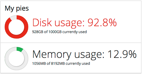
Pie Definition
require([
   "aps/load",
   "aps/ready!"
], function(load) {
    load(["aps/PageContainer", [
       ["aps/Panel", {
           title: "My pies"
       },
       [
           ["aps/Pie", {
               title: "Disk usage: ${percent}%",
               maximum: 1000,
               value: 928,
               legend: "${value} of ${maximum}GB currently used"
           }],
           ["aps/Hr", {visible: true, gridSize: "md-12"}],
           ["aps/Pie", {
               title: "Memory usage: ${percent}%",
               maximum: 8192,
               value: 1056,
               legend: "${value} of ${maximum}MB currently used"
           }]

       ]
    ]]]);
});
Demonstration of titleType
require([
    "aps/load",
    "aps/ready!"
], function(load) {
    load(["aps/Tiles", [
        ["aps/Tile", {
                title: "Default title with default titleType"
            },
            [
                ["aps/Pie", {
                    maximum: 8192,
                    value: 8056,
                    legend: "${value} of ${maximum}MB currently used"
                }]
            ]
        ],
        ["aps/Tile", {
                title: "Default title with titleType:'usage'"
            },
            [
                ["aps/Pie", {
                    titleType: "usage",
                    maximum: 8192,
                    value: 8056,
                    legend: "${value} of ${maximum}MB currently used"
                }]
            ]
        ],
        ["aps/Tile", {
                title: "Title is defined explicitly"
            },
            [
                ["aps/Pie", {
                    title: "${value} Random Text",
                    maximum: 8192,
                    value: 1056,
                    legend: "${value} of ${maximum}MB currently used"
                }]
            ]
        ]
    ]]);
});
Public Properties
PROPERTY |
TYPE |
DEFAULT |
DESCRIPTION |
|---|---|---|---|
number |
100 |
Available amount of the respective resource - ``maximum`` - ``value``. Property is readonly. |
|
string |
“” |
Text printed under the numbers. |
|
boolean |
false |
Specifies if the widget will respond to user input. |
|
string |
undefined |
This specifies the widget width that is relevant only for widgets inside Container, FieldSet, or Tiles. |
|
string |
“” |
Textual hint to be displayed as a small greyed text under the numbers. |
|
boolean |
false |
If the widget is busy then this property is true. |
|
string |
“” |
Text that is shown as a label if the widget is placed inside a aps/FieldSet. |
|
sting |
“” |
Legend or description. |
|
number |
100 |
Upper limit. |
|
number |
0 |
Lower limit. |
|
number |
0 |
Pie percent. Property is readonly. |
|
number |
0 |
The precision of the value property. |
|
boolean |
true |
Determines if to texts and numbers or not. |
|
string |
“” |
Title of the diagram (colored red if the ``value`` exceeds the threshold). |
|
string |
percent |
Specifies whether the ``pieTitle`` presents the ``value/ maximum`` as a percentage (“percent” value) or as an absolute value (“usage” value). |
|
number |
0 |
Current value. |
|
boolean |
true |
If this property value is set to true, then the widget is visible. |
available number readonly
Available amount of the respective resource - ``maximum`` - ``value``. Default value: 100.
description string
Text printed under the numbers. It describes the resource usage. Can use templates, for example, ${percent}. Default value: “”.
gridSize string
This specifies the widget width that is relevant only for widgets inside Container, FieldSet, or Tiles. In other cases it will be ignored.
gridSize string contains few options with number values (from 1 to 12) separated by spaces, which specify the grid size of the widget in different layouts:
- md - desktop
- xs - phone
For example, gridSize: “md-4 xs-2”.
All values below 1, e.g. “md-0”, will be replaced with the empty string (“”), values above 12, e.g. “md-14”, will be reduced to 12 (“md-12”).
Default value: undefined.
hint string
Textual hint to be displayed as a small greyed text under the numbers. Can use templates, for example, ${percent}. Default value: “”.
label string
Text that is shown as a label if the widget is placed inside a aps/FieldSet.
Default value: “”.
legend sting
Legend or description. Default value: “”.
maximum number
Upper limit. The default value is 100.
minimum number
Lower limit. The default value is 0.
percent number readonly
Pie percent. Calculated as (``value`` / ``maximum``) * 100 Default value: 0.
precision number
The precision of the value property. This property doesn’t affect any other properties except ‘value’. Determines the number of digits after the decimal point to show. The default value is 0.
showText boolean
Determines if to texts and numbers or not. The default value is true.
title string
Title of the diagram (colored red if the ``value`` exceeds the threshold). If the property is not set, the ``value/maximum`` is displayed. Default value: “”.
titleType string
Specifies whether the ``pieTitle`` presents the ``value/ maximum`` as a percentage (“percent” value) or as an absolute value (“usage” value). Default value: “percent”.
value number
Current value. The default value is 0.
visible boolean
If this property value is set to true, then the widget is visible.
Default value: true.
Public Methods
METHOD |
RETURN |
DESCRIPTION |
|---|---|---|
object
|
Sets the isBusy property to false |
|
undefined
|
Destroys this widget |
|
any
|
Get a property of the Stateful instance |
|
array
|
Discover and return all parents of the widget |
|
dijit/_widgetbase
function
|
Place this widget somewhere in the DOM based on standard dojo/dom-construct::place() conventions |
|
object
function
|
Set a property of the Stateful instance |
|
undefined
|
Gets started after the DOM fragment is added to the document |
destroy
Destroys this widget. Will also destroy any resources (including widgets) registered via this.own(). This method will also destroy internal widgets such as those created from a template.
Return: undefined
get
Get a property of the Stateful instance. Get a named property of the Stateful object. The property may potentially be retrieved via a getter method in subclasses.
In the base class, this just retrieves the object’s property.
Return: any
placeAt
Place this widget somewhere in the DOM based on standard dojo/dom-construct::place() conventions. A convenience function providing a simple shorthand mechanism to put an existing (or newly created) widget somewhere in the DOM, and allow chaining.
Return: dijit/_widgetbase function
set
Set a property of the Stateful instance. Sets named properties of the stateful object and notifies the watchers of the property. A programmatic setter may be defined in subclasses.
Return: object function
startup
Gets started after the DOM fragment is added to the document Called after the widget and its children have been created and added to the page, and all related widgets have finished their create() cycle, up through postCreate().
Note that startup() may be called while the widget is still hidden, for example if the widget is inside a hidden dijit/Dialog or an unselected tab of a dijit/layout/TabContainer. For widgets that need to do layout, it’s best to put that layout code inside resize(), and then extend dijit/layout/_LayoutWidget so that resize() is called when the widget is visible.
Return: undefined
Public Events
EVENT |
RETURN |
DESCRIPTION |
|---|---|---|
undefined
|
The method is called when a user clicks on the widget |
onClick
The method is called when a user clicks on the widget.