CloudBlue Commerce API (DRAFT)
Table Of Contents
aps/Tabs
This widget container is used to pack more information into a single context. The allowed child widget is ``aps/Tab``.
Table of contents
Compatibility
UX1 only.
Overview
An aps/Tabs container with its child aps/Tab containers provides a convenient way to create a number of
tabbed sections in a single aps/Panel or aps/PageContainer parent container.
Example
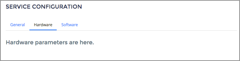
A pair of tabs added to an asp/Panel container:
require([
    "aps/load",
    "aps/ready!"
], function(load) {
    load(["aps/Panel", {
        title: "Service Configuration"
    },
        [
            ["aps/Tabs", {
                activeTabId: '2' // Tab 2 is selected by default
            },
                [
                    ['aps/Tab', {
                        id: '1',
                        tabTitle: 'General',
                        title: 'General parameters are here.'
                    }

                    ],
                    [
                        'aps/Tab', {
                        id: '2',
                        tabTitle: 'Hardware',
                        title: 'Hardware parameters are here.'
                    }
                    ]

                ]

            ]
        ]
    ]);
});
Public Properties
PROPERTY |
TYPE |
DEFAULT |
DESCRIPTION |
|---|---|---|---|
string |
undefined |
The active child aps/Tab identifier. |
|
boolean |
false |
If this property value is set to “false”, the inner part of the widget is visible. |
|
boolean |
false |
A container may provide a user an ability to collapse its content and leave only the title visible. |
|
number |
0 |
Number of columns in a container. |
|
string |
“” |
Text under the header of the Container and over the content of the Container. |
|
boolean |
false |
Specifies if the widget will respond to user input. |
|
string |
undefined |
This specifies the widget width that is relevant only for widgets inside Container, FieldSet, or Tiles. |
|
string |
“” |
It contains supplemental information. |
|
boolean |
false |
If the widget is busy then this property is true. |
|
string |
“” |
Text that is shown in aps. |
|
string |
“” |
Text that is shown in the header of the Container. |
|
boolean |
true |
If this property value is set to true, then the widget is visible. |
activeTabId string
The active child aps/Tab identifier. Default value: undefined.
collapsed boolean
If this property value is set to “false”, the inner part of the widget is visible. Default value: false.
collapsible boolean
A container may provide a user an ability to collapse its content and leave only the title visible. Default value: false.
cols number
Number of columns in a container. Supported values: 0 and 2. The default value is 0.
description string
Text under the header of the Container and over the content of the Container. Default value: “”.
gridSize string
This specifies the widget width that is relevant only for widgets inside Container, FieldSet, or Tiles. In other cases it will be ignored.
gridSize string contains few options with number values (from 1 to 12) separated by spaces, which specify the grid size of the widget in different layouts:
- md - desktop
- xs - phone
For example, gridSize: “md-4 xs-2”.
All values below 1, e.g. “md-0”, will be replaced with the empty string (“”), values above 12, e.g. “md-14”, will be reduced to 12 (“md-12”).
Default value: undefined.
hint string
It contains supplemental information. Deprecated in CCP v2. Default value: “”.
label string
Text that is shown in aps.FieldSet. Don’t shown in the header of the Container. Default value: “”.
title string
Text that is shown in the header of the Container. Don’t shown in aps.FieldSet. Default value: “”.
visible boolean
If this property value is set to true, then the widget is visible.
Default value: true.
Public Methods
METHOD |
RETURN |
DESCRIPTION |
|---|---|---|
object
|
Sets the isBusy property to false |
|
undefined
|
Destroys this widget |
|
aps/_container
function
|
Focusing on the focusNode of the first suitable child |
|
any
|
Get a property of the Stateful instance |
|
array
|
Returns all direct children of this widget, i |
|
array
|
Discover and return all parents of the widget |
|
dijit/_widgetbase
function
|
Place this widget somewhere in the DOM based on standard dojo/dom-construct::place() conventions |
|
undefined
|
Remove all children in the widget |
|
undefined
|
Removes the passed widget instance from this widget and destroys it |
|
undefined
|
Resets the widget |
|
object
function
|
Set a property of the Stateful instance |
|
addChild
ARGUMENT |
TYPE |
DESCRIPTION |
|---|---|---|
|
undefined
|
|
|
undefined
|
destroy
Destroys this widget. Will also destroy any resources (including widgets) registered via this.own(). This method will also destroy internal widgets such as those created from a template.
Return: undefined
get
Get a property of the Stateful instance. Get a named property of the Stateful object. The property may potentially be retrieved via a getter method in subclasses.
In the base class, this just retrieves the object’s property.
Return: any
getChildren
Returns all direct children of this widget, i.e. all widgets underneath this.containerNode whose parent is this widget. Note that it returns not all descendetns, but only the direct children. Analogous to Node.childNodes, except containing widgets rather than DOMNodes.
The result intentionally excludes internally created widgets (a.k.a. supporting widgets) outside of this.containerNode.
Note the returned array is a simple array. The application code should not assume existence of methods like forEach().
Return: array
placeAt
Place this widget somewhere in the DOM based on standard dojo/dom-construct::place() conventions. A convenience function providing a simple shorthand mechanism to put an existing (or newly created) widget somewhere in the DOM, and allow chaining.
Return: dijit/_widgetbase function
removeChild
Removes the passed widget instance from this widget and destroys it. You can also pass in an integer indicating the index within the container to remove (ie, removeChild(5) removes the sixth widget).
Return: undefined
ARGUMENT |
TYPE |
DESCRIPTION |
|---|---|---|
|
Widget
Int
|
Child widget or index |
set
Set a property of the Stateful instance. Sets named properties of the stateful object and notifies the watchers of the property. A programmatic setter may be defined in subclasses.
Return: object function
startup
Public Events
EVENT |
RETURN |
DESCRIPTION |
|---|---|---|
undefined
|
The method is called when a user clicks on the widget |
onClick
The method is called when a user clicks on the widget.