CloudBlue Commerce API (DRAFT)
Table Of Contents
aps/ToolsList
Container for aps/ToolsItem widgets.
Group of clickable PCP-style elements, like a large icon with a label and description.
Table of contents
Overview
With the aps/ToolsList widget, you can display a set of links of a
special kind, which are created using aps/ToolsItem widgets, and
supplement it with text information, if necessary. When a tool is clicked,
in most cases another screen is opening to perform the required action.
Find the nested rules for this widget in the recommended Widget Hierarchy.
An aps/ToolsList with several aps/ToolsItem widgets can be declared using any of
declaration methods.
The only property defined in the widget module is cols (default value is 3) that defines a number of columns used
by the child elements.
The usual common information the ToolsList may display:
title- a title of the listdescription- a description of the listhint- supplemental information about the list
Examples
Set of Widgets
In the simplest case, a aps/ToolsList is just a set of aps/ToolsItem widgets.
require(["aps/load", "aps/ready!"],
  function(load){
    "use strict";

    load(["aps/PageContainer", [
          ["aps/ToolsList",
                  [[ "aps/ToolsItem", {
                      title:
                          "Mass E-Mail Messages",
                      description:
                          "Send an e-mail message to a number of Panel users at once.",
                      iconName:
                          "/aps/ppanel-theme/icons/32/plesk/mass-email-messages.png"
                    } ],
                  [ "aps/ToolsItem", {
                      title:
                          "Scheduled Tasks",
                      description:
                          "Schedule execution of scripts or utilities on the server.",
                      iconName:
                          "/aps/ppanel-theme/icons/32/plesk/scheduled-tasks.png"
                }]]
        ]
    ]]);
});
Together with Title and Description
require(["aps/load", "aps/ready!"],
function(load){
"use strict";
load(["aps/PageContainer", [
["aps/ToolsList", {
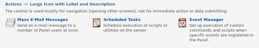
title: "Actions -> Large Icon with Label and Description",
description: "The control is used mostly for navigation (opening other " +
"screens), not for immediate action or data submitting." },
[[ "aps/ToolsItem", {
title:
"Mass E-Mail Messages",
description:
"Send an e-mail message to a number of Panel users at once.",
iconName:
"/aps/ppanel-theme/icons/32/plesk/mass-email-messages.png"
}],
[ "aps/ToolsItem", {
title:
"Scheduled Tasks",
description:
"Schedule execution of scripts or utilities on the server.",
iconName:
"/aps/ppanel-theme/icons/32/plesk/scheduled-tasks.png"
}]]
]
]]);
});
Horizontal Line in Place of Title
To display a horizontal line above a aps/ToolsList that does not have
title text, you need to set the title property to true.
require(["aps/load", "aps/ready!"],
   function(load){
     "use strict";

     load(["aps/PageContainer", [
           ["aps/ToolsList", { title: true },
                  [[ "aps/ToolsItem", {
                       title:
                           "Mass E-Mail Messages",
                       description:
                           "Send an e-mail message to a number of Panel users at once.",
                       iconName:
                           "/aps/ppanel-theme/icons/32/plesk/mass-email-messages.png"
                     }],
                   [ "aps/ToolsItem", {
                       title:
                           "Scheduled Tasks",
                       description:
                           "Schedule execution of scripts or utilities on the server.",
                       iconName:
                           "/aps/ppanel-theme/icons/32/plesk/scheduled-tasks.png"
               }]]
         ]
     ]]);
 });
Allow Collapsing
aps/ToolsList may provide a user an ability to collapse
its content and leave only the title visible. To do this,
you need to set the collapsible property to true.
require(["aps/load", "aps/ready!"],
   function(load){
     "use strict";

     load(["aps/PageContainer", [
           ["aps/ToolsList", {
                  title:      "Actions -> Large Icon with Label and Description",
                  collapsible: true
                }, [
                     [ "aps/ToolsItem", {
                           title:
                               "Mass E-Mail Messages",
                           description:
                               "Send an e-mail message to a number of Panel users at once.",
                           iconName:
                               "/aps/ppanel-theme/icons/32/plesk/mass-email-messages.png"
                       }],
                     [ "aps/ToolsItem", {
                           title:
                               "Scheduled Tasks",
                           description:
                               "Schedule execution of scripts or utilities on the server.",
                           iconName:
                               "/aps/ppanel-theme/icons/32/plesk/scheduled-tasks.png"
                 }]]
         ]
     ]]);
 });
Public Properties
PROPERTY |
TYPE |
DEFAULT |
DESCRIPTION |
|---|---|---|---|
boolean |
false |
If this property value is set to “false”, the inner part of the widget is visible. |
|
boolean |
false |
A container may provide a user an ability to collapse its content and leave only the title visible. |
|
number |
3 |
Number of columns in a container. |
|
string |
“” |
Text under the header of the Container and over the content of the Container. |
|
boolean |
false |
Specifies if the widget will respond to user input. |
|
string |
undefined |
This specifies the widget width that is relevant only for widgets inside Container, FieldSet, or Tiles. |
|
string |
“” |
It contains supplemental information. |
|
boolean |
false |
If the widget is busy then this property is true. |
|
string |
“” |
Text that is shown in aps. |
|
string |
“” |
Text that is shown in the header of the Container. |
|
boolean |
true |
If this property value is set to true, then the widget is visible. |
collapsed boolean
If this property value is set to “false”, the inner part of the widget is visible. Default value: false.
collapsible boolean
A container may provide a user an ability to collapse its content and leave only the title visible. Default value: false.
cols number
Number of columns in a container. The default value is 3.
description string
Text under the header of the Container and over the content of the Container. Default value: “”.
gridSize string
This specifies the widget width that is relevant only for widgets inside Container, FieldSet, or Tiles. In other cases it will be ignored.
gridSize string contains few options with number values (from 1 to 12) separated by spaces, which specify the grid size of the widget in different layouts:
- md - desktop
- xs - phone
For example, gridSize: “md-4 xs-2”.
All values below 1, e.g. “md-0”, will be replaced with the empty string (“”), values above 12, e.g. “md-14”, will be reduced to 12 (“md-12”).
Default value: undefined.
hint string
It contains supplemental information. Deprecated in CCP v2. Default value: “”.
label string
Text that is shown in aps.FieldSet. Don’t shown in the header of the Container. Default value: “”.
title string
Text that is shown in the header of the Container. Don’t shown in aps.FieldSet. Default value: “”.
visible boolean
If this property value is set to true, then the widget is visible.
Default value: true.
Public Methods
METHOD |
RETURN |
DESCRIPTION |
|---|---|---|
undefined
|
Addition of a new child widget |
|
object
|
Sets the isBusy property to false |
|
undefined
|
Destroys this widget |
|
aps/_container
function
|
Focusing on the focusNode of the first suitable child |
|
any
|
Get a property of the Stateful instance |
|
array
|
Returns all direct children of this widget, i |
|
array
|
Discover and return all parents of the widget |
|
dijit/_widgetbase
function
|
Place this widget somewhere in the DOM based on standard dojo/dom-construct::place() conventions |
|
undefined
|
Remove all children in the widget |
|
undefined
|
Removes the passed widget instance from this widget and destroys it |
|
undefined
|
Resets the widget |
|
object
function
|
Set a property of the Stateful instance |
|
undefined
|
Gets started after the DOM fragment is added to the document |
|
boolean
|
Called by oninit, onblur, and onkeypress |
addChild
Addition of a new child widget.
Return: undefined
ARGUMENT |
TYPE |
DESCRIPTION |
|---|---|---|
|
Widget
|
New child widget |
destroy
Destroys this widget. Will also destroy any resources (including widgets) registered via this.own(). This method will also destroy internal widgets such as those created from a template.
Return: undefined
get
Get a property of the Stateful instance. Get a named property of the Stateful object. The property may potentially be retrieved via a getter method in subclasses.
In the base class, this just retrieves the object’s property.
Return: any
getChildren
Returns all direct children of this widget, i.e. all widgets underneath this.containerNode whose parent is this widget. Note that it returns not all descendetns, but only the direct children. Analogous to Node.childNodes, except containing widgets rather than DOMNodes.
The result intentionally excludes internally created widgets (a.k.a. supporting widgets) outside of this.containerNode.
Note the returned array is a simple array. The application code should not assume existence of methods like forEach().
Return: array
placeAt
Place this widget somewhere in the DOM based on standard dojo/dom-construct::place() conventions. A convenience function providing a simple shorthand mechanism to put an existing (or newly created) widget somewhere in the DOM, and allow chaining.
Return: dijit/_widgetbase function
removeChild
Removes the passed widget instance from this widget and destroys it. You can also pass in an integer indicating the index within the container to remove (ie, removeChild(5) removes the sixth widget).
Return: undefined
ARGUMENT |
TYPE |
DESCRIPTION |
|---|---|---|
|
Widget
Int
|
Child widget or index |
set
Set a property of the Stateful instance. Sets named properties of the stateful object and notifies the watchers of the property. A programmatic setter may be defined in subclasses.
Return: object function
startup
Gets started after the DOM fragment is added to the document Called after the widget and its children have been created and added to the page, and all related widgets have finished their create() cycle, up through postCreate().
Note that startup() may be called while the widget is still hidden, for example if the widget is inside a hidden dijit/Dialog or an unselected tab of a dijit/layout/TabContainer. For widgets that need to do layout, it’s best to put that layout code inside resize(), and then extend dijit/layout/_LayoutWidget so that resize() is called when the widget is visible.
Return: undefined
validate
Called by oninit, onblur, and onkeypress. Show missing or invalid messages if appropriate, and highlight textbox field.
Return: boolean
Public Events
EVENT |
RETURN |
DESCRIPTION |
|---|---|---|
undefined
|
The method is called when a user clicks on the widget |
onClick
The method is called when a user clicks on the widget.