CloudBlue Commerce API (DRAFT)
Table Of Contents
aps/TextBox
Text input field.
HTML ``TextBox`` with the ability to validate and to define an input mask. The mask definition format is similar to JQuery Masked Input Plugin, version 1.3.1. For more details see, for example, digitalbush.com.
Table of contents
Compatibility
All user panels - CP and UX1
Overview
The aps/TextBox allows a user to enter text in the input field. In addition, the widger allows to:
Specify an input mask
Validate if the input field is not empty
Validate if the entered text matches a pattern
Display a tooltip that helps to enter a valid text
Find the nested rules for this widget in the recommended Widget Hierarchy.
Input mask
With the aps/TextBox widget, you can specify an input mask that defines a format of the input field. The mask functionality is inherited from JQuery Masked Input Plugin, version 1.3.1. For more details see, for example, http://digitalbush.com/projects/masked-input-plugin/.
A mask is specified in the mask property and by default it is not defined. The property value
is a string containing the following elements:
literals are any characters formatting the input field. They cannot be changed by a user.
definitions are single character symbols, each presenting a range (dictionary) of allowed characters. By default, the following three definitions are predefined:
a- requires an alphabet character [a-zA-Z]9- requires a numeric character [0-9]*- requires an alphanumeric character [0-9a-zA-Z]
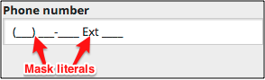
For example, if you want a user to enter a phone number, you can use the following mask containing literals and numeric definitions:
mask: "(999) 999-9999 Ext 9999"
With a proper label, it will look as follows in UI:
Definitions
The definitions property specifies a dictionary for groups of symbols,
which are valid for input into positions of the mask. It is an
associative array, in which the keys are single-symbol
designators in a mask, and values are regular expressions.
If you try to input in the current position a character that does not
match the specified regular expression the character will be ignored.
By default, the dictionary specified in the widget is:
definitions: {
   '9': "[0-9]",
   'a': "[A-Za-z]",
   '*': "[A-Za-z0-9]"
}
You can completely override the definitions. In the following example, the dictionary is extended with hexadecimal ‘h’, binary ‘b’, and sign ‘-‘ definitions:
definitions: {
   '9': "[0-9]",
   'a': "[A-Za-z]",
   'h': "[0-9a-hA-H]",
   'b': "[01]",
   '*': "[A-Za-z0-9]",
   '-': "[-+]"
}
Placeholders
The placeholders property defines a dictionary of symbols that
will hint a user which symbols to enter at each position.
It is an associative array, in which the keys are single-symbol
designators from a dictionary of symbol groups, and the values are
single-symbol designators, which will be displayed in the
input field. The ‘*’ key is an exception. Its value will be
substituted for all types of input symbols for which a value to
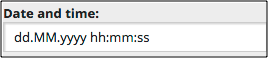
be displayed is not specified. Let’s consider an input mask for date
entry as an example:
{
   mask: "dd.MM.yyyy hh:mm:ss",
   definitions:  {
      "d": "[0-9]",
      "M": "[0-9]",
      "y": "[0-9]",
      "h": "[0-9]",
      "m": "[0-9]",
      "s": "[0-9]"
   },
   placeholders: {
      "d": "d",
      "M": "M",
      "y": "y",
      "h": "h",
      "m": "m",
      "s": "s"
   }
}
If a label is added, this will display the following UI element:
Groups
There may be situations when a value being entered consists of several
groups, which should not exchange symbols. In such a case the
groups property must be set to true. Then all mask literals
in the definitions property will work as group separators.
For better understanding, let us assume that there is a group of symbols completely filled in by a user, and the next group is empty. If the cursor is placed inside the first group and the user starts to enter data, the symbols will be simply replaced by new ones. If grouping were disabled, then the symbols entered earlier would move into the next group.
Let us consider an input mask for ip-address entry as an example:
{
    mask:   "999.999.999.999",
    groups: true
}
Suppose, a user has entered “128.__0.__0.__1” and then understood that he made a mistake. He places the cursor before symbol “8” and enters symbol “7”. If grouping were disabled, he would get “127.8_0.__0.__1”. But since grouping is enabled, “7” simply replaces “8” and the user gets what he wants: “127.__0.__0.__1”.
Processing Values
You can get the data entered by a user through the get method
using “value” as the argument. In this case all placeholders will be automatically
removed from the value shown in the input field.
You can programmatically specify data through the set method with
“value” as the first argument.
Mask Requirements
You can make the whole mask required. For this purpose, set the
requireAll property to true. The requireAllMessage
property contains the message printed out in case of an error.
Examples
The first two examples below demonstrate all widget declaration methods.
The others demonstrate input mask usage. The showCharCounter property works the same way as demonstrated for the
aps/TextArea widget.
Using Widget Loader
require(["aps/load", "aps/ready!"],
function(load){
    "use strict";

    load(["aps/PageContainer", [
        ["aps/Panel", [
            ["aps/FieldSet", [
                ["aps/TextBox", {
                    required: true,
                    placeHolder: "Type an Integer value",
                    pattern: "-?[0-9]*",
                    constraints: {
                        minimumLength: 2,
                        maximumLength: 8
                    },
                    invalidMessage: "Sorry, only an Integer accepted",
                    missingMessage: "Sorry, the field is empty"
    }]]]]]]]);
});
Using Widget Constructors
require(["aps/TextBox", "aps/FieldSet", "aps/Panel", "aps/PageContainer", "aps/ready!"],
function(TextBox, FieldSet, Panel, PageContainer){
    "use strict";
    var page = new PageContainer({}, "example");
    var panel = new Panel();
    var fieldSet = new FieldSet();

    fieldSet.addChild(new TextBox({
       pattern:          ".*123.*",
       label:            "Description",
       invalidMessage:   "You should have the '123' pattern in this text field to pass validation"
    }));
    panel.addChild(fieldSet);
    page.addChild(panel);
    page.startup();
});
Simple Use of Input Mask
require(["aps/load", "aps/ready!"],
function(load) {
    "use strict";

    load(["aps/PageContainer", [
        ["aps/Panel", [
            ["aps/FieldSet", [
                ["aps/TextBox", {
                    label: "Phone number",
                    mask: "+9(999)-999-99-99" }]
            ]]
    ]]]]);
});
Mask Definitions
require(["aps/load", "aps/ready!"],
function(load){
    "use strict";

    load(["aps/PageContainer", [
        ["aps/Panel", [
            ["aps/FieldSet", [
                ["aps/TextBox", {
                    label: "~.9.99 ~.9.99 999",
                    mask: "~.9.99   ~.9.99 999",
                    definitions: {
                    "~": "[+-]",
                    "9": "[0-9]"
    }}]]]]]]]);
});
Mask with Placeholders
require(["aps/load", "aps/ready!"],
function(load){
    "use strict";

    load(["aps/PageContainer", [
        ["aps/Panel", [
            ["aps/FieldSet", [
                ["aps/TextBox", {
                    mask:         "dd.MM.yyyy hh:mm:ss",
                    definitions:  {
                        "d": "[0-9]",
                        "M": "[0-9]",
                        "y": "[0-9]",
                        "h": "[0-9]",
                        "m": "[0-9]",
                        "s": "[0-9]"
                    },
                    placeholders: {
                        "d": "d",
                        "M": "M",
                        "y": "y",
                        "h": "h",
                        "m": "m",
                        "s": "s"
                    }
    }]]]]]]]);
});
Processing Values
require(["aps/load", "dijit/registry", "aps/ready!"],
function(load, registry) {

    load(["aps/PageContainer", [
        ["aps/Panel", [
            ["aps/FieldSet", [
                ["aps/TextBox", {
                    id: "textBox",
                    placeHolder: "127.000.000.001",
                    mask: "111.222.333.444",
                    definitions: {
                        '1': "[0-9]",
                        '2': "[0-9]",
                        '3': "[0-9]",
                        '4': "[0-9]"
                    },
                    placeholders: {
                        '1': "a",
                        '2': "b",
                        '3': "c",
                        '4': "d"
                    },
                    groups: true
                }],
                ["aps/Output", {
                    id: "out",
                    content: "You've entered: ${value}"
                }]
            ]]
        ]]
    ]]);

    // Textbox to input new value
    var textBox = registry.byId("textBox");
    // Output to display the value
    var out = registry.byId("out");

    // Handler definition
    function printValue() {
        var newValue = textBox.get("value");
        out.set("value", newValue);
    }
    // Watch for changes and update the display when the value changes
    textBox.watch("value", printValue);
});
<div id="inputNode"></div>
<div id="target"></div>
Public Properties
PROPERTY |
TYPE |
DEFAULT |
DESCRIPTION |
|---|---|---|---|
boolean |
true |
Only for PCP / CCP v1. |
|
object |
{} |
Sets the lower and upper limits on the length of the input string: “constraints”: { “minimumLength”: <number>, “maximumLength”: <number>} Default value: {}</number></number>. |
|
object |
{'9': “[0-9]”, 'a': “[A-Za-z]”, '*': “[A-Za-z0-9]”} |
Mask definition (dictionary) that specifies allowed ranges of symbols. |
|
string |
“” |
Textual description to be displayed as a small greyed text under the control. |
|
boolean |
false |
Specifies if the widget will respond to user input. |
|
string |
md-4 xs-12 |
This specifies the widget width that is relevant only for widgets inside Container, FieldSet, or Tiles. |
|
boolean |
<strong>false</strong> |
If true, the input mask is divided into _groups_. |
|
string |
“” |
Help information in a widget. |
|
string |
The value entered is not valid. |
Tooltip text that appears when the content of the text box is invalid. |
|
boolean |
false |
If the widget is busy then this property is true. |
|
string |
“” |
Text that is shown as a label if the widget is placed inside a aps/FieldSet. |
|
string |
“” |
Side text inside the input filed. |
|
string |
“” |
Input mask. |
|
string |
This value is required. |
Tooltip text that appears when the content of the text box is empty and the field is required. |
|
string |
(Optional) |
Text for optional widgets of the Input category. |
|
string |
.* |
This defines the regular expression used to validate the input. |
|
string |
“” |
Grayed out text displayed in the input field until the user starts entering new data. |
|
object |
{ “*”: “_” } |
The dictionary of displayed symbols for the input mask. |
|
string |
“” |
If defined, displays the string when the text box is empty and on focus. |
|
boolean |
false |
Indicates if all mask elements must be entered. |
|
string |
All symbols required. |
Text of message which will be shown if requireAll set to true. |
|
boolean |
false |
User is required to enter data in the input field. |
|
boolean |
<strong>false</strong> |
This property is used for displaying remaining characters counter for text input. |
|
number |
10 - PCP / CCP v1, undefined - CCP v2 |
Affects the selection of a CSS class that defines the width of the input field of the widget. |
|
string |
The value you specified is too long. It must not exceed <strong>maximumLength</strong> characters. |
The message displayed when the input data is longer than the specified length. |
|
string |
The value you specified is too short. It should be at least <strong>minimumLength</strong> characters. |
The message displayed when the input data is shorter than the specified minimum length. |
|
string |
text |
Type of input data. |
|
boolean |
true |
If this property value is set to true, then the widget is visible. |
autoSize boolean
Only for PCP / CCP v1. If this property value is set to “true”, then a CSS class is assigned to the widget based on the value of the “size” property: size <= 7 - f-small-size (40px) 7 < size <= 33 - f-middle-size (215px) 33 < size - f-big-size (240px) The default value of this property is true. If you want to use your own CSS class for defining the widget’s size, you should set this property value to “false” and specify your class name in the widget’s “class” property. Default value: true
constraints object
Sets the lower and upper limits on the length of the input string: “constraints”: { “minimumLength”: <number>, “maximumLength”: <number>} Default value: {}.</number></number>
definitions object
Mask definition (dictionary) that specifies allowed ranges of symbols. Default value: {‘9’: “[0-9]”, ‘a’: “[A-Za-z]”, ‘*’: “[A-Za-z0-9]”}.
description string
Textual description to be displayed as a small greyed text under the control. Default value: “”.
gridSize string
This specifies the widget width that is relevant only for widgets inside Container, FieldSet, or Tiles. In other cases it will be ignored.
gridSize string contains few options with number values (from 1 to 12) separated by spaces, which specify the grid size of the widget in different layouts:
- md - desktop
- xs - phone
For example, gridSize: “md-4 xs-2”.
All values below 1, e.g. “md-0”, will be replaced with the empty string (“”), values above 12, e.g. “md-14”, will be reduced to 12 (“md-12”).
Default value: “md-4 xs-12”.
groups boolean
If true, the input mask is divided into _groups_. Default value: false.
hint string
Help information in a widget. It is shown under the content of the widget. Deprecated in CCP v2. Default value: “”.
invalidMessage string
Tooltip text that appears when the content of the text box is invalid. Default value: “The value entered is not valid.”
label string
Text that is shown as a label if the widget is placed inside a aps/FieldSet.
Default value: “”.
legend string
Side text inside the input filed. Only for CCP v2. Default value: “”.
mask string
Input mask. For example, a mask to type a phone number: “+9(999)-999-99-99”. Default value: “”.
missingMessage string
Tooltip text that appears when the content of the text box is empty and the field is required. Default value: “This value is required.”
optionalText string
Text for optional widgets of the Input category. Default value: “(Optional)”.
pattern string
This defines the regular expression used to validate the input. Do not add leading ^ or $ characters since the widget adds these. A function may be used to generate a valid pattern when dependent on constraints or other runtime factors. set(‘pattern’, String|Function). Default value: “.*”.
placeHolder string
Grayed out text displayed in the input field until the user starts entering new data. Often used to show a sample input. Once the user clicks on the input field to start typing a value, the ``placeHolder`` will be replaced by the text defined by the ``mask`` along with ``placeholders``. Default value: “”.
placeholders object
The dictionary of displayed symbols for the input mask. It defines a grayed out text displayed in the input field while the user is entering new data. Default value: { “*”: “_” }.
promptMessage string
If defined, displays the string when the text box is empty and on focus. Also displays if the textbox value is Incomplete (not yet valid but will be with additional input). Think of this like a tooltip that tells the user what to do, unlike an error message that tells the user what they’ve done wrong. Default value: “”.
requireAll boolean
Indicates if all mask elements must be entered. Only for CCP v2 and ppanel. Default value: false.
requireAllMessage string
Text of message which will be shown if requireAll set to true. Default value: “All symbols required.”
required boolean
User is required to enter data in the input field. Default value: false.
showCharCounter boolean
This property is used for displaying remaining characters counter for text input. Only shows up when input is in focus. Default value: false.
size number
Affects the selection of a CSS class that defines the width of the input field of the widget.
size <= 7        f-small-size (40px)
7 < size <= 33   f-middle-size (215px)
size > 33        f-big-size (240px)
Default value: 10 - PCP / CCP v1, undefined - CCP v2.
tooLongMessage string
The message displayed when the input data is longer than the specified length. Default value: “The value you specified is too long. It must not exceed maximumLength characters.”
tooShortMessage string
The message displayed when the input data is shorter than the specified minimum length. Default value: “The value you specified is too short. It should be at least minimumLength characters.”
type string
Type of input data. Default value: “text”.
visible boolean
If this property value is set to true, then the widget is visible.
Default value: true.
Public Methods
METHOD |
RETURN |
DESCRIPTION |
|---|---|---|
object
|
Sets the isBusy property to false |
|
undefined
|
Destroy this widget |
|
boolean
|
Here you can do additional verifications |
|
aps/_input
function
|
Focusing on the focusNode of the current object |
|
any
|
Get a property of the Stateful instance |
|
string
|
Here you can return a custom error message |
|
array
|
Discover and return all parents of the widget |
|
dijit/_widgetbase
function
|
Place this widget somewhere in the DOM based on standard dojo/dom-construct::place() conventions |
|
object
function
|
Set a property of the Stateful instance |
|
undefined
|
Gets started after the DOM fragment is added to the document |
|
boolean
|
Called by oninit, onblur, and onkeypress |
|
boolean
|
Overridable function used to validate the text input against the regular expression |
destroy
Destroy this widget. Will also destroy any resources (including widgets) registered via this.own(). This method will also destroy internal widgets such as those created from a template.
Return: undefined
get
Get a property of the Stateful instance. Get a named property of the Stateful object. The property may potentially be retrieved via a getter method in subclasses.
In the base class, this just retrieves the object’s property.
Return: any
getCustomErrorMessage
Here you can return a custom error message. The method must return a value, only if additional verifications fail. To change standard error messages, use respective properties.
Return: string
placeAt
Place this widget somewhere in the DOM based on standard dojo/dom-construct::place() conventions. A convenience function providing a simple shorthand mechanism to put an existing (or newly created) widget somewhere in the DOM, and allow chaining.
Return: dijit/_widgetbase function
set
Set a property of the Stateful instance. Sets named properties of the stateful object and notifies the watchers of the property. A programmatic setter may be defined in subclasses.
Return: object function
startup
Gets started after the DOM fragment is added to the document Called after the widget and its children have been created and added to the page, and all related widgets have finished their create() cycle, up through postCreate().
Note that startup() may be called while the widget is still hidden, for example if the widget is inside a hidden dijit/Dialog or an unselected tab of a dijit/layout/TabContainer. For widgets that need to do layout, it’s best to put that layout code inside resize(), and then extend dijit/layout/_LayoutWidget so that resize() is called when the widget is visible.
Return: undefined
validate
Called by oninit, onblur, and onkeypress. Show missing or invalid messages if appropriate, and highlight textbox field.
Return: boolean
ARGUMENT |
TYPE |
DESCRIPTION |
|---|---|---|
|
Boolean
|
It is true if the widget is focused. |
validator
Overridable function used to validate the text input against the regular expression.
Return: boolean
ARGUMENT |
TYPE |
DESCRIPTION |
|---|---|---|
|
String
|
Value of the widget. |
|
String
|
Regular expression. |
Public Events
EVENT |
RETURN |
DESCRIPTION |
|---|---|---|
undefined
|
The method is called when a user clicks on the widget |
onClick
The method is called when a user clicks on the widget.