Table Of Contents
Application Packaging Standard
Last updated 18-Mar-2019aps/tiles/UsageInfoTile
Tile combined with a ``UsageInfo``.
Table of contents
Overview
The aps/tiles/UsageInfoTile is a combined pair of the aps/UsageInfo widget
inside the aps/Tile container.
It is used to output a resource usage in the form of text and pie-diagram similar to aps/Pie.
Warning
Do not embed additional widgets into aps/tiles/UsageInfoTile.
Example
require([
"aps/load",
"aps/ready!"
], function(load) {
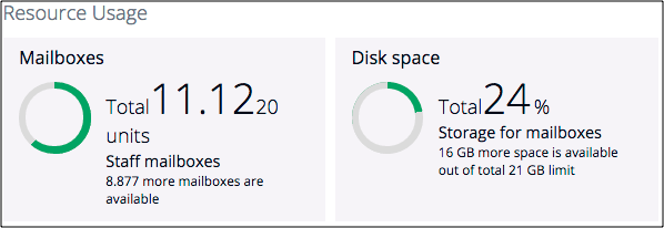
load(["aps/Tiles", {
title: "Resource Usage"
},
[
["aps/tiles/UsageInfoTile", {
title: "Mailboxes",
gridSize: "md-6 xs-12",
value: 11.123,
maximum: 20,
textPrefix: "Total",
precision: 2,
textSecondNumber: "${maximum}",
textSuffix: "units",
description: "Staff mailboxes",
usageHint: "${available} more mailboxes are available",
showPie: true
}],
["aps/tiles/UsageInfoTile", {
title: "Disk space",
gridSize: "md-6 xs-12",
value: 5,
maximum: 21,
textPrefix: "Total",
textFirstNumber: "${percent}",
textSuffix: "%",
description: "Storage for mailboxes",
usageHint: "${available} GB more space is available out of total ${maximum} GB limit"
}]
]
]);
});
Public Properties
| PROPERTY | TYPE | DEFAULT | DESCRIPTION |
|---|---|---|---|
| additionalInfo | function | undefined | This method specifies information which appears in the bottom of the Tile. |
| available | number | 100 | Anout of free values ( maximum - value). Property is readonly. |
| backgroundColor | string | “” | Color of the Tile background in HEX format, for example, “#C0C0C0” Default value: “”. |
| backgroundImage | string | “” | Background Image - the path to the file from the project root, for example, “images/image. |
| buttons | array | undefined | Defines buttons in the toolbar inside the Tile. |
| description | string | “” | Text under the numbers with their description. |
| disabled | boolean | false | Specifies if the widget will respond to user input. |
| fontColor | string | “” | Color of the text in the Tile in HEX format, for example, “#001122” Default value: “”. |
| gridSize | string | md-4 xs-12 | This specifies the widget width that is relevant only for widgets inside Container, FieldSet, or Tiles. |
| iconName | string | “” | iconName - the path to the file from the project root, for example, “images/image. |
| iconRightCornerClass | string | “” | Class used by the DOMNode to display an icon in its right corner. |
| info | null | null | This is an ``aps/Status`` widget displayed near the title. |
| isBusy | boolean | false | If the widget is busy then this property is true. |
| label | string | “” | Text that is shown as a label if the widget is placed inside a aps/FieldSet. |
| maximum | number | 100 | Maximum allowable value. |
| minimum | number | 0 | Minimum allowable value. |
| onClick | function | undefined | Callback method activated when a user clicks on the Tile body. |
| percent | number | 0 | Pie percent. Property is readonly. |
| precision | number | 0 | The precision of the value property. |
| serviceDescription | string | “” | Textual description to be displayed as a small greyed text above the progress bar (only for “inactive” and “inProgress” states, see “state” property). |
| showPie | boolean | true | Determines if to show pie or not. |
| showText | boolean | true | Determines if to texts and numbers or not. |
| state | string | “” | Influences the tile visualization to represent a bound service state as the Service State Presentation section explains. |
| textFirstNumber | string | ${value} | Textual display of first number. |
| textPrefix | string | “” | Prefix text before the first number. |
| textSecondNumber | string | “” | Textual display of second number. |
| textSuffix | string | “” | Suffix text after the second number. |
| usageHint | string | “” | Textual hint to be displayed as a small greyed text under the numbers. |
| useOriginalIcon | boolean | false | Defines whether tile icon will be transformed (greyscale, invert) or original colors will be used. |
| value | number | 0 | Current value. |
| visible | boolean | true | If this property value is set to true, then the widget is visible. |
additionalInfo function
This method specifies information which appears in the bottom of the Tile. It can return an instance, a load-structure array or a promise.
var data = [{
    id: 'tile1',
    status: 'warn'
}, {
    id: 'tile2',
    status: 'error'
}];

additionalInfo: function(data) {
    return new Status({status: data.status});
}

additionalInfo: function(data) {
    return ['aps/Status', {status: data.status}];
}

additionalInfo: function(data) {
    return load(['aps/Status', {status: data.status}]);
}
Default value: undefined.
available number readonly
Anout of free values ( maximum - value). Default value: 100.
backgroundColor string
Color of the Tile background in HEX format, for example, “#C0C0C0” Default value: “”.
backgroundImage string
Background Image - the path to the file from the project root, for example, “images/image.png”. Default value: “”.
buttons array
Defines buttons in the toolbar inside the Tile. Default value: undefined. Each button is defined as an object with the following properties:
iconClass: String         // CSS class of the button.
label: String             // Label on the button.
disabled: Boolean         // Specifies if the button will respond to user action.
type: String              // Type of the button.
onClick: function         // Callback function.
alphaButtonState: String  // Defines the state of alpha button. Possible values: "active", "inactive".
hasRevertButton: Boolean  // Specifies if there will be a revert button.
items: array              /* Defines the second level toolbar containing buttons
                             with the same set of properties as mentioned above.
                             This toolbar is available when a user clicks on
                             the top level button where the toolbar is defined. */
description string
Text under the numbers with their description. Can use templates, e.g. ${percent}. Default value: “”.
fontColor string
Color of the text in the Tile in HEX format, for example, “#001122” Default value: “”.
gridSize string
This specifies the widget width that is relevant only for widgets inside Container, FieldSet, or Tiles. In other cases it will be ignored.
gridSize string contains few options with number values (from 1 to 12) separated by spaces, which specify the grid size of the widget in different layouts:
- md - desktop
- xs - phone
For example, gridSize: “md-4 xs-2”.
All values below 1, for example, “md-0”, will be replaced with the empty string (“”), values above 12, for example, “md-14”, will be reduced to 12 (“md-12”).
Default value: “md-4 xs-12”.
iconName string
iconName - the path to the file from the project root, for example, “images/image.png”. Default value: “”.
iconRightCornerClass string
Class used by the DOMNode to display an icon in its right corner. Default value: “”.
info null
This is an ``aps/Status`` widget displayed near the title. Example:
["aps/Tile", {title: "Tile title", info: new Status({useIcon: false}), gridSize: 'md-12' }]
Default value: null.
label string
Text that is shown as a label if the widget is placed inside a aps/FieldSet.
Default value: “”.
maximum number
Maximum allowable value. The default value is 100.
minimum number
Minimum allowable value. The default value is 0.
onClick function
Callback method activated when a user clicks on the Tile body. Default value: undefined.
percent number readonly
Pie percent. Default value: 0.
precision number
The precision of the value property. This property doesn’t affect any other properties except ‘value’. Determines how many digist after point to show. The default value is 0.
serviceDescription string
Textual description to be displayed as a small greyed text above the progress bar (only for “inactive” and “inProgress” states, see “state” property). Default value: “”.
showPie boolean
Determines if to show pie or not. The default value is true.
showText boolean
Determines if to texts and numbers or not. The default value is true.
state string
Influences the tile visualization to represent a bound service state as the Service State Presentation section explains. The value can be one of the following. “ready” - the service is provisioned and ready to use. “inProgress” - the service provisioning is in progress. “inactive”` - the service is inactive. Default value: “”.
textFirstNumber string
Textual display of first number. Can use templates, e.g. ${percent}. The default value is ${value}.
textPrefix string
Prefix text before the first number. Default value: “”.
textSecondNumber string
Textual display of second number. Can use templates, e.g. ${maximum}. Default value: “”.
textSuffix string
Suffix text after the second number. Default value: “”.
usageHint string
Textual hint to be displayed as a small greyed text under the numbers. Can use templates, e.g. ${percent}. Default value: “”.
useOriginalIcon boolean
Defines whether tile icon will be transformed (greyscale, invert) or original colors will be used. Default value: false.
value number
Current value. The default value is 0.
visible boolean
If this property value is set to true, then the widget is visible.
Default value: true.
Public Methods
| METHOD | RETURN | DESCRIPTION |
|---|---|---|
| addChild () | undefined
|
Addition of a new child widget |
| cancel () | object
|
Sets the isBusy property to false |
| destroy () | undefined
|
Destroys this widget |
| focus () | aps/_tile
|
Focusing on the focusNode of the first suitable child |
| get () | any
|
Get a property of the Stateful instance |
| getChildren () | array
|
Returns all direct children of this widget, i |
| getParents () | array
|
Discover and return all parents of the widget |
| placeAt () | dijit/_widgetbase
function
|
Place this widget somewhere in the DOM based on standard dojo/dom-construct::place() conventions |
| removeAll () | undefined
|
Remove all children in the widget |
| removeChild (widget) | undefined
|
Removes the passed widget instance from this widget and destroys it |
| reset () | undefined
|
Resets the widget |
| set () | object
function
|
Set a property of the Stateful instance |
| startup () | ||
| validate () | boolean
|
Called by oninit, onblur, and onkeypress |
destroy
Destroys this widget. Will also destroy any resources (including widgets) registered via this.own(). This method will also destroy internal widgets such as those created from a template.
Return: undefined
get
Get a property of the Stateful instance. Get a named property of the Stateful object. The property may potentially be retrieved via a getter method in subclasses.
In the base class, this just retrieves the object’s property.
Return: any
getChildren
Returns all direct children of this widget, i.e. all widgets underneath this.containerNode whose parent is this widget. Note that it returns not all descendetns, but only the direct children. Analogous to Node.childNodes, except containing widgets rather than DOMNodes.
The result intentionally excludes internally created widgets (a.k.a. supporting widgets) outside of this.containerNode.
Note the returned array is a simple array. The application code should not assume existence of methods like forEach().
Return: array
placeAt
Place this widget somewhere in the DOM based on standard dojo/dom-construct::place() conventions. A convenience function providing a simple shorthand mechanism to put an existing (or newly created) widget somewhere in the DOM, and allow chaining.
Return: dijit/_widgetbase function
removeChild
Removes the passed widget instance from this widget and destroys it. You can also pass in an integer indicating the index within the container to remove (ie, removeChild(5) removes the sixth widget).
Return: undefined
| ARGUMENT | TYPE | DESCRIPTION |
|---|---|---|
widget |
Widget
Int
|
Child widget or index |
set
Set a property of the Stateful instance. Sets named properties of the stateful object and notifies the watchers of the property. A programmatic setter may be defined in subclasses.
Return: object function
startup
validate
Called by oninit, onblur, and onkeypress. Show missing or invalid messages if appropriate, and highlight textbox field.
Return: boolean