Table Of Contents
Application Packaging Standard
Last updated 18-Mar-2019aps/DropDownButton
The ``aps/DropDownButton`` widget is a drop-down list of buttons with possible separators between them.
A user will be able to select an action from a list.
Table of contents
Compatibility
UX1 only
Overview
The aps/DropDownButton widget is a drop-down list of buttons with possible separators between them.
Find the nested rules for this widget in the recommended Widget Hierarchy.
Structure
The widget provides a list of buttons implementing a group of actions on a certain object.
It consists of its own common properties and an items array, where each item is an object
whose properties are similar to properties of an aps/Button:
[ "aps/DropDownButton", {
   /* Common widget properties */
   id: "<widget ID>",
   // ... other common properties

   /* Set of buttons and separators */
   items: [
      {item-1},
      {item-2},
      //... other items
   ]
}]
The type property of an item defines whether an item presents a button or a separator.
For the latter, type must be "separator", otherwise, the item is a button.
Buttons
An item in the items array defines a button by means of the following properties:
idis a string that defines the widget ID (undefinedby default).labelis a string typed on the button.typedefines a visual style as explained for aps/Button:- “primary”
- “success”
- “info”
- “warning”
- “danger”
- “link”
- “default”
onClickis a callback function activated when the button is clicked.
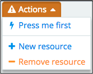
Example
require(["aps/load", "aps/ready!"],
    function(load) {
        "use strict";
        var button1 = function() {
            alert("Button-1 is pressed");
        };
        load(["aps/PageContainer", [
            ["aps/Panel", [
                ["aps/DropDownButton", {
                    label: "Actions",
//                visible: false,
//                disabled: true,
                    items: [{
                        id: "Button-1", // Widget id
                        label: "Press me first", // Label on the button.
                        type: "default", // Type of the button.
                        onClick: button1 // Callback function.
                    }, {
                        id: "separator-1",
                        type: "separator"
                    }, {
                        id: "Button-2",
                        label: "New resource",
                        type: "primary",
                        onClick: function() {
                            alert("Creation of the new object is started");
                        }
                    }, {
                        id: "Button-3",
                        label: "Remove resource",
                        type: "warning",
                        onClick: function() {
                            alert("The object is removed");
                        }
                    }]
                }]
            ]]
        ]]);
});
Public Properties
| PROPERTY | TYPE | DEFAULT | DESCRIPTION |
|---|---|---|---|
| autoBusy | boolean | false | If true than a button will be disabled after a click. |
| disabled | boolean | false | Specifies if the widget will respond to user input. |
| gridSize | string | undefined | This specifies the widget width that is relevant only for widgets inside Container, FieldSet, or Tiles. |
| isBusy | boolean | false | If the widget is busy then this property is true. |
| items | array | undefined | Defines buttons with separators in the dropdown list inside the DropDownButton. |
| label | string | “” | Text that is shown as a label if the widget is placed inside a aps/FieldSet. |
| visible | boolean | true | If this property value is set to “true”, then widget is visible. |
autoBusy boolean
If true than a button will be disabled after a click. Default value: false.
gridSize string
This specifies the widget width that is relevant only for widgets inside Container, FieldSet, or Tiles. In other cases it will be ignored.
gridSize string contains few options with number values (from 1 to 12) separated by spaces, which specify the grid size of the widget in different layouts:
- md - desktop
- xs - phone
For example, gridSize: “md-4 xs-2”.
All values below 1, e.g. “md-0”, will be replaced with the empty string (“”), values above 12, e.g. “md-14”, will be reduced to 12 (“md-12”).
Default value: undefined.
items array
Defines buttons with separators in the dropdown list inside the DropDownButton. Default value: undefined. Each button is defined as an object with the following properties:
id: String            // Widget id
label: String         // Label on the button.
type: String          // Type of the button.
onClick: function     // Callback function.
Each separator is defined as an object with the following properties:
id: String            // Widget id
type: "separator"     // Must be 'separator'
label string
Text that is shown as a label if the widget is placed inside a aps/FieldSet.
Default value: “”.
visible boolean
If this property value is set to “true”, then widget is visible. Default value: true.
Public Methods
| METHOD | RETURN | DESCRIPTION |
|---|---|---|
| cancel () | object
|
Sets the isBusy property to false |
| destroy () | undefined
|
Destroys the DropDownButton |
| get () | any
|
Get a property of the Stateful instance |
| getParents () | array
|
Discover and return all parents of the widget |
| openDropDown () | ||
| placeAt () | dijit/_widgetbase
function
|
Place this widget somewhere in the DOM based on standard dojo/dom-construct::place() conventions |
| set () | object
function
|
Set a property of the Stateful instance |
| startup () | undefined
|
Gets started after the DOM fragment is added to the document |
get
Get a property of the Stateful instance. Get a named property of the Stateful object. The property may potentially be retrieved via a getter method in subclasses.
In the base class, this just retrieves the object’s property.
Return: any
openDropDown
placeAt
Place this widget somewhere in the DOM based on standard dojo/dom-construct::place() conventions. A convenience function providing a simple shorthand mechanism to put an existing (or newly created) widget somewhere in the DOM, and allow chaining.
Return: dijit/_widgetbase function
set
Set a property of the Stateful instance. Sets named properties of the stateful object and notifies the watchers of the property. A programmatic setter may be defined in subclasses.
Return: object function
startup
Gets started after the DOM fragment is added to the document Called after the widget and its children have been created and added to the page, and all related widgets have finished their create() cycle, up through postCreate().
Note that startup() may be called while the widget is still hidden, for example if the widget is inside a hidden dijit/Dialog or an unselected tab of a dijit/layout/TabContainer. For widgets that need to do layout, it’s best to put that layout code inside resize(), and then extend dijit/layout/_LayoutWidget so that resize() is called when the widget is visible.
Return: undefined
Public Events
| EVENT | RETURN | DESCRIPTION |
|---|---|---|
| onClick () | undefined
|
The method is called when a user clicks on the widget |
onClick
The method is called when a user clicks on the widget.