Table Of Contents
Application Packaging Standard
Last updated 18-Mar-2019aps/Button
This is a typical HTML button, but with special styling.
Table of contents
Compatibility
All user panels - CP and UX1
Overview
With the aps/Button widget, you can display a usual button which
can be temporarily disabled on clicking.
It is possible to display a label, an icon, or both on a button.
A label must be specified either by the label (preferable) or by the title (legacy way) property, but only
one of the ways must be used at a time.
To prevent a user from clicking a button repeatedly before the operation previously activated by this button is completed, it is recommended to disable the button as explained later.
Find the nested rules for this widget in the recommended Widget Hierarchy section.
Button Types
The button type and disabled property influence the button view as presented in the following diagram.
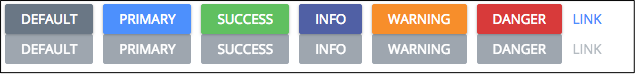
The upper line presents active buttons and the lower line presents the disabled buttons.
Examples
In the following first two examples, you will find how to implement various declaration methods to declare a button. The other examples illustrate properties and methods of the widget.
Widget Loader
The preferable way to specify a text on a button is to assign this text through the label property.
Please note that you can also specify text on the button using the title property, but you must not use the both
properties together.
require(["aps/load", "aps/ready!"],
    function(load){
    	"use strict";
        load(["aps/PageContainer", [
            ["aps/Toolbar", [
                ["aps/Button", { title: "iButton" }]
            ]]
        ]]);
});
Widget Constructor
require(["aps/Button", "aps/Toolbar", "aps/PageContainer", "aps/ready!"],
    function(Button, Toolbar, PageContainer){
        "use strict";
        var page = new PageContainer({}, "simpleButton");
        var toolbar = new Toolbar({});
        toolbar.addChild(new Button({ label: "I'm a simple button!" }));
        page.addChild(toolbar);
        page.startup();
});
Disable Button
You may leave a button visible, but not available for clicking
by setting the disabled property to true.
require(["aps/load", "aps/ready!"],
    function(load){
        "use strict";
        load(["aps/PageContainer", [
            ["aps/Toolbar", [
                [ "aps/Button", {
                    title: "Off",
                    disabled: true
                }]

            ]]
        ]]);
});
Specify Icon
You can specify an icon for a button using one of the two ways:
- Through a CSS class by means of the
iconClassproperty - By specifying the path to an icon file in the
iconNameproperty
in the iconClass property, use an icon class name from the available icons
repository with the fa- prefix.
require(["aps/load", "aps/ready!"],
    function(load){
    	"use strict";
       	load(["aps/PageContainer", [
       	    ["aps/Toolbar", [
                ["aps/Button", {
                    title: "Some picture",
                    // iconClass: "fa-external-link"
                    iconName: "../pictures/pic.png"	// To use iconClass, comment this out
                    // .. and uncomment the iconClass definition
                }]
            ]]
       	]]);
});
On Click Handler
You can add an on-click handler for a button by defining the onClick property:
require(["aps/load", "aps/Button", "aps/ready!"],
    function(load, Button) {
        "use strict";
        load(["aps/PageContainer", [
            ["aps/Toolbar", [
                ["aps/Button", {
                    title: "Press me",
                    onClick: function() {
                        alert("I'm pressed!");
                        this.cancel();
                    }
                }]
            ]]
        ]]);
});
After creating a button, irrespective of the way it was declared,
you can specify a click handler at any time you like by using
the on method with a value of the first argument set to "click".
At any time you can get a button object with help of the
dijit/registry object.
require(["aps/Button", "aps/Toolbar", "aps/PageContainer", "dijit/registry", "aps/ready!"],
    function(Button, Toolbar, PageContainer, registry){
        "use strict";

        var page = new PageContainer({}, "clickButton");
        var toolbar = new Toolbar();
        var clickButton = new Button({
           id:      "clickButtonID",
           label:   "click me!"
        });
        toolbar.addChild(clickButton);
        page.addChild(toolbar);
        page.startup();

        registry.byId("clickButtonID").on("click", function(e) {
            alert("click!");
        });
});
Disable Button on Click
By default, after clicking a button it changes its color to grey,
the text on the button also changes and the button itself becomes
disabled until the cancel method is called for the button.
The autoBusy, busyLabel, and timeout properties affect this process as described
in the Public Properties section.
require(["aps/Button", "aps/Toolbar", "aps/PageContainer", "aps/ready!"],
    function(Button, Toolbar, PageContainer) {
        "use strict";

        var page = new PageContainer({}, "maxSettingsButton");
        var toolbar = new Toolbar({});
        var maxSettingsButton = new Button({
            id: "maxSettingsButtonID",
            label: "I'm a button with max number of settings!",
            timeout: 1000,
            busyLabel: "I'm thinking...",
            name: "maxSettingsButton",
            title: "I'm a button"
        });
        toolbar.addChild(maxSettingsButton);
        page.addChild(toolbar);
        page.startup();
});
Public Properties
| PROPERTY | TYPE | DEFAULT | DESCRIPTION |
|---|---|---|---|
| autoBusy | boolean | true | If true than a button will be disabled after a click. |
| busyLabel | string | Please wait | Text displayed while a button is disabled. |
| disabled | boolean | false | Specifies if the widget will respond to user input. |
| gridSize | string | undefined | This specifies the widget width that is relevant only for widgets inside Container, FieldSet, or Tiles. |
| hideFor | string | “” | It is a string containing “md” (hides the property in desktops), or “xs” (hides it in mobiles), or both “md xs” (hides the property regardless of the mode). |
| iconClass | string | “” | CSS class from. |
| iconName | string | “” | Icon source - address to an icon file. |
| isActive | boolean | false | If true use the CSS class ‘Active’. |
| isBusy | boolean | false | If the widget is busy then this property is true. |
| isDefault | boolean | false | Use CSS class ‘Action’. |
| label | string | “” | Text on a button. |
| requireItems | boolean | false | If “true” the button will be enabled only if ONE or MORE items in the aps/Grid is selected. |
| requireSingleItem | boolean | false | If “true” the button will be enabled only if ONE item in the aps/Grid is selected. |
| timeout | number | 0 | If exists, then it will call the cancel() method to enable the button after a period of time specified by this property. |
| title | string | “” | Text on a button. |
| type | string | default | Type of visual format. |
| visible | boolean | true | If this property value is set to true, then the widget is visible. |
autoBusy boolean
If true than a button will be disabled after a click. Default value: true.
busyLabel string
Text displayed while a button is disabled. Default value: “Please wait” (PCP / CCP v1) or “Loading” (CCP v2).
gridSize string
This specifies the widget width that is relevant only for widgets inside Container, FieldSet, or Tiles. In other cases it will be ignored.
gridSize string contains few options with number values (from 1 to 12) separated by spaces, which specify the grid size of the widget in different layouts:
- md - desktop
- xs - phone
For example, gridSize: “md-4 xs-2”.
All values below 1, e.g. “md-0”, will be replaced with the empty string (“”), values above 12, e.g. “md-14”, will be reduced to 12 (“md-12”).
Default value: undefined.
hideFor string
It is a string containing “md” (hides the property in desktops), or “xs” (hides it in mobiles), or both “md xs” (hides the property regardless of the mode). Default value: “”.
iconClass string
CSS class from Font-Awesome to assign to the respective DOMNode and thus make it display an icon. it has no effect without the label or title property. Default value: “”.
iconName string
Icon source - address to an icon file. Deprecated in CCP v2 and replaced with iconClass. it has no effect without the label or title property. Default value: “”.
isActive boolean
If true use the CSS class ‘Active’. Default value: false.
isDefault boolean
Use CSS class ‘Action’. Default value: false.
label string
Text on a button. The preferred equivalent for the title property. You cannot use both, label and title together. The label cannot be empty in PCP / CCP v1. Default value: “”.
requireItems boolean
If “true” the button will be enabled only if ONE or MORE items in the aps/Grid is selected. Default value: false.
requireSingleItem boolean
If “true” the button will be enabled only if ONE item in the aps/Grid is selected. This property has a priority on requireItems property. Default value: false.
timeout number
If exists, then it will call the cancel() method to enable the button after a period of time specified by this property. Default value: 0.
title string
Text on a button. Equivalent for the “label” property. You shouldn’t use both together. We recommended using the “label” property. Default value: “”.
type string
Type of visual format. Only for CCP v2. Possible values: “primary”, “success”, “info”, “warning”, “danger”, and “link”. Default value: “default”.
visible boolean
If this property value is set to true, then the widget is visible.
Default value: true.
Public Methods
| METHOD | RETURN | DESCRIPTION |
|---|---|---|
| cancel () | undefined
|
Switches the button back to the enabled state |
| destroy () | undefined
|
Destroys the button |
| get () | any
|
Get a property of the Stateful instance |
| getParents () | array
|
Discover and return all parents of the widget |
| makeBusy () | aps.button
function
|
Does a transition between the ‘ready to handle user event’ (isBusy: false) state and the ‘busy’ (isBusy: true) state |
| placeAt () | dijit/_widgetbase
function
|
Place this widget somewhere in the DOM based on standard dojo/dom-construct::place() conventions |
| resetTimeout (timeout) | undefined
|
Resets existing timeout and sets a new timeout |
| set () | object
function
|
Set a property of the Stateful instance |
| setLabel (val) | undefined
|
Deprecated |
| startup () | undefined
|
Processing after the DOM fragment is added to the document |
cancel
Switches the button back to the enabled state. To prevent double submission by a user, aps.Button is switched to the disabled state automatically each time after the user clicks. To switch the button back to the enabled state, call the cancel() method in your onClick handler. Functionality is almost the same as dojox/form/BusyButton.
Return: undefined
get
Get a property of the Stateful instance. Get a named property of the Stateful object. The property may potentially be retrieved via a getter method in subclasses.
In the base class, this just retrieves the object’s property.
Return: any
makeBusy
Does a transition between the ‘ready to handle user event’ (isBusy: false) state and the ‘busy’ (isBusy: true) state. Also disables the button (disabled:true).
Return: aps.button function
placeAt
Place this widget somewhere in the DOM based on standard dojo/dom-construct::place() conventions. A convenience function providing a simple shorthand mechanism to put an existing (or newly created) widget somewhere in the DOM, and allow chaining.
Return: dijit/_widgetbase function
resetTimeout
Resets existing timeout and sets a new timeout.
Return: undefined
| ARGUMENT | TYPE | DESCRIPTION |
|---|---|---|
timeout |
Int
|
Time in millisecondsю |
set
Set a property of the Stateful instance. Sets named properties of the stateful object and notifies the watchers of the property. A programmatic setter may be defined in subclasses.
Return: object function
setLabel
Deprecated. Use set() instead.
Return: undefined
| ARGUMENT | TYPE | DESCRIPTION |
|---|---|---|
val |
String
|
The label of the button. |
startup
Processing after the DOM fragment is added to the document. Called after a widget and its children have been created and added to the page and all related widgets have finished their creation cycle, that is after the postCreate() function is successfully completed for each of the related widgets. Note that startup() may be called while the widget is still hidden.
Return: undefined
Public Events
| EVENT | RETURN | DESCRIPTION |
|---|---|---|
| onClick () | undefined
|
The method is called when a user clicks on the widget |
onClick
The method is called when a user clicks on the widget.